Multiple Flows Should Have Different Device Frames


Show first post

196 replies

Maxim_Dobrovolsky

+1, really need this feature


IraX
  • New Participant
  • 145 replies
  • September 28, 2023

Yes, please. I need this often.


  • 1 reply
  • September 29, 2023

its 2023 and we still miss this +1


Per
  • 2 replies
  • October 3, 2023

Usually when you don’t agree with a design decision you understand what the designers “right way to do it” is, but this functionality seam flat out broken to me.

I don’t even understand how the Figma UX-team thinks we should be working. One page per device we’re designing for?

I don’t know any web-designer that works this way. Everyone I know has desktop and mobile views right next to each other when designing a page for both.


Suman_Saurabh

Just have the device type associated with the flow created in prototype. We just want the a flow on ipad will have the outline of an iPad, same goes for mobile as well.


iNg
  • 1 reply
  • October 4, 2023

+100500 We need it


Margot_Gabel
  • Active Member
  • 47 replies
  • October 4, 2023

Coming back here since 2021 to check the status of this feature we need daily : ’ )


SIA_NEW_BLACK

Please make this possible…


Lars_Farstad

Agree, this would be super useful not just for responsive design but also for presentations leading into a prototype. For example with some intro slides then changing device when linking from slides into a different prototype flow.

Alternatively at least being able to link prototypes from two separate pages together and switching device that way


Rebekka_Karrengarn

really disappointed this has not been solved in the meantime. We absolutely need this!


+1, really need this feature


Alex_Gott-Cumbers

Please Figma. You promised. Forget AI, do this instead…


Denis_Mallet

I am new to Figma and shocked there isn’t anything like different device frames on the same project and somehow irritated to see that this has been asked by users since July 2021. Am I starting to use Figma at the moment it is actually becoming XD ?


Marilee_Sweeney2

I frequently present prototypes for desktop and mobile in the same meeting . For this reason, the ability to set Prototype Device Settings by frame would allow me to do so seamlessly, without having to stop, and reset the setting from mobile to desktop.


IraX
  • New Participant
  • 145 replies
  • November 7, 2023

mr.D
  • 4 replies
  • November 15, 2023

Yep, it would be nice to see this fixed.


Margot_Gabel
  • Active Member
  • 47 replies
  • November 24, 2023

This idea is from 2021! Still needing it every day.


Josiah_Pierce

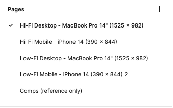
Hi everybody. I haven’t read every comment on this thread but I have found a workaround that I like and have been using for several projects. I still would like devices sizes for each flow… but, try this out!

Figma does let you set prototype devices per “page”. Here’s a screenshot of what I do for each project file now. I set up mobile and desktop pages that contain only those device size prototypes, then I assign the corresponding prototype device for each page. You can setup a master Figma file that you duplicate every time you start a new project if you want. I hope this helps some people!

image


Joseph_Amato

Great input, @Josiah_Pierce. Thanks for the input. We appreciate your input!


Margot_Gabel
  • Active Member
  • 47 replies
  • December 15, 2023

We design desktop and mobile screen in the same page and use the Custom Size setting to show our prototype (to overcome the fact that Figma can still not handle different devices for different flows…), the problem is that the Prototype option Fit Width is not available for some obscure reason. Therefore we MANUALLY add &scaling=scale-down-width to the URL to have it working and to have a proper link to share with client.

Would it be possible to just display it in the Option dropdown like for the Presentation setting?


Morten_Brix_Falslund

We need this! 😭


The_Company_You_Keep

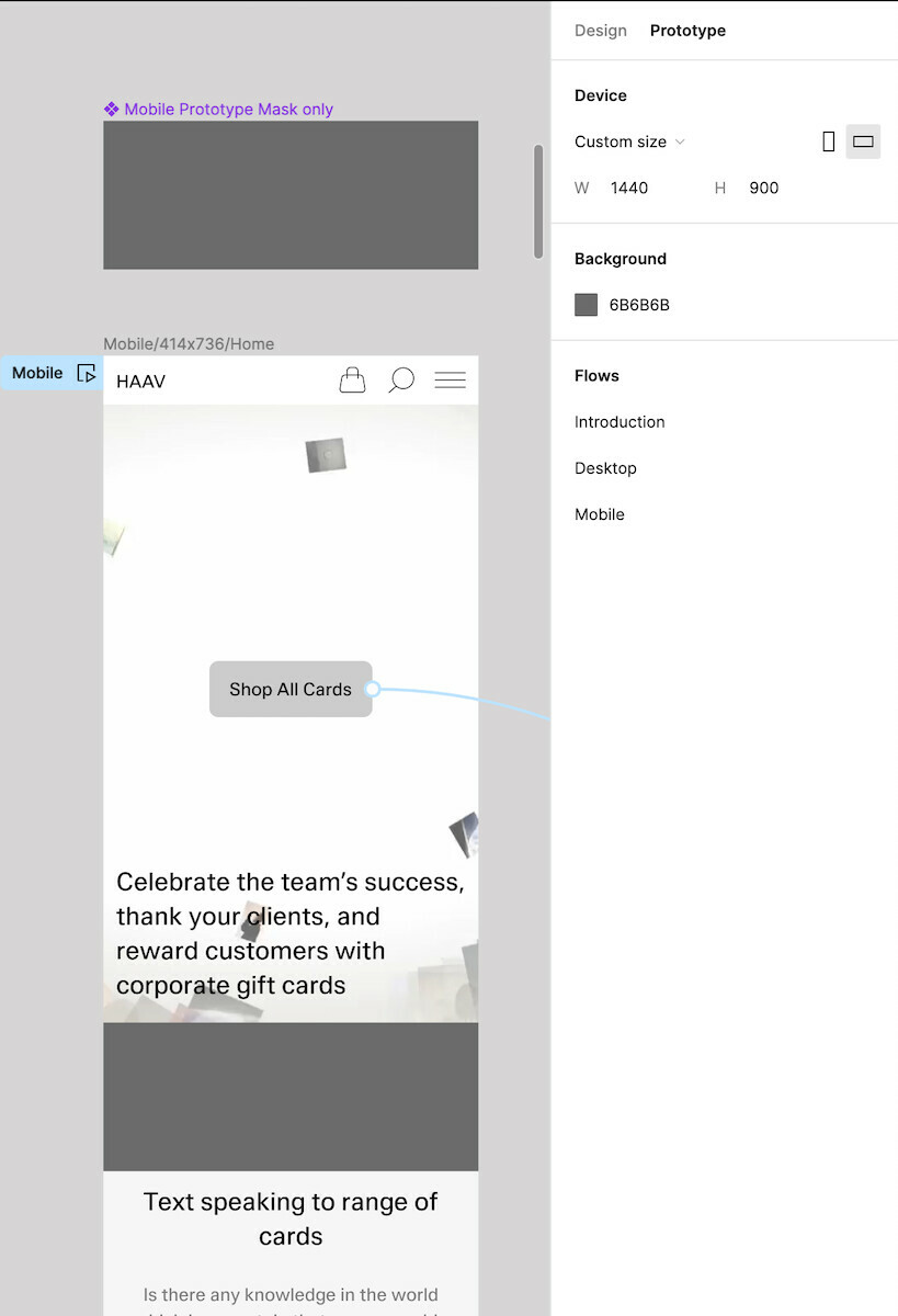
A solution we use:
• Custom device frame for desktop (1440 x 900px)
• Insert a rectangle the same hex value as your prototype background
• Size rectangle to your mobile width and the difference between 900px and your mobile height (900 – 736 = 164px)
• Set rectangle to fixed position
• Extend page frames by 164px at bottom so this rectangle can hide there once scrolled to bottom of page


+1 New to Figma and loving it but already running into the need for this feature as my team designs for different viewports on the same page. Also seems like the new variables feature supports this concept by allowing you to assign your variable modes (mobile, desktop, etc) to a specific frames on the same page. Would be great to treat the device prototypes the same way.


  • 1 reply
  • February 4, 2024

+1 This would be a superb feature!


Mateusz17
  • 1 reply
  • February 10, 2024

Still nothing? 😦


Reply


Cookie policy

We use cookies to enhance and personalize your experience. If you accept you agree to our full cookie policy. Learn more about our cookies.

 
Cookie settings