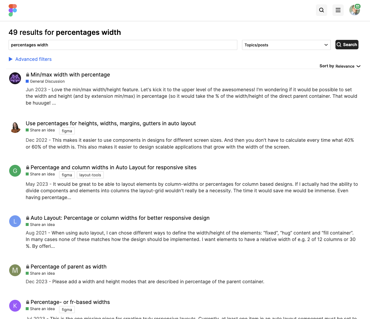
This makes it easier to use components in designs for different screen sizes. And then you don’t have to calculate every time what 40% or 60% of the width is.
This also makes it easier to design scalable applications that grow with the width of the screen.
I have this text block component with a few nested auto layout containers, one of which is the body below the heading with padding on either side. Yes I have it flexible with “Fill container” and would much rather set a percentage width on that body, like anyone would in real life.
I thought of this today as I was designing a data table and the dev team asked what percentage of the width each column should be. Due to the absence of this feature, I had to do math. MATH!
In all seriousness, though, I think this makes a whole lot of sense considering that in CSS you are able to set dimensions of divs by using percentage units as well, and it would also save us the work of a LOT of workarounds involved to make an auto layout frame look the way we want.
Just throwing my hat in the ring here to say this would be an incredibly useful, fundamental layout feature. Being able to have an autolayout of 2 columns where I can set their widths to relative percentages (For example : col 1 is set to “Fill” and 70%, col 2 is set to “Fill” and 30%) would be really helpful.
I find myself coming to the Figma Forum to search out this topic nearly monthly, and at this point, I’m just looking for someone to show me a hack workaround that will suffice until this is added natively (I’ve even found old comments of my own about this that I forgot I left…hehehe). Please Figgie! Make this happen in June!
By using the percentage or relative units like em or pem that your design can adapt the different screen sizes. This eliminates the need of pixel calculation for each element.
This has been posted a hundred times before. People have been asking Figma for this for YEARS. Hard to get votes when it has already been voted on a bunch of times.
I logged in just to vote for this feature. It should be the top priority. Design and consideration for different screen sizes have always been requirements for professionals. Percentage, at least in auto layout, would be the greatest update since auto layout itself
Add this already! This would be such a great - basic - option to have. Working with percentages is a much better practice and it mirrors how layouts actually get built during development. You do not want to hard-code pixel values or work on the assumption that a desktop or a phone would have x:y aspect ratio most of the time - that’s bad practice!
Oh it would be a dream! how easy it would be the responsive behaviour of uneven layouts with percentage matching the grid! I have always a tone amount of extra work with sliders in different breakpoints. Do we have any solution on this yet?
I’m not sure if this has already been requested, but I still wanted to share this idea.
Right now you can use Fill container to make elements responsive inside an Autolayout frame. But what if I want 1 element to be larger/smaller than the rest, but still responsive (so not using fixed)?
For example: you can set the width of a child element to 50% relative to its parent frame, which uses auto layout, while leaving the other elements set to Fill Container. This way, when the design is scaled down, the layout adjusts automatically without requiring you to apply a new fixed width each time you scale up or down.
This approach would make creating responsive designs much easier and faster. It would also improve the handoff to development, as developers can directly use percentage units in the CSS. There’s no need to explain how you want the responsiveness to work, since the units are already built into the design.