
Use percentages for heights, widths, paddings, gutters in auto layout

  • December 9, 2022
  • 100 replies
  • 8014 views

Show first post

100 replies

Elliott_UX
  • New Participant
  • December 19, 2024

If we are trying to align designers and developers, this is crucial. This is the sort of thing that leads to design drift and misinterpretation of designs.


Jan Niklas Hellenbrandt

Dear Figma,
I would love to use this feature.
My colleagues would love to use this feature.
Our Figma-community would love to use this feature.
Your future clients would love to use this feature.
It’s CSS basic. Please!
Thank you


Kait_O_Malley

This would be a gamechanger when creating reusable components for my design team partners. We on the UX team create a structure similar to what they would find in their CMS platform to both set rules but give the creative team freedom and tools to get creative before trial and error on the platform itself to prevent rework. 


Jan Niklas Hellenbrandt

Oh – of course!
My developer-colleagues would love this feature, too!

thanks :) bye.


Sergio666
  • New Member
  • January 22, 2025

+1 right here :) it would be really a nice feature, I was trying to solve it just now :D 


Phil Salesses

Honest question: How are we supposed to design a responsive website with auto-layout?

I have to adjust each child manually and recalculate 50% of the parent container to reset everything?


Gabi_Gordon
  • New Member
  • January 31, 2025

Many people have said the same thing, but I’m here to recommend supporting percentages within auto layout. I’ve seen many people asking for the same thing.

Percentage width auto layout would help us be more efficient. Auto layout “Fill container” is great for sections being sized equally (50/50 or 30/30/30).

When we’re designing content with sections, the sections are generally not the same width as each other to indicate importance.

Myself and many other designers would love to have autolayout support something like this:

  • The main container has the same spacing all the way around
  • Each section takes up a specifid percentage of the container (70% and 30%)
  • When the modal grows and shrinks, those sections maintain their width of 70% and 30%
  Without spacing With spacing
800px wide


1000px wide


This is what autolayout currently supports

If we use auto layout, each section must be a specified width or the same width as the other sections.  It makes it so we cannot use autolayout on re-usable components like page layouts or dialogues because the content cannot maintain its scale.

Without spacing With spacing


Laurentiu
  • New Member
  • February 1, 2025

This is awesome! I think this can be done as MIN-MAX , but with percentages, you would set the autolayout as fill-container , with a min and max width of x% from parent.


ArtMalikoff
  • New Member
  • February 10, 2025

Comment in support of this idea. This feature is very much needed.


AJ114
  • New Member
  • February 11, 2025

+1

Genuinely shocking that this wasn’t implemented when auto-layout was released, or even when they released wrapping with auto-layout. I’m able to assign % values with Flexbox, there’s no real reason we couldn’t do this in Figma.


Gabriel Poli
  • New Member
  • February 25, 2025

Let’s gooooooooo Figma

It’s been 2 years now, and people still need this more than a new UI

C’mon, that’s easy peasy for you guys


Coltide
  • New Member
  • March 3, 2025

+1


Coltide
  • New Member
  • March 3, 2025

+1

I (and the developers I work with) would really loved this


Matt_Ryan1
  • New Member
  • March 19, 2025

Voted.


Came to request this feature. The hack with columns and constraints is too limiting and time consuming. Just allow me to change the width or height to a percentage of it’s parent, please!


GLD
  • New Member
  • March 27, 2025

I don’t need AI, I need percentage widths.


Sofie_Katan1
  • New Participant
  • April 1, 2025

+1 Less AI and more basic features like percentages!


Faulancr
  • New Member
  • April 3, 2025

Percentages would be awesome and consistent to use in css-vars.


Joris_Demange

+1. I promise I’ll treat my FigPal well.


Zoe_Gomez
  • Active Member
  • April 9, 2025

Begging once again for this one


Savan Kotadiya

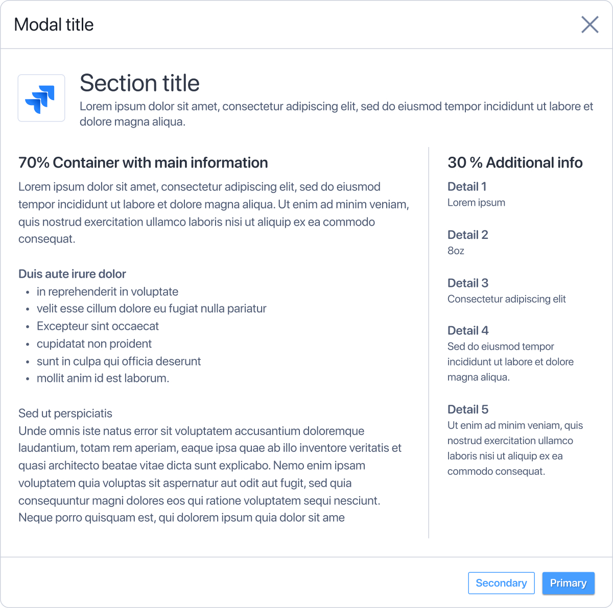
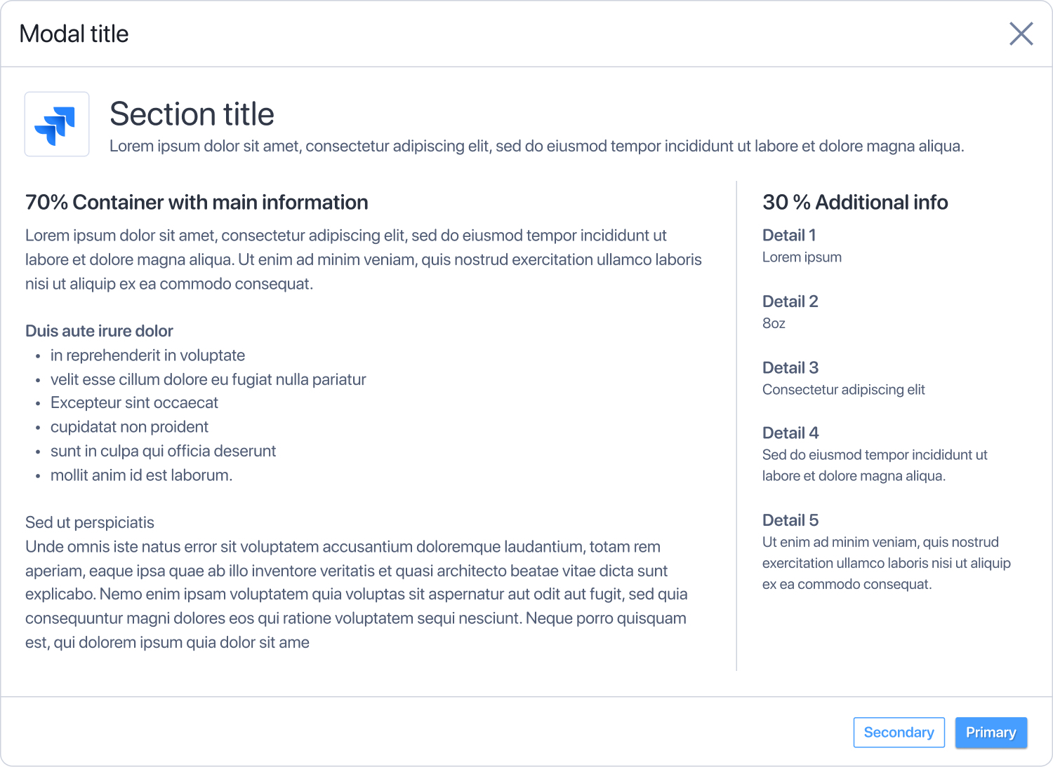
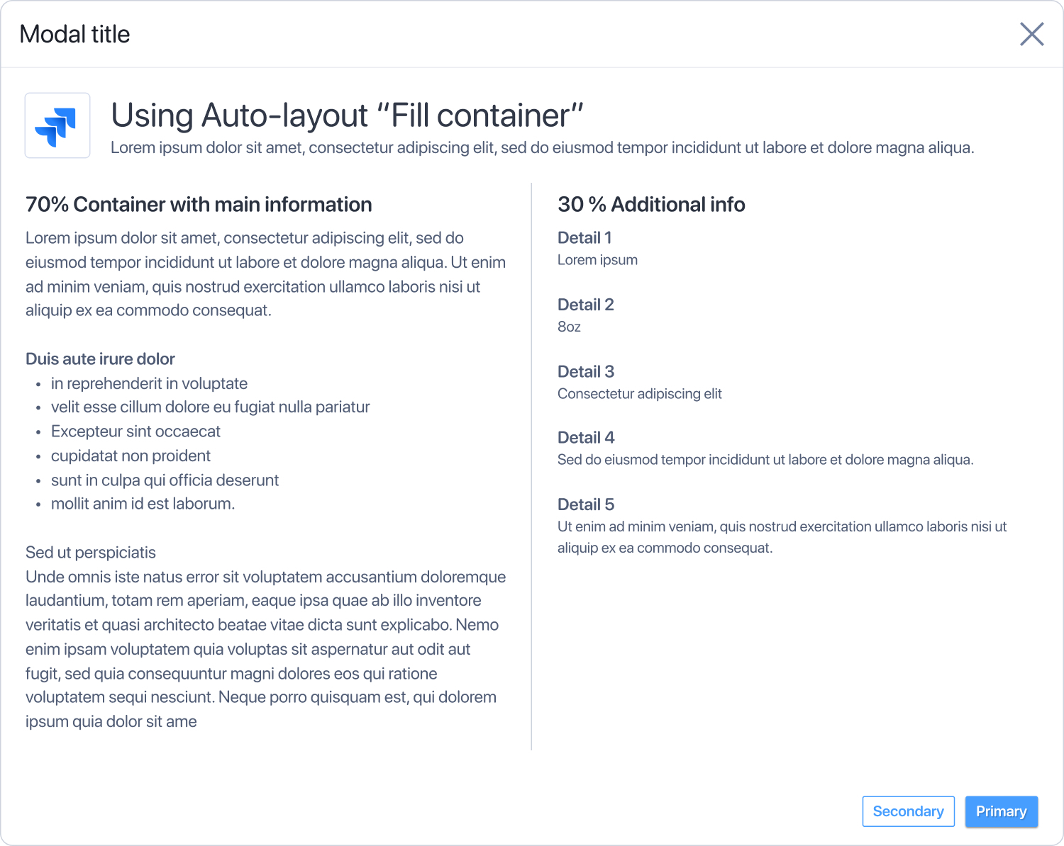
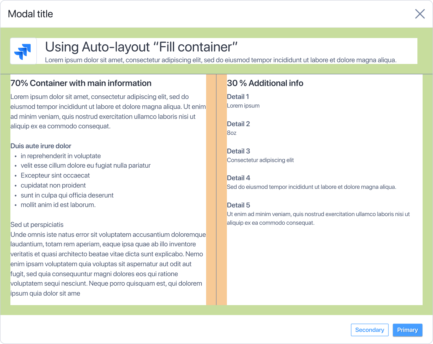
This makes it easier to use components in designs for different screen sizes. And then you don’t have to calculate every time what 40% or 60% of the width is.

This also makes it easier to design scalable applications that grow with the width of the screen.

@figma please introduce this feature


BenchPress Ben

Does Figma not take a stand on this? There must be a reason for it.


ahmadfawaid
  • New Participant
  • April 12, 2025

+1 really need this feature!!


Vicky10
  • New Member
  • April 16, 2025

Logged in just to say yep I really need this. I hate having to apply a column grid to auto layouts just to get the width correct, and then having to add extra notes to the devs that it should be percentage based instead of fixed width. It also sucks when there’s a responsive option in the present mode but this doesn’t work with that.


Krystal1
  • New Member
  • May 1, 2025

Pretty please, with sugar on top, end our suffering and let us set dimensions by percentage. We wants it. We needs it. Please?


MinibossMike

It would be wonderful if Auto Layout had the properties we’d expect from Flex Box. Since that seems to be what it was shooting for.