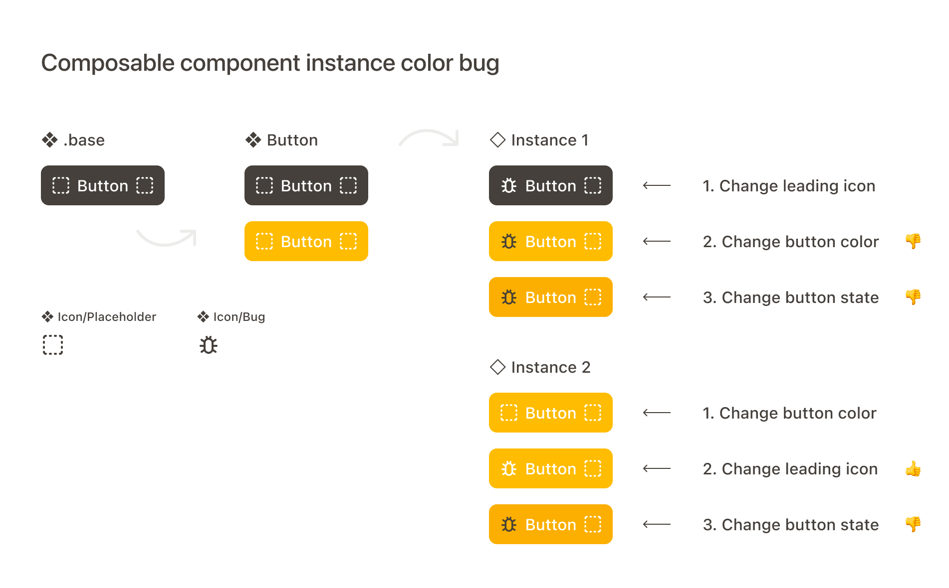
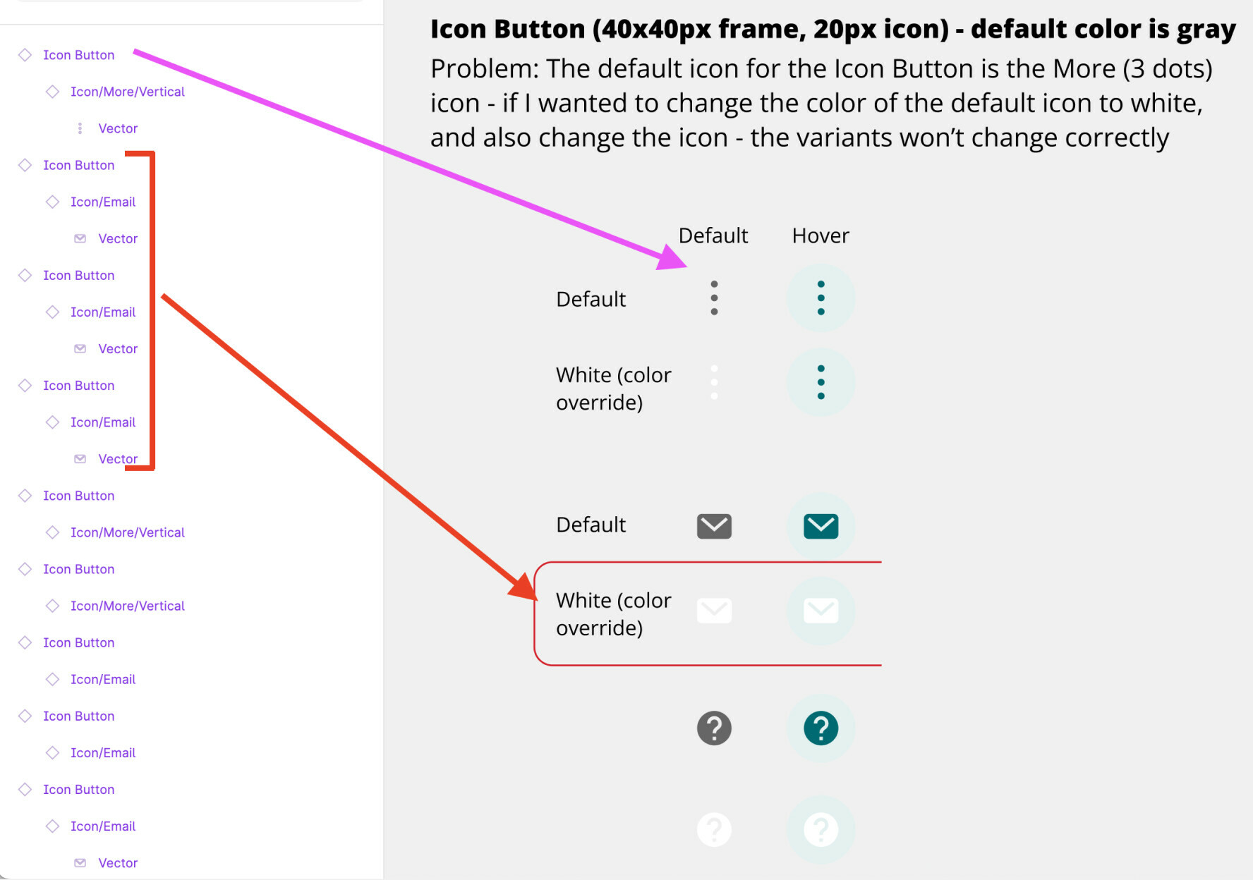
It’s a bug that I’m watching closely because I can’t adopt these features in our design system until it’s resolved. Here’s the other thread, which I think is categorized incorrectly: Component Properties & Variants Bug - #13 by Jared_r
@anon24157657 you might want to check out my reply in another thread in the forum discussing color override preservation for icons.
As @Dominik6 described, the icon component’s frame can have a unique name, but the shape within should be standardized. Something like “Shape”, “Vector”, or “Icon” like this:
@Craig_C, curious if this is a naming issue on your end, or something else? If you have a file you can share view-access to I can take a closer look.
Here is the link component in default and hover states. You can see the hover icon remains black, while the text link color is a darker version of the default state.
I came across the exact same problem as everyone else. And I found a solution that might work for others, I hope.
All my icons have the same structure and the same naming convention and everything. When changing the component to another variant let’s say another state. From default to disabled. The icon changes in color, however when changing the state back to default, it doesn’t change the color of the icon anymore. It is stuck.
SOLUTION:
Change all your icons colors to something else (Let’s say they were gray, change them all to black). And see if the icons now adopts to the state of the variant. If it does, then now change all your icons colors to your desired color again.
I found out that this is possibly a glitch in the color styles. Hope this works and helps others.
When you use an icon instance in a new component, you should redefine its color even if it already has the desired color. Just change it to something else and then give it the color you want it to have for that state.
If you don’t define the color of an icon when using it in a component that has multiple states, you’re not giving that component the information it needs to manage the transitions between states.
Hi Raphael. Thanks for the reply. I’m not sure I understand though. When you have a button component in a library, for example. I don’t know how you could redefine the color of an icon in a hover state from a project using that library if it’s not your component default.
I did take @Mastermind’s approach though and changed all of the icons’ colors back and forth. That did not fix the issue. So I went back through all of the components in my library and reselected the colors of each placeholder icon back and forth in each component state, then republished my library. Which seems to have updated whatever was causing the issue. This is an obvious bug that Figma hasn’t addressed in months. My library is pretty extensive, but I don’t know what a reasonable fix would be for someone who has hundreds of components. Yikes.
Also don’t mix stroke-based and fill-based icons, or at least be aware that Figma cannot handle color changes between them without false behavior.
That is the reason I always need to convert and flatten each icon component…
It doesn’t get an immediate effect after arranging everything because Figma seems to need some time to load up everything a little bit then it works before it gets the components to work. You saved me. Thank you.
Is the problem from the title of a thread → “An icon doesn’t change color when making an instance swap with the new component properties” still unsolved? @Figma_Support → When do you plan to solve the issue?
But then I put buttons into another component like “Button navigation”. And when using it’s instance, inner button’s state property, which changes color of text and button now not change color of icon. Even thougn it works for alone simple button instance