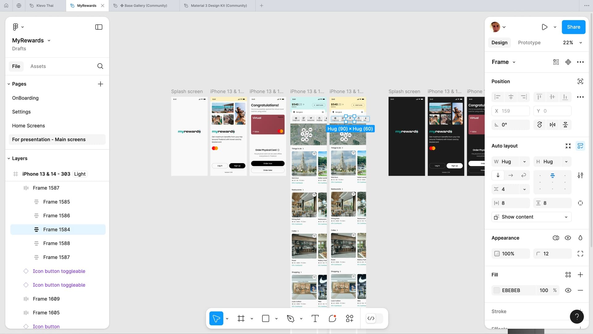
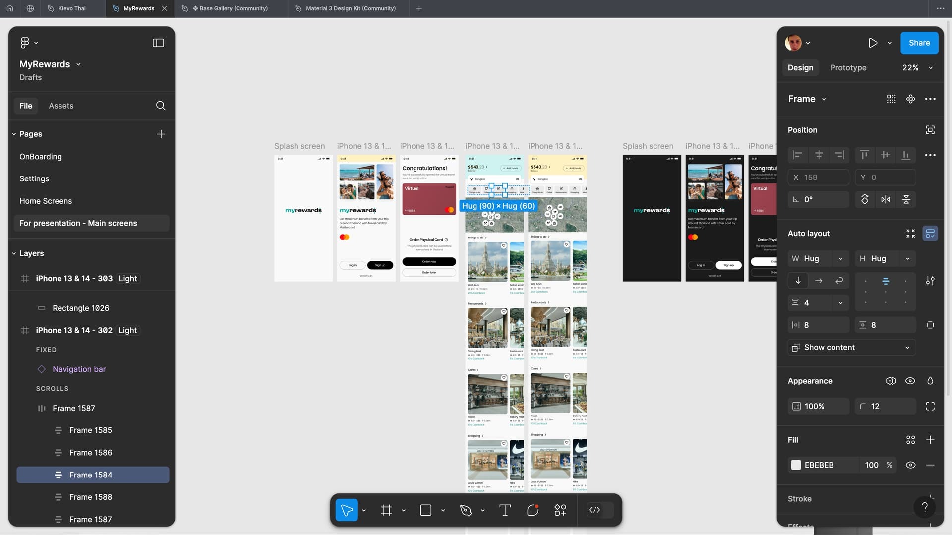
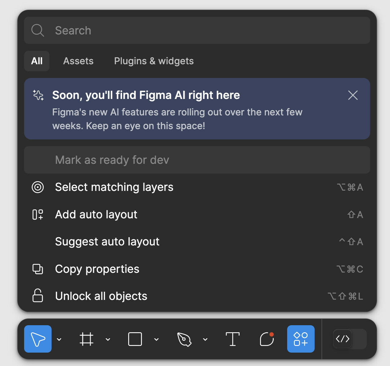
- What I can’t stand the most is that the panels of the new UI can’t be attached to the edges. They leave some gaps, wasting the space to display the main design and operation area. And visually, these gaps are also distracting my attention.
- The toolbar at the bottom also interferes with the main operation space, especially if its color is the same as my design draft. By the way, is it just for the convenience of novices to move it from the top to the bottom? If someone who uses Figma more frequently, he will use shortcuts instead of mouse clicks to trigger these functions.
So I hope that adjustments can be made in time in the official version of UI3, otherwise these redesign will seem like a subjective conjecture of someone who doesn’t use Figma much.
UI3 Feedback
- July 3, 2024
- 426 replies
- 9637 views
- New Member
426 replies
- New Participant
- July 20, 2024
I really like Figma, and i been using UI3 for couple days
here is some idea about UI i like to share,
I think these parts are taken up a little bit too much:
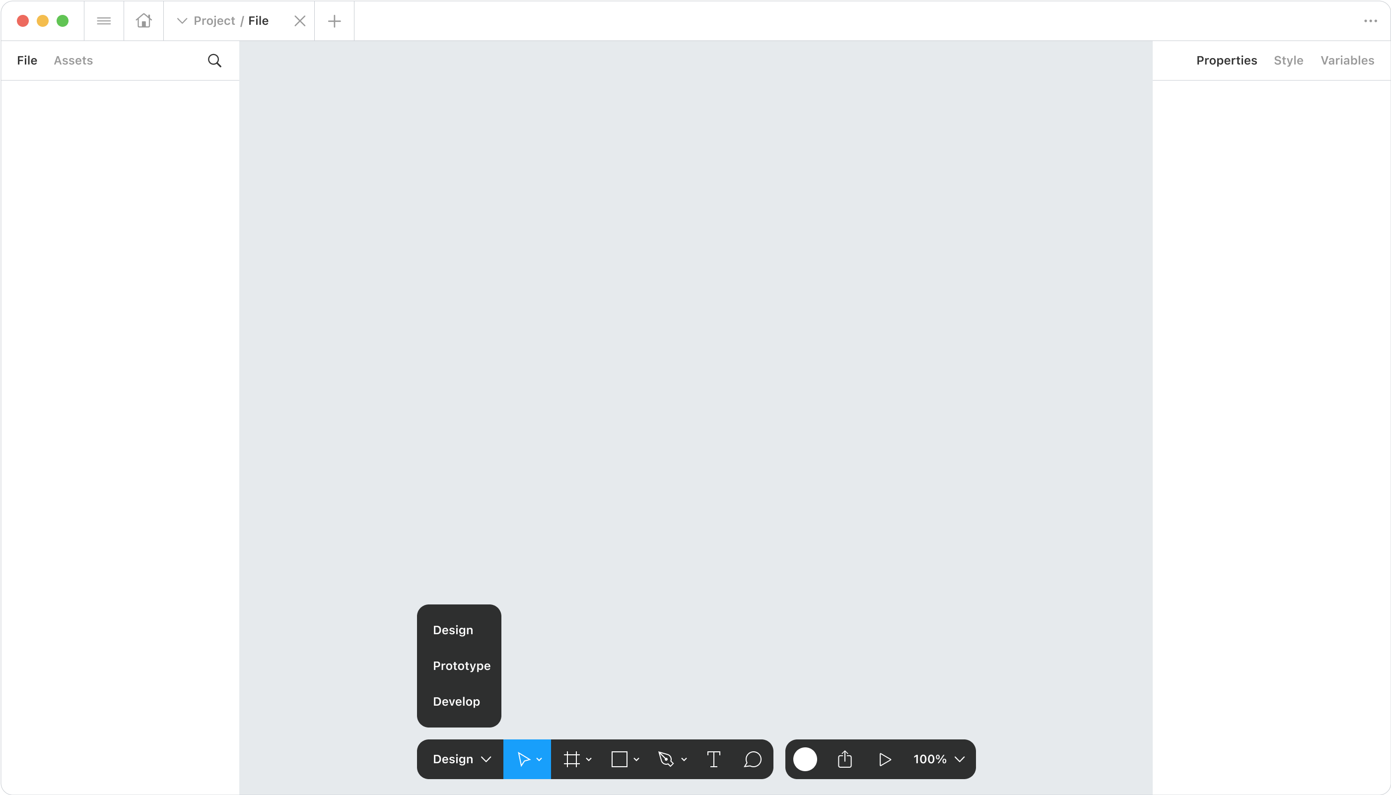
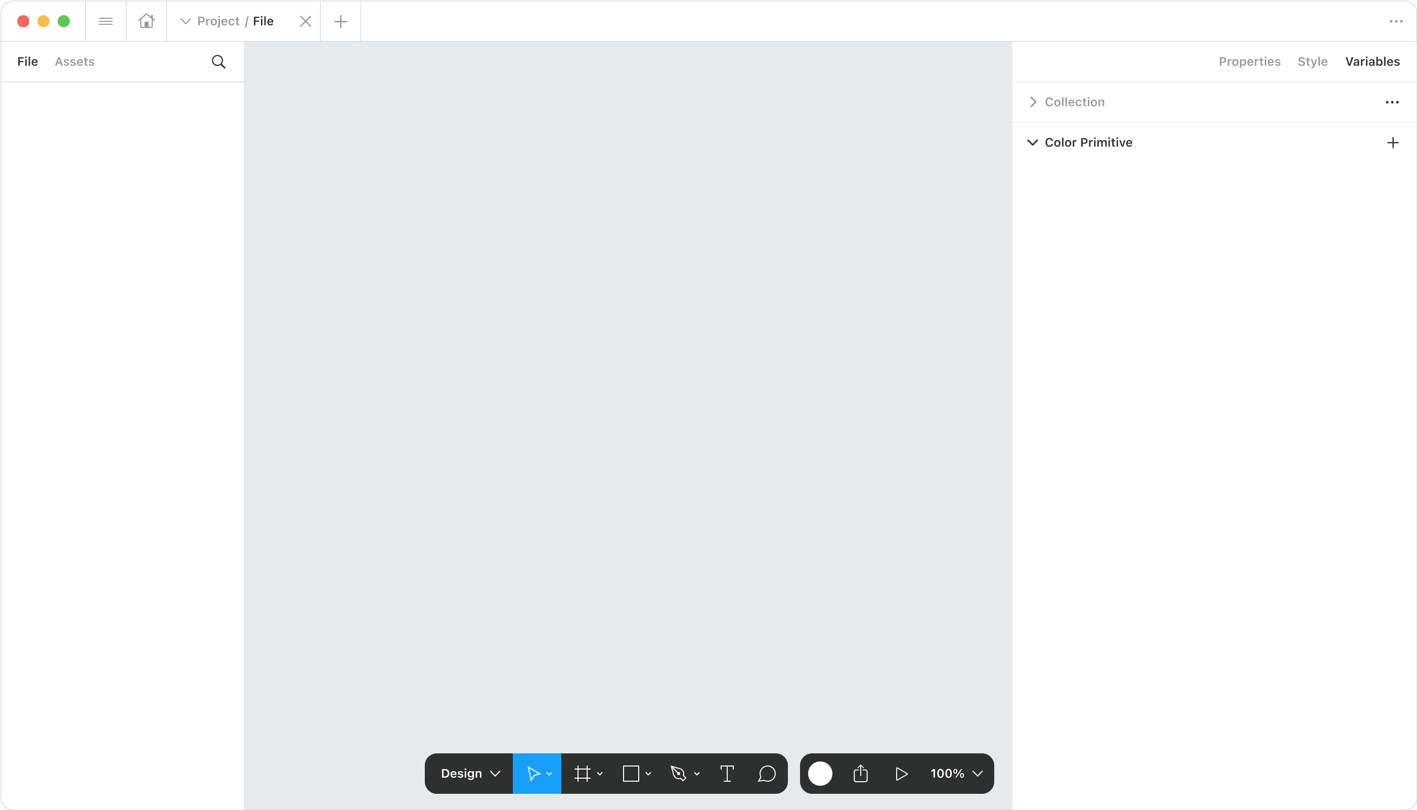
here is changes i made:
“Figma”(menu) button move to tab bar;
“user” “play” “share” button move to tool bar;
tool bar has 3 role, design, prototype, develop;
right panel has 3 tabs, properties, style, variable, they’re all properties;
when switch to variable, the panel will get a little bigger;
the structure of “collection list” and “variable list” is similar to “page” and “layer”.
Thanks!
- July 20, 2024
Figma have fantastic updates usually. The UI3 is much less efficient in general. For example setting constraints is something that you do quite often, having it hidden in a panel makes the whole experience feel laborious.
Having floating panels the interface doesn’t fade into the background, it stands out a little too much. I’m not sure if it’s the new UI or my computer but I experienced lots of lag.
- New Participant
- July 22, 2024
I would like to add my name to the thread about the new UI. i’ve been using it for the last 2-3 weeks now and yesterday i reverted to UI2 (thanks god that option exists).
Main reason - I just couldn’t find the “Switch frame from portrait to landscape” and i did look everywhere. i guess the designer forgot to add the icon to his design (oops 😉 )
But what i just mentioned was the straw that broke the camels back 🐪 , let me indulge you with some more of my honest opinion about the new UI:
-
Floating panels - Has been a popular topic and i will add my +1 to it. it is very distracting choice of design and my input to that will be that most of us deisgners design UI’s that look like those panels. so actually, Figma should look a little different than what is now “trendy” and “popular” so it will create a good contrast between “common” designs and the tool itself. FIgma - don’t follow the dribbble herd please.
-
Adding more clicks - A lot of the options that were “Exposed” are now hidden behind one or more extra clicks than it used to be in UI2. for example: Clipping options, The “Publish library updated/Update components from library” modal. now are more hidden and harder to find and adjust (my index finger is in worst condition thanks to you).
-
Attributes background - the greyish rounded corner you added behind every single attribute add so much uneeded clutter that it just makes everything very hard to quickly scan, find and read. please consider to revert or adjust this design.
-
File context and management - In UI2 the file name and actions used to be clear and on top. now it is quite hidden and unclear. please consider changing it back to where it was. the placement help me as a designer be clear what document im viewing at the moment and also control it better.
-
A very convenient short cut was the CMD+SHIFT+BACKSLASH, this shortcut used to hide only the layers/assets panel but keep the attributes panel visible. very useful since in Figma this view was sufficient and would allow more canvas to be visible without hurting productivity (i could still change attributes quickly) in the UI3 this action actually make bot panels, left and right to collapse. they will only show up once i hover on them and that interaction is very much confusing since there is no real difference now between CMD+DOT and the said shortcut
-
Another example for hiding useful actions: the Tidy up button placment in UI2 was exposed and that made sense, since it is a “high traffic” function, now it is very hidden and adds many more unnecessarily click to the user (me 😢 )
-
You have disabled the option to bulk “detach” components(!!!)
-
Maybe i got older, but now it seems like all the fonts are SUPER small. very unproductive.
What i do like:
- The re-arrangement of sections in the attributes panel is great and makes lot of sense.
- The new icon set - LOVE IT, great job
What I’m indifferent about:
- new placement of actions panel at the bottom
As a user and Figma hard-core fan, please take all these requests before and after me, as well as mine with some gravity. thank you!
- July 22, 2024
I got access to UI3 and immediately turned it off. The visual noise from the gap around the panels is extremely distracting. My canvas is usually gray which is helpful for seeing colors accurately and also easy on the eyes that stare at screens all day. Contrast between the darkmode black toolbars and canvas background is large and unpleasant. Please allow the panels to be docked.
Personally, I don’t like the very rounded corners of these floating panels either. They feel like big marshmallows stuck on my screen ‘helpfully’ pushing themselves forward to grab more attention than they should have. I want the chrome to be more quiet and supporting, background helpers.
- New Member
- July 23, 2024
I agree with the gaps being very distracting. Additionally, when I switch to the smaller screen, they steal precious space from my working space, which is already small. (with longer layer names, sometimes I need to expand it to, for example, hide it.)
Also, as for the position of the panel - I’m already so used to it on the top, with most of the programs having functions on the top, that I find reaching for it at the bottom bothersome. It’s not a mobile to have it closer to the thumb… so why such a decision? Was there any research backing it? User tests?
I switched to the old view
- July 23, 2024
The new UI is both “nice” visually" but terrible in terms or ergonomics. Everything has been hidden and moved somewhere else. Creating components, adding variants, knowing if a frame clips content, knowing if there is autolayout applied to a frame, and more, has become a pain, both in Light and Dark mode. There is a lack of contrast between UI elements. The toolbar has become useless because there’s no useful tool for me in there anymore! Oh, yes, it’s hidden in this menu that looks like it will open a plugin or content library!
I’m using Figma everyday, I play the piano, but somehow I’m okay clicking on buttons with a mouse to achieve the things I want to do, I’m not interested in learning 666+ key combinations to be able to work.
- July 23, 2024
Hi, I agree with most of the arguments above, but I still want to give the new UI a chance, to be sure which of my issues is due to unfamiliarity and whatnot.
There are however some things I haven’t seen mentioned that bother me quite a lot. I work a lot with components and now I feel bothered by all the extra clicks I have to do.
For example, if I make a component made by the same token (e.g. a squared made of different smaller squares) and I want to select just some of them to change them all to a different variant, even if they have everything set the same (aka the same variant of that token) I am now obliged to select them one by one or I cannot see the token properties. This isn’t very pleasant.
On top of me having to cherry-pick all the tokens 1 by 1, the properties are now nested in a toggle, which is another extra click. My wasted time has increased by 3 times basically.
I hope Figma will at least get back to the old interaction because I get that some more pixels for the canvas are nice to have, but my main interaction is on the panels and that is where I want the things to be quick because I often have to compare different designs, do quick changes and so on.
- July 23, 2024
You’re right Jeff. That’s what disappoint me the most with the new U.I. style. It highlights what you can interact with, but at the cost of having to squint to read the values or states. It is far less readable.
- New Participant
- July 23, 2024
Totally @Hugues_Peeters. You said it perfectly. It’s important to give context that for me personally, I have 20/20 vision and I am NOT a stickler for accessibility over functionality, but… I literally was squinting at the values as well. Definitely the number one thing that needs to be address IMO.
- July 23, 2024
Agree with almost everyone here. I was excited to see a refreshed UI for Figma. Visually it looks really nice. Nice for marketing assets, such as videos and so on.
But using it, goooooosh, it’s plain horrible. More than a week in and nothing feels intuitive. Still trying to find my fill, hug etc. Why are the constraints hidden behind a little icon and why does it open left from the sidebar? The toolbar at the bottom center sucks and is annoying. The gab from the rulers to the floating sidepanels is also annoying and distracting. Basically everything sucks from a usability perspective. Gonna revert back and hope they cancel UI3 and come up with a well tested UI4 for the next config.
- July 23, 2024
I guess there’s no need for me to repeat what has been said before. I’m on the same page with most of the issues people have pointed here.
What I want to say is that:
First, generally I dislike the UI3 update, I’ve used it for a few good days and I couldn’t no more, far too many changes, too much frustration. Some updates might be justified, others don’t make sense at all (hidden features/actions/functionalities, floating panels, toolbar bottom-centre gets too much attention and space, etc).
Second, I was hoping I’d see an evolution of UI2 instead of the UI3 revolution. The good changes in UI3 got lost between too many bad ones and too much frustration; with an evolution approach all these changes could have been spread over many updates, the UI polished slowly, and the frustration avoided. Everyone would have been happy!
- July 23, 2024
Totally feel you on the new Figma UI! Those gaps where panels can’t attach are such a hassle and do mess with your design flow. And yeah, the toolbar at the bottom can be a pain, especially if it blends with your design. It’s like they’re catering to newbies with the toolbar shift, but for power users like us, it’s a step backward. Fingers crossed they tweak it in the next update!
- New Participant
- July 23, 2024
Sorry Figma team, but UI3 sucks… I agree with all the points above 😦 I hope you will keep “switch to previous UI” button
- Active Member
- July 24, 2024
Yeah, that’s one of my my main issues with it.
As far as I understand they wanted to align it more with FigJam (and Slides), but they really misunderstood their users/customer base.
- FigJam is a tool catering to POs/Managers/Business Analysts/UX Researchers/(So, mainly non-designers)
- Slides is a tool for POs/Managers/Business Analysts and makes Designers happy because they won’t have to use Powerpoint. 😉
- But Figma is a professional tool for (UI/UX) designers, with tools for handing off designs to devs and for Management/Other colleagues to comment and follow progress.
The whole UI3 redesign feels like someone decided that the floating bottom bar was the most important thing and everything else would have to adjust to that. But FigJam (still) has a top bar with the filename, the F menu, etc.
I had to switch back to UI2 because I have deliverables to hand over, with a deadline, and I was hunting for basic features.
- New Member
- July 24, 2024
People don’t like change, especially when it comes to workflow and UI. People also don’t forget.
- July 25, 2024
Hi mates! I unexpectedly got access to the beta version of the new UI Figma. After using it for several days in a row I want to share my thoughts on why it sucks.
First, let’s take a look at it.
The most obvious changes:
1. Side panels have been redesigned. They no longer stick to the edges of the screen.
2. The top control panel has been partially moved down.
3. The design system has been updated.
I want to start with the main feeling of it before focusing on the details. I lost the sense that Figma is a program for designers. The lightness inherent in the words “design”, and “art” has gone somewhere. The feeling that anyone can learn this program easily has gone away.
Now it looks like a program for engineers and developers. Boring, heavy, tedious, and uninteresting. All these new endless strokes and contrasting backgrounds on inputs are similar to the well-known services for assembling business card sites, after which returning to Figma, for me personally, was a breath of fresh air. Because Figma is a creative environment, not an engineering one.
What bad exactly in the last changes?
1. Side panels have been redesigned. They no longer stick to the edges of the screen.
Due to this, focus on the work area was lost. There is no feeling of immersion in the project. The project you are doing is the main thing, and the side panels are secondary. Now they are perceived as part of my project. This feeling is especially enhanced when working with a dark theme.
2. The top control panel has been partially moved down.
This is a total shock. For two reasons.
The first reason is that:
All design books and design classics teach us designers that the human eye reads information from left to right (in Western culture), from top to bottom. Now Figma has decided that the key actions should be at the bottom…
Yes, I rarely press these buttons because I use hotkeys. But I see a lot of beginners and people who are not professional designers clicking there to create a rectangle.
In the previous UI, all available actions are in one place, on one line at the top. If you need something, you know where to look for it. Everything is conveniently organized. In the new UI, everything is scattered across different parts of the screen: Creating objects from below, there are also plugins (there is a separate topic about the panel with them), and the dev mod. But share the project, previews, and active users are at the top, and on the panel, which is dedicated to managing the selected object.
The second reason is not less trash, but probably even greater.
Now the available actions with selected objects are located not at the top in the center with large icons, but in the panel on the right, in the second row, with micro-icons of size 24. This was almost the key feature that helped newcomers adapt to Figma. No wonder it was located at the top and center.
It’s so cool when you select an object and see how the list of available basic actions with it changes! In the center, large. There was nothing like this anywhere except Figma. Now this won’t happen in Figma either, because it doesn’t work well with the fancy menu at the bottom.
Hmmm, what to choose a convenient functionality or a fashionable menu to collect likes for Behance?? The question is rhetorical. The answer is clear.
Other points:
Plugins.
Am I the only one who uses them all the time? Why do you need to make a lot of clicks every time to launch something? But the useless console, which I use at most once every 3 days, opens with one click. Yes, of course, there will be AI, but it doesn’t have to be placed specifically in the console, right? 🙂
Assets.
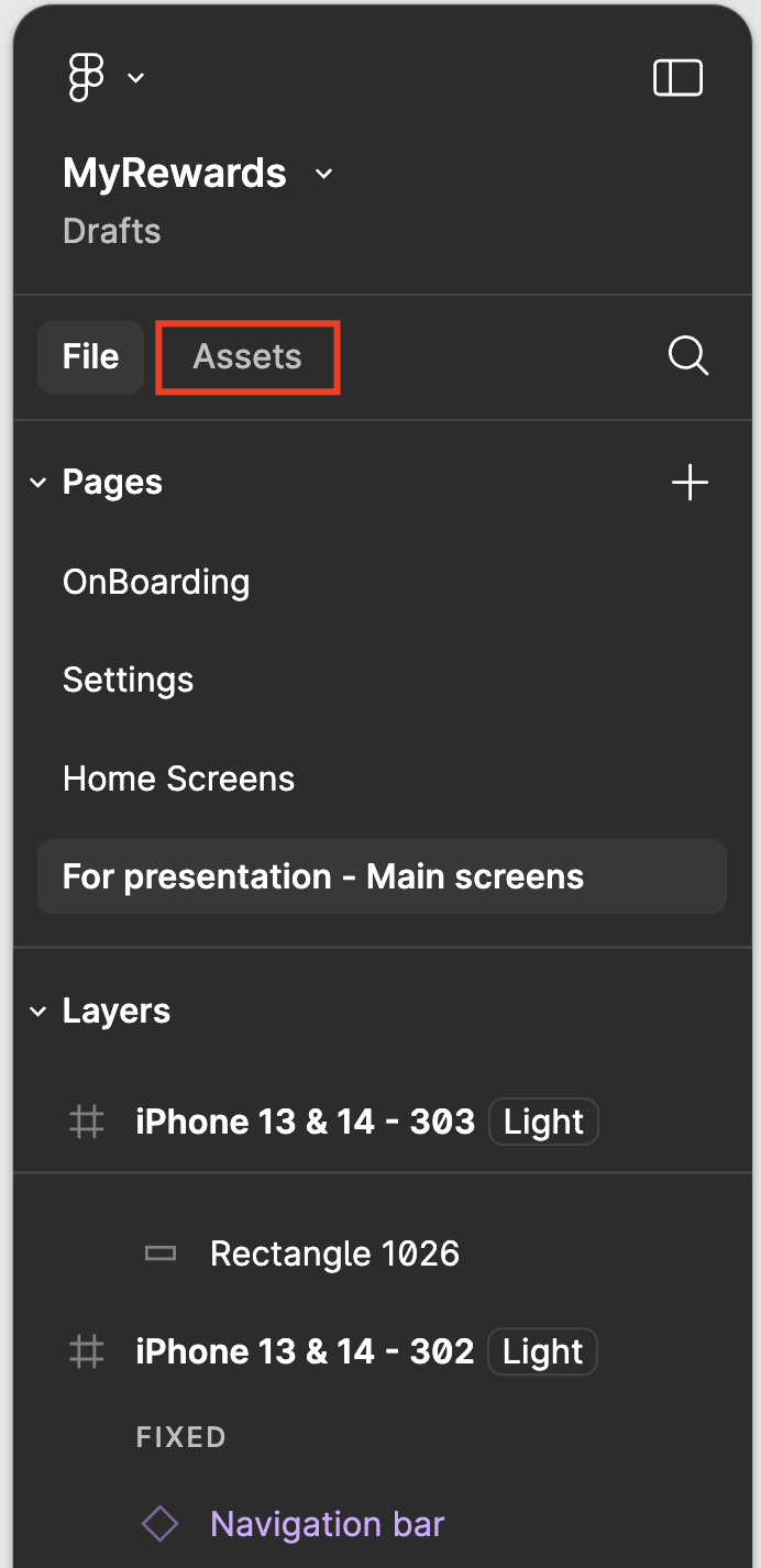
As before, assets from the library can be added from two places. Let’s finally decide on one. I vote for the sidebar. (Assets panel 2 on picture)
List of pages.
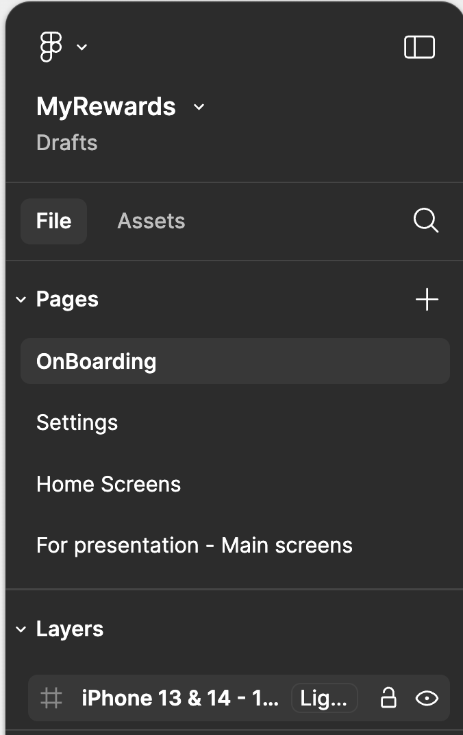
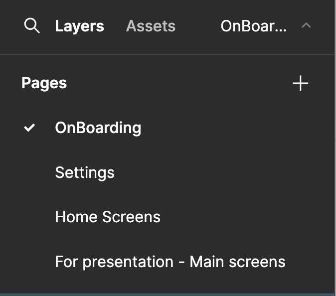
In the new design system, the section heading and the active element are on the same level and written in the same font. Which makes it hard to see what page I’m on. Even if this happens for a split second in my head, it doesn’t happen in the old UI.
Sorry for the Figma team 🙃
- New Participant
- July 25, 2024
I also find it a little more difficult to eye-scan the properties panel, not only due to the reorganization of options but also because of the input backgrounds and additional outlines around elements. However, I believe this perception may vary from person to person.
- July 26, 2024
It’s really terrible. I’ve been using Figma for 5 year straight and they somehow managed to ruin Figma simplicity.
- July 26, 2024
I agree, I preferred the older UI not only for the lack of being able to reoganize and snap things to the sides, but because a lot of things moved out of sight and take precious minutes to find- even when I know they have moved, my brain is struggling with the lack fo visibility on many tools, which have been nested into tiny areas. I would rather be able to collapse things I don’t need than have everything collapsed and not expandable to be always visible. (for example, the masking button, and things like Union, Subtract, etc boolean states.)
Please consider reverting to the older thinking of having everything easily accessible. I know the hot new trend is to have things as minimalist as possible but it hurts usability and accessibility, imo.
- Power Member
- July 28, 2024
There is already a lot of necessary commentary here that is critical of the new UI so I won’t repeat much. But I agree, as it’s inefficient, cumbersome, and completely antithetical to getting work done (plus the irony of “Clearing the stage for your work” when it is literally on top of the work). These changes must not go though (or let us disable it indefintiely).
- July 29, 2024
Figma, I beg you to listen and fix the issues detailed in this thread before forcing everybody to use the new UI.
- Active Member
- July 29, 2024
Figma really should listen to all this honest feedback.
I think they rushed it to get it (at least visually) ready for Config 2024.
But UI3 is simply not good, not well tested, not crafted with proper UX of actual users in mind. And it should be the absolute basic UX 1x1 that you simply don’t hide important information or actions from users and require them more clicks especially for labor intensive tasks.
I’m honestly flabbergasted that Figma did so many things wrong here.
Hiding width and height values, hiding Clip Content Checkbox, readability problems / color contrast issues, moving the toolbar to the bottom (why???), inefficient real estate with unnecessary paddings of panels, no dockable panels, … just to name a few that have already been mentioned here.
Did they focus too much on the visual presentation for Config?
I really hope they rework this based on the user feedback.
Please take your time Figma and let us reuse UI2 until then.
Enter your E-mail address. We'll send you an e-mail with instructions to reset your password.
Scanning file for viruses.
Sorry, we're still checking this file's contents to make sure it's safe to download. Please try again in a few minutes.
OKThis file cannot be downloaded
Sorry, our virus scanner detected that this file isn't safe to download.
OK

