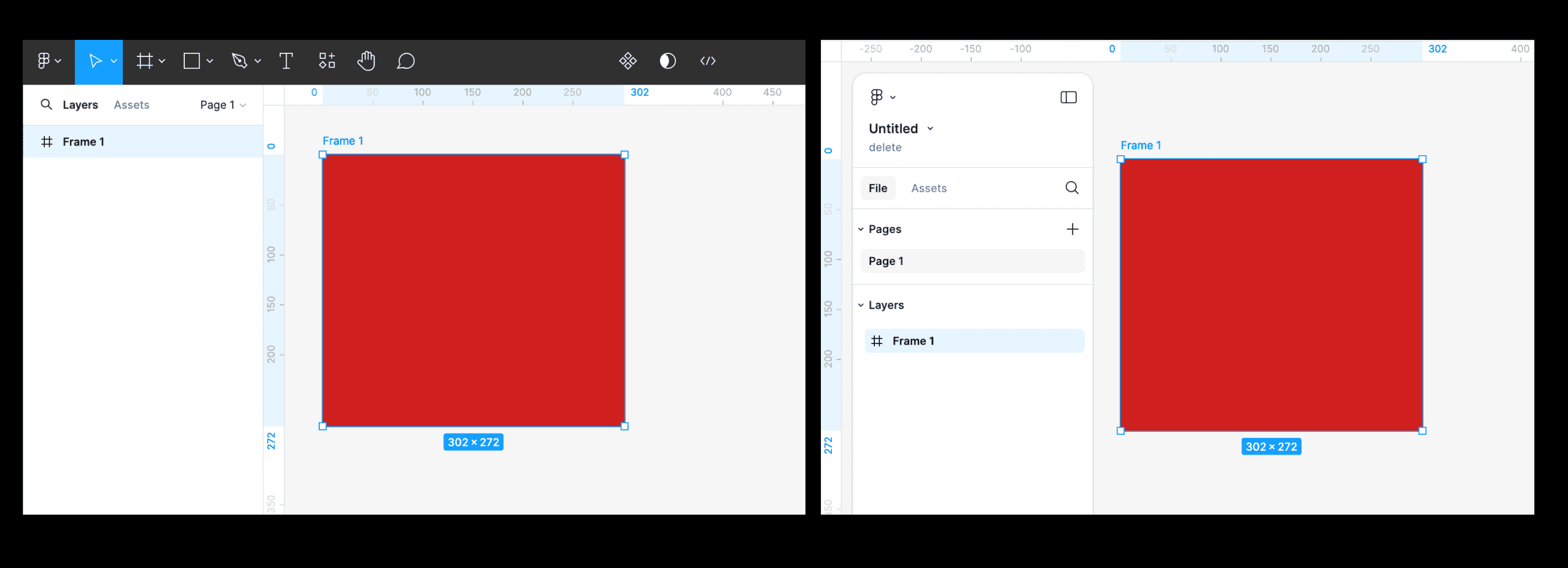
- What I can’t stand the most is that the panels of the new UI can’t be attached to the edges. They leave some gaps, wasting the space to display the main design and operation area. And visually, these gaps are also distracting my attention.
- The toolbar at the bottom also interferes with the main operation space, especially if its color is the same as my design draft. By the way, is it just for the convenience of novices to move it from the top to the bottom? If someone who uses Figma more frequently, he will use shortcuts instead of mouse clicks to trigger these functions.
So I hope that adjustments can be made in time in the official version of UI3, otherwise these redesign will seem like a subjective conjecture of someone who doesn’t use Figma much.
UI3 Feedback
- July 3, 2024
- 426 replies
- 9637 views
- New Member
426 replies
- Community Support
- July 18, 2024
A post was merged into an existing topic: UI3 : Make Clip Content a checkbox again
- July 19, 2024
I would like to add that with the new UI3.
-
Blend modes: You are hiding quite important features like blend modes. I really liked that it was more visible, as I use blend modes a lot to diversify and improve my experiences.
-
Interface Customisability: I guess we are the test subjects, but overall, what I miss is customisability in the interface – similar to what Adobe has in their tools. Where you can set up the structure of your interface to match your workflow and needs. To me, the new UI seems to match people who might only work on laptops, but I believe that most would be having Figma on a 27-inch screen or like and only do quick edits on a laptop if they are about to do a presentation and see a mistake somewhere. So please, work more on a customisable interface and maybe lock the interface on laptops and free them up on larger screens – or something like that. Also, as mentioned earlier, it would be amazing if you could separate pages from layers and have two columns instead of one. Generally, just allow customizability. I know that it is harsh to live with Adobe in the Figma world, but If Adobe did one thing right in their software then it is allowing users to customise the interface to match the needs of your workflow.
-
Height/Weight + Typography shaping settings: It is really annoying that you have moved the width and height. They look misplaced, so please reverse the layout area, get the height and width back above X/Y, and move the shape settings for typography back to the typography area. It’s a bit of a weird move.
-
Interface look’n’feel: Most importantly, users should be allowed to have the sidebars sticky to the side or floating as they are. Some might like this new style, but it really annoys me to the core.
- New Participant
- July 19, 2024
After finally getting to design in UI3, I’m struggling to find a standout I like about this new UI, unfortunately. I share pretty much every critical sentiment that others have expressed thusfar, but here’s my personal feedback shortlist:
- Floating panels Like many others, I would love an option to have the floating gaplessly dock (or better yet just reverted) so they function as they did in UI2. I wanted to give UI3 floating panels the benefit of the doubt, but I find they make the UI more cluttered, draw more attention to themselves, and take up more space while somehow making the text even smaller. I’m also going to just call out this ruler view: One of these UX’s makes more sense.
-
Clip content. Would love to see this change back to a single click behavior instead of the 2 click drop down (or you could even do a single click toggle).
-
Lack of contrast in the UI in light mode - If nothing else, this should be addressed. This is mainly an issue in the right side panel. I am not against grey on grey, but as someone who stares at this tool all day, it’s harder on the eyes to read property values in UI3 over UI2 in light mode. I’d recommend changing all grey fills on the fields to white with grey strokes for light mode:
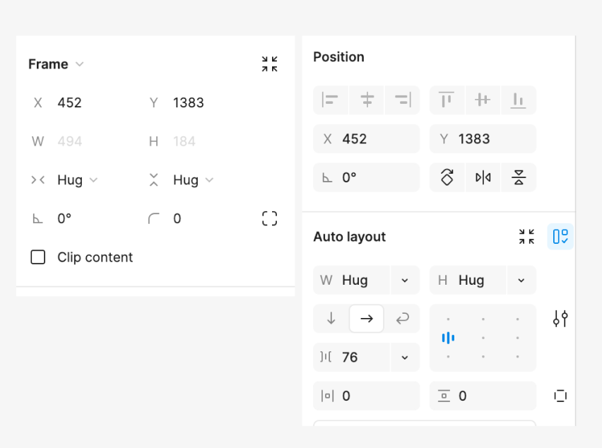
- hidden auto layout values. In UI2 I was able to, at a glance, see my pixel dimensions. I now have to mouse over the properties in the W/H boxes to see what my dimensions are. What was once a “no-mouse” action, now requires me to make two individual precise mouse-over movements, remember one field value at a time, returning to the mouse over in case I forget while trying to re-enter values. Also, This is such a small field that the cursor itself is enough to cover-up the information upon mouse-over. This one has no easy design-fix I can imagine. I simply prefer UI2 on this one. The new org of X/Y separate from W/H is nice, but I’d absolutely take being about to see my W/H values in auto layout over that separation:
- The new gradient icon this is a real nitpick but the designer in me can’t help myself. I can get used to this because the muscle memory is the same… but… one of these gradient icons makes more sense than the other…
- Lastly, one positive piece of feedback: I really like how this beta allows us to toggle instantaneously between UI2 and UI3. Serious kudos to Figma team in this execution. It makes comparing/learning this new/old interface soooo much easier and is hands down my favorite thing about this roll-out.
That brings me to my final piece of feedback: I would love if Figma made a “legacy UI2 mode” available (similar to how adobe allows for “use legacy menu” toggles on certain functions). Obviously I can see this being problematic to maintain in the longterm, but I’ll personally be rolling back to UI2 for as long as possible and would love to continue to do so if some of the issues on UI3 aren’t addressed. Happy to elaborate on any feedback. Thanks for taking the time to review.
- July 19, 2024
I was going to tell this… im also like when UI getting newer look but this time its really hard to find tools and icons also. and mostly i dont like bottom toolbar at least if you guys using that floating tool bars give user to freedom to move it. Because im using bigger screen for UI work and i keep my inspiration and research work in upper section of screen and working on bottom … now we have toolbar on bottom thats too distracting and tis even floating … so its really annoying to work like that 8 hours on office work 😅
I was going through new UI but ultimately revert back to previous. Please if you are changing UI do it slowly like step by step versions … i really like what you did in dev mood introducing toggle … …thats a step by step change
- July 19, 2024
I’m struggling with all the problems other users pointed out already. It looks like redesign was done by someone who never used Figma before… To make so many visual clutter on DESIGN app is just unacceptable.
!!! Please let me hide this bottom toolbar. I’ve never used them and I’m not planning to do so. Shortcuts for the win. So, let me hide this toolbar!
- July 19, 2024
The presence of too many boxes feels overwhelming and looks rather like an old-school UI. The lack of edge-to-edge connection is confusing and gives a missing feeling, reducing various differentiation factors.
I would any day prefer the old UI over this new one.
- July 19, 2024
I honestly hate the new UI. The floating panels look good but offer nothing beyond that, and the gap between the panels and the window is terribly distracting, not to mention it takes up a lot of space from the canvas, especially on smaller screens (e.g., laptops).
I hate that the toolbar doesn’t use the previous context-based appearance. What used to be solvable with 1 click now often takes 3-5 clicks because everything is hidden behind fcking dropdowns, which I can’t understand. Instead of progressing with my work, I waste a lot of time trying to find the command I’m looking for.
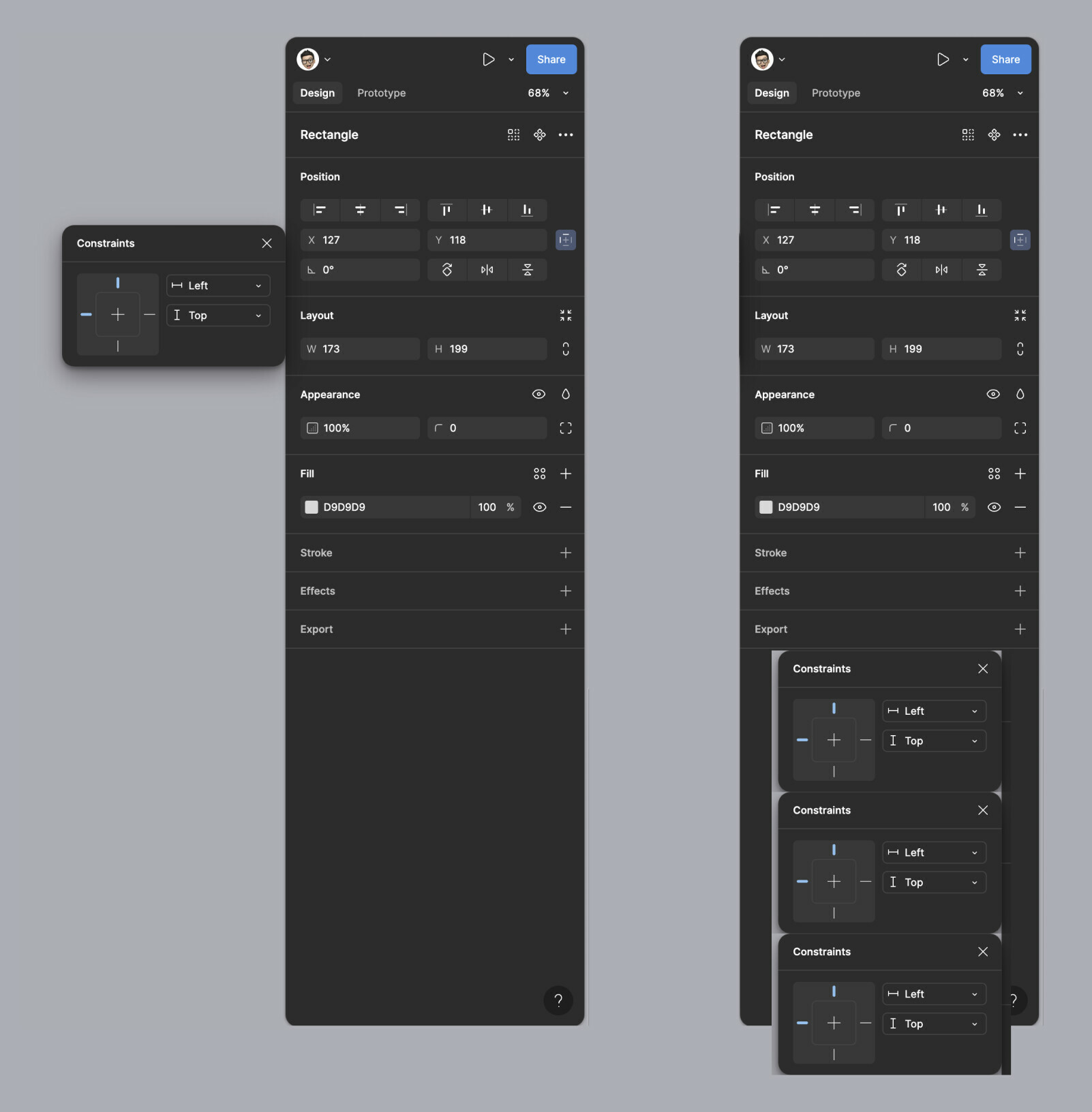
Even the most frequently used commands are hidden behind dropdowns, WHY?!?!? Not to mention that the icon sizes also feel much smaller, and I have to hunt around to find many functions (e.g., constraints).
I simply don’t understand why these changes were necessary. There was no problem with the previous UI, why ‘fix’ something that works perfectly? Not to mention, from a UX perspective, it feels like it was designed by a junior designer (or maybe it was AI? It generates similarly unusable UIs).
- July 19, 2024
Instead of wasting time redesigning something that worked perfectly, why not address real issues? I would like to have a better prototyping experience and a better variables panel.
And rather than introducing an AI, which, in my opinion, is very awful at generating designs, why not add functions to turn it into an assistant that can help me execute tedious and repetitive tasks faster, such as generating tokens, styles, component variants, or states? This year’s improvements do not bring anything useful to Figma rather, they remove features that were already perfect.
- July 19, 2024
- July 19, 2024
I just got the new UI3 and in the old UI it was possible to open all folders at once, which made it easier to build screens with assets from different subfolders. Now I have to click into each folder, go back, open the next one etc. which just creates more clicks during work than before. Could we have the collapsable list back to see all opened folders at once?
- New Member
- July 19, 2024
Dear Figma,
You’ve forgotten a cardinal rule of product development. Just because you are bored of looking at the product, it doesn’t mean your users are.
Unless there is something coming down the pipe that warrants these changes, this is a triumph of form over function. I’m all for flatenning the learning curve, as you chase that larger TAM, but this is a professional tool (not consumer or prosumer) whose sex appeal comes from empowering us. Some of these changes make a lot of sense but giving us all RSI for the sake of a cleaner aesthetic is not the way.
- Dock the floating panels for all of the reasons mentioned already.
- Increase the grey on grey contrast. And dark on dark contrast. The need to be discrete becomes less of a problem if there is cognitive separation between the work and tool. See point 1.
- Unhide the ‘goto master component’ command. This is a navigation point that makes jumping in and out of libraries easy.
- Return to instance dialogue disappears on my light interface. Maybe make it Figma purple.
- A dropdown for Clip content? Seriously?
JR
- New Participant
- July 19, 2024
For what it’s worth,
I am currently learning UI/UX design, and from everything I’ve learned so far, I do not understand most of these changes.
This all seems pretty obvious to me:
- Make the panels hug the window left and right: this maximizes the available space - the space around the floating panels are just wasted space anyhow.
- Put the scrollbars in the area that actually scrolls. I mean, sorry, but this just seems painfully obvious.
- Put the rulers in the content area where they’re needed. I don’t really think I need to explain this one either.
Like so:
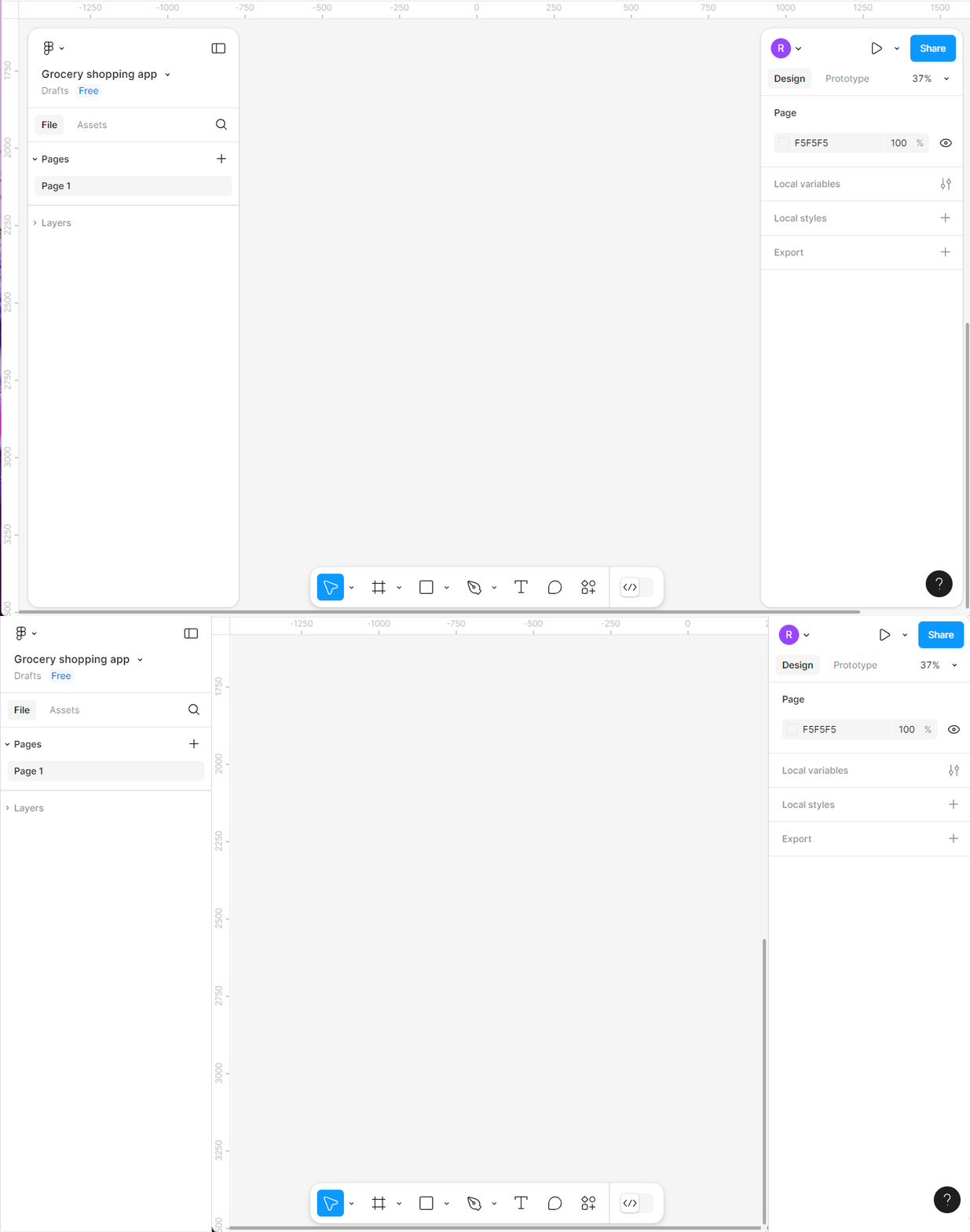
The scrollbars are rulers aren’t even useful where they are now. Such an odd design choice - how do you even explain that one? Yeah, the floating panels look cool and new, but Figma is not a toy.
It seems like you wanted a refresh and something that feels new, at all cost, but you’re making some serious design compromises here.
As others have commented, I also find the floating toolbar a bit distracting. I feel less strongly about this change, and I understand if you were actually trying to free up vertical real estate by making it float. I don’t know, I guess I could go either way on this one.
With design changes like these, there are bound to be people who like them, and people who don’t. But you’re a design tool, used by designers - we’re going to be more opinionated about these things because our job is to understand and care about details like these.
I would strongly suggest you offer at least an option to at least dock the panels and put the scrollbars and rulers back where they’re needed - or just change it entirely. It isn’t really a change that makes any sense from a UI/UX perspective, is it?
- July 19, 2024
Hey Figma,
I really like when UI getting newer look coz working on same UI months … 8 hours daily kind a gets board. but this time its really hard to find tools and icons also. and mostly i dont like bottom toolbar at least if you guys using that floating tool bars give user to freedom to move it. Because im using bigger screen for UI work and i keep my inspiration and UX research work in upper section of screen and working on bottom … now we have toolbar on bottom thats too distracting and its even floating and i can see my artboard white color in that small edge … and its really annoying to work like that 8 hours on office work 😅
I was going through new UI but ultimately revert back to previous. Please if you are changing UI do it slowly like step by step versions … i really like what you did in dev mood introducing toggle … …thats a step by step change
- New Participant
- July 19, 2024
Hello, long time user here, I got UI3 this morning.
Here’s my feedback.
- it should be possible to reposition and also hide the action bar (for those users who use shortcuts IE everyone)
- it should be possible to change the style of the side panels so they’re not floating (the ruler is terrible otherwise, plus if feels like wasted space atm, and visually distracting)
- the UI should be more flexible, as in it should be possible to pick what to show and what to hide in the design panel (IE I suspect a lot of users would want constrains to be always visible)
since I’m here, a bit of feedback that doesn’t relate to UI3 specifically:
- it should be possible to detach and move the local variables panel out of the app (I have to open the file twice to achieve this atm, one with the app and one on web)
I would have liked to keep updating this post with more feedback but I cannot work with UI3 anymore already.
The main reason why I am switching back to the old UI is the action bar and also the floating panels.
Good UI should be invisible. This UI is in the way.
- July 19, 2024
I think they don’t need to fix anything. Just forget the new UI completely and revert back to the old one. Seriously.
- July 19, 2024
Sorry to say I hate everything about the new UI. I want my tools at the top and my side-panels on the sides. Please never show me that UI again, as in never ever.
- Active Member
- July 19, 2024
Please never remove old UI. Unless UI3 doesn’t get a whole new makeover that doesn’t do unnecessary things, but improves what is needed. Just knowing that at some point Figma will remove old UI and make the “new” one as the only one, is really scary.
It’s not about getting used to things, but that the new UI hides stuff and makes a lot of things less reachable. And although, it says that new UI improves space, it’s in fact the contrary. Just make screenshots and draw rulers and you’ll see.
- July 19, 2024
To add to what was already mentioned here:
-
the UI should be created to meet the acceptance criteria of the user experience that we need to get our work done efficiently. A “condensed” or “pretty” UI does not necessarily achieve this in many cases.
-
I also feel that the space around the floating toolbars distracts me (not just the gaps, but also the negative space that the overly rounded corners create. There is a fine balance between not being distracted by sharp corners and the same thing happening in the negative space.
-
the fact that the toolbars are floating brings them up in the visual hierarchy, and I find myself staring at them rather than focusing on the actual UI that I should be working on.
- July 19, 2024
What was the reason for removing the fill from the arrows on the Move tool? I work on a regular HD monitor (this is the main resolution of the target audience of our product), and the pointer is of course small and not sharp, and now I am constantly confused whether I have the Move or Scale tool enabled
- Active Member
- July 19, 2024
Unless the floating panels and the panel positions/regrouping are the first step to detachable panel segments (a la Photoshop style), this update would probably get a C- from a UX course.
I do not know how Figma did their UX research for this change (no one asked me as a user, for example 🙂 ), but it seems they missed the fundamental rule of “you are not your users.”
Of course, this may be an availability heuristic issue on my side or a false consensus effect, but it seems that once you get past the mist of “influencer cheerleaders,” the actual users are not that thrilled.
I mean, instead of all these weird updates, I would have expected:
- A table component creator
- Color accent generator
- Dynamic input fields
- Multiple actions per trigger
- Better variables pricing
- Properly working nested variables
- Flow chart connection interaction to connect frames without using 3rd party plugins
etc. Like, things actual product designers need to use everyday to create their products in commercial environments.
- New Participant
- July 19, 2024
Firstly, I want to appreciate the Figma product team for their amazing work on the new UI3, which brings a fresh and improved feel to the design experience.
Below are few issues I’ve noticed about the new design so far:
- User Preference for Toolbar Position: Not every user would appreciate the new toolbar position. To improve user satisfaction, allow users to decide if they want the toolbar at the top or bottom of the screen. Many users may find the bottom position distracting, and having it at the top is more intuitive, especially since minimized panels are displayed as pills at the top of the screen.
- Adjust Values with Mouse Wheel: Provide an option to use just the mouse wheel to adjust values in the number field without holding the Alt key. This would streamline the user experience and make value adjustments more efficient.
- Search Icon for Layers: Add a search icon on the trailing side of the layers title to enable users to search for layers by name easily. This feature would enhance navigation and improve productivity.
- Visibility of Section Titles in FigJam: In FigJam, section titles are hidden behind the floating pills when zoomed to fullscreen. Please adjust so that all elements on the board are displayed underneath and above the surrounding UI.
- Ruler Guide Functionality: The ruler guide functionality in UI3 is problematic because it shifts the surrounding Figma UI from their fixed positions and doesn’t display a drag cursor when users hover over the rulers. Improving this feature would enhance usability.
- Auto Layout Symbol: Please consider reverting to the previous auto layout symbol. It was simpler and easier to identify.
I’ll be sharing more feedback in the future.
- July 20, 2024
In my organization, with about 30(licences) seats we are thinking of switching to Sketch. Figma UI is a bit childish and distracting, moved the toolbar (In 90% of cases we work on vertical designs from top to bottom, so why you’ve taken away the area from the bottom? It’s UX 101…, margins of the panels and the overall tendency to rounded corners (what is behind this?). It seems like you do not fully understand how efficient UI/UX design tools should be, we don’t need animations in the menus (no point) - you lost your own principles from the PAST!.
Many people are a bit concerned that you are moving from a UI tool to something like more “office” app, miro or similar.
IMO UI3 is a step backwards and you are not focusing on being more professional but more attractive, the trade-off is usability which is something that we can’ agree on.
On the other hand, I don’t know who is in charge of the UX and how the team is structured but, maybe try some good old design thinking approach?. Have you tested anything at all before the release?
Also, I won’t agree that Old UI was broken - and if wasn’t broken why…?
- July 20, 2024
The following new UI is not my cup of tea, so much changed, and am having much trouble navigating now, I understand with the rounded corners and everything, but it feels off putting.
- July 20, 2024
I think the problem is that they (Figma) have some young designers and they were excited to make things “flashy” “dribble” “apple” and “cool” I think this is exactly how UX should be never done. IMO it’s some kind of generational shift in design with early gen-z or late millennials - doing cool things.
and I agree with the comment above just turn it off this UI3 is shovelware to the bin IMO
Enter your E-mail address. We'll send you an e-mail with instructions to reset your password.
Scanning file for viruses.
Sorry, we're still checking this file's contents to make sure it's safe to download. Please try again in a few minutes.
OKThis file cannot be downloaded
Sorry, our virus scanner detected that this file isn't safe to download.
OK

