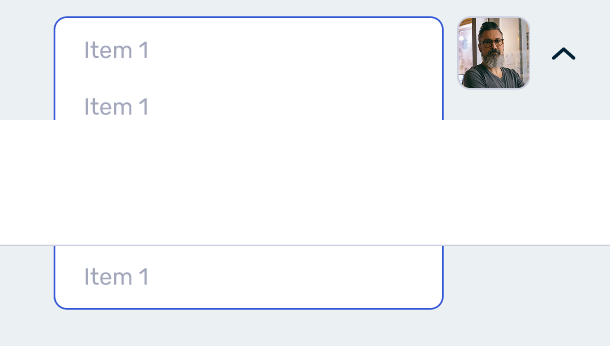
Currently there is a huge limitation in prototyping possibilities because any dropdown menus appear underneath the following element in the autolayout flow.
I can’t remove autolayout because it would break designs across all useage of design system components and we can’t properly demo prototypes. Anchored by the lack of a customizable z-index property.
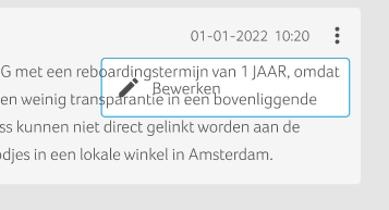
Especially when working with auto-layout, positioning elements become so hard because the z-index is tied to the layer order in a way that is impossible to change the z-index without breaking the whole layout (or opting-out of auto-layout completely).
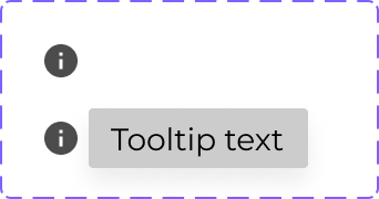
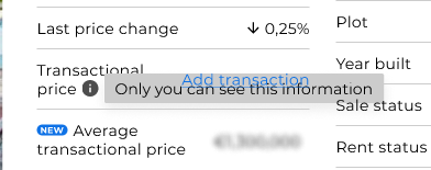
This is a problem mainly with interactive components that have a “pop-up” or something that should appear on top of every other layer, the best example is tooltips!
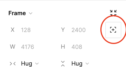
My suggestion is to solve this as we would solve with CSS, creating a z-index controller that would be set to Auto as default, and if we want we can type any value to force the z-index:
Explicit Z-index property has its pros and cons. For a start, it is going to be a mess. Even more a mess if you are using libraries. It is just too easy to abuse. I know same problem exists in CSS, where you often spend hours trying to figure out why something is not in a place it is supposed to be. I would rather see some entirely different way to solve “pop-up” problem.
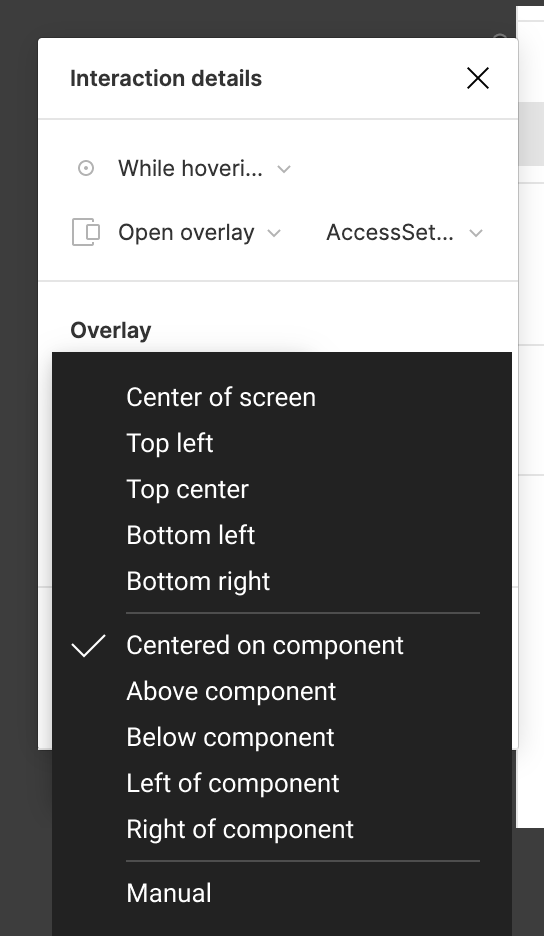
For example, ability to position overlay relative to interactive component that invokes it.
Here is my quick mockup:
I think this would help but won’t solve the problem.
For tooltips, for example, we wouldn’t be able to change the text for each tooltip without creating multiple frames outside our main frame. In this case, it would be best to have the button and the tooltip itself in the same component/frame and adjust the z-position manually.
I agree, this would also help for the workflow on my end.
In general having overlays is a problem when using auto layout. So I am always have to find a good combination of contraints with no autolayout and autolayout.
Especially when on hover the hovered element is bigger and maybe even overlapping with items on the left or right, setting the z-index would help a lot!
Currently I have to move these kind of hover-overlays out of the variants canvas to make it work via interaction “open overlay”. This adds again some confusion when it comes to a handoff (to Devs or other Designers). Because suddenly not all states can be found in the variant area.
I wrote a small plugin that can reverse the z-indexes in an auto-layout.
It makes use of a hack using flips and reordering that was mentioned in another thread so a native solution would definitely be preferred, but for the time being this should help when you really need it.
Hey, @James_Mitchell could you maybe rename this to something more descriptive? Like, ‘Reverse Autolayout Z-index’, for instance?
I can’t quite wrap my head around the fact that plugin names are so much out of the blue sometimes. Like, good luck finding some plugins after a few weeks of not using them, then recalling ‘Ah, there was this great plugin I need for that’ and then you stare at that list, completely lost…
@Matt_at_HAUD I’ll have a think. I chose Easy Z because typing ‘ez’ as a quick action returns it as first result, whereas ‘Rev…’ matches too many other things.
If I can’t think of a suitable name I can anyway add a label to the command to make it more searchable / clear.