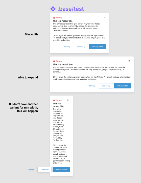
I would like to add a max-width to a text box while using auto layout to keep the word count per line at a reasonable minimum.
Currently, I have the text element set to “Fill Container” which makes the text respond very nicely to the screen size. But because it is set to “Fill Container”, the text spans the entire width of the element which makes the text lines more difficult for users to read quickly.
If a max-width was set, the component should respond until it reaches the max-width, which would help keep the line length down.
I also feel like there are many other circumstances where max and min-width would be extremely helpful
Anyone else having this issue? Or does anyone have a great fix/hack to get around it?
There is no workaround for setting max-width, this is impossible. But for min-width, you can put an invisible line (set opacity to 0%, don’t hide the object itself) inside of the auto-layout frame. This line will prevent the frame from shrinking too much when the text is smaller than the line. There is an example in my file Auto Layout Tips & Hacks:
You can also mimic the max-width for components and their elements. Unfortunately, it’s not an automated process — you should manually switch some preferences but it still saves some time.
Please check this file.
Adding multipliers to fill container would also be helpful, and would correspond well with flex box, so you can set 2 or 3 to continuously fill but with 1 at 2 or 3x the size of another.
It would get a bit confusing since that’s not exactly how flex works. The flex-grow setting determines how remaining available space is distributed, not how overall space is distributed. So the contents of one of the flex items can make it so a flex-grow: 2 item is not actually twice as big as a flex-grow: 1 item.
What we need is actual CSS in Figma, not these approximations of it that continue to confuse my developers in hand-off.
This would be very useful. Another use case would be localization: in some languages button labels may become much shorter when compared to English for example. In this case I’d want to set a min-width for the button component so that buttons don’t shrink too much. This is just one simple but rather common example.
Having access to min/max settings would be so nice. Many components in our design system have this in documentation, but not in the Figma library, and we can’t rely on people reading every last detail in the docs (unfortunately). Having this built in would also be huge for showing responsive behaviors across devices!
Right now if we want to set a min width and max width for a component we have to make 2 different variants and its kinda silly that you have to keep swapping the variants to make either use fixed width (for min width) and fill container for expanding the width.
For min-width, use the zero-height frame hack. For this frame, specify a fixed width such as 400px and place it in Auto Layout. And for max-width, just expand your Auto Layout horizontally so it becomes fixed in width.
I set the max-width manually in the Auto Layout properties, that is, I change from Hug content to Fixed width. Or, for example, you can add a component variant with a switch (max-width=true/false).
Yes, this is not ideal and I voted to add the min / max-width function, but unfortunately there is no other way to do it. In any case, the limitations should be described in the specification.
Would be great to be able to specify the max width of an element on resize. This would be helpful in auto layouts and when creating elements that can adapt to various screen sizes during design testing.