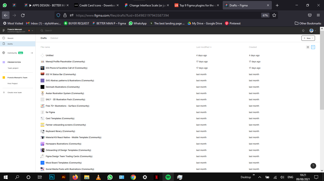
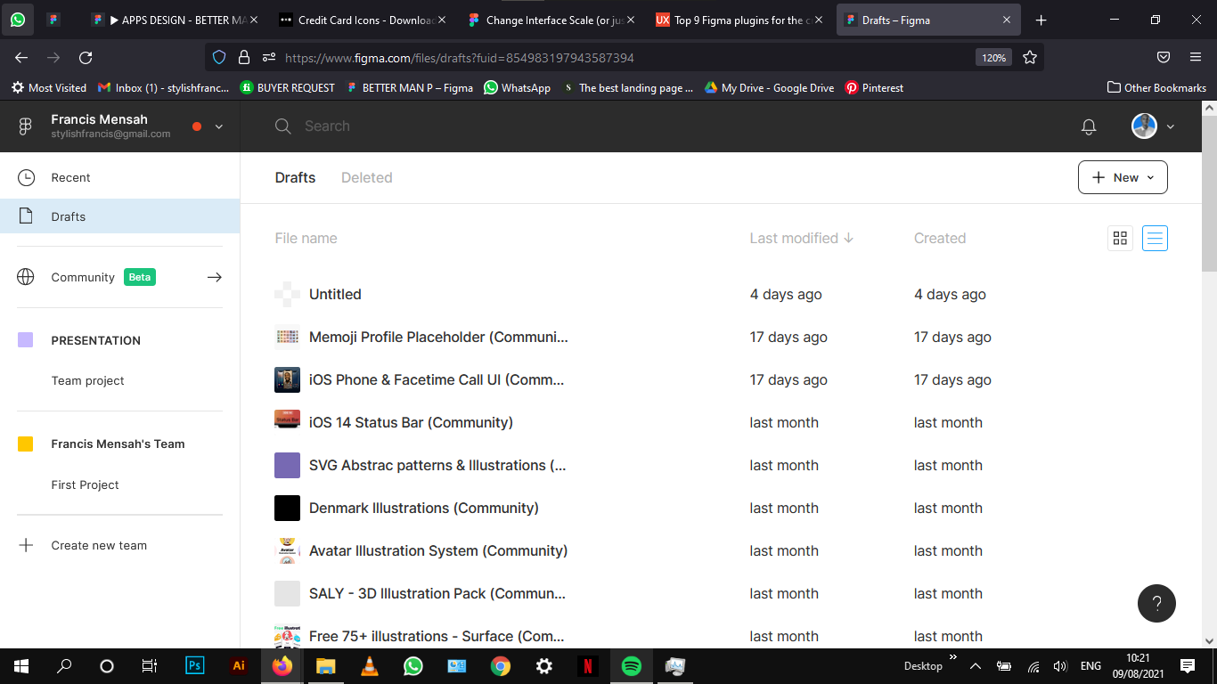
It always has bothered me that Figma’s general UI is slightly too tiny / has very small font sizes and I hoped that View>Interface Scale would solve this issue. Figma’s small font size and icon size make it quite difficult to navigate through the app without having hawk eyes. Sometimes elements (especially in Effects menu) are small click targets.
Scaling the Interface up seems like a good idea to counter this and improve readability and clickability.
Unfortunately at this rate, it’s not a real solution for me. It is pretty much useless to me since it also scales your designs / the canvas. I’d like to scale the UI (Sidebars, Top Bar) only and keep my design canvas untouched to remain at an actual 100% scale.
The current behaviour doesn’t make much sense to me. If I’m designing for example a screen at 1920px width I’d like to see an actual 1920px screen. My work depends on the canvas representing the pixels at 1:1 / @1x scale. Sure, a workaround could be to view the canvas in something else than 100% to counteract it visually – but let’s be honest: This is not the way.(Read this in mandalorian voice)
Maybe you could implement an option to adjust the scale of Figma’s UI not in terms of everything in general but instead just the font and icon sizes of menus (sidebars, plugins etc. you name it) which won’t affect the canvas itself.
Not sure if it’s relevant but I’m using the App in Firefox 86.0 (64bit) and native Desktop App 95.8 both on macOS 10.15.7. If the behaviour I described is a bug instead of a feature
This is more about how it’s implemented in the browser than someone specifically designing this feature this way: instead of adding a complex setting for changing the UI (CSS) somehow, they are using the default browser capabilities to scale the whole website. And I’ve seen some people who find it really helpful that it scales the canvas as well.
But your point is totally valid too, it would be nice to have this option, so feel free to edit your topic and move it to #product-ideas so other people can vote for your suggestion (maybe change the title to fit this category better too). I would suggest something like “Change Figma UI font scale”.
I am!! Doing the opposite but the same problem.
I want to Reduce the scale of sidebars / tool panels without scaling the canvas area (so I can have more canvas area).
The workaround of reduce/enlarge interface + view zooming actually has another very detrimental side effect → it messes up the antialiasing and text smoothing. On my mac the work around makes everything look horrendous (fuzzy and blurry edges) in the canvas. It brings tears to my eyes, in a bad way.
I am using the desktop app, so hopefully not confined to web browsers capability.
Just discovered this by myself. Thought that this is some bug that the 1000px width rectangle had 900px on the screenshot. Turn out interface scale affects image overall. Hope this bug will be fixed
@Dennis appreciate you sharing this feedback. While we may not be able to respond to all of the feedback and ideas posted here, we do read and take them into consideration.
For this one specifically we agree that there’s a lot of room for improvement when it comes to the accessibility of the interface and it’s something we’re exploring. At the moment we have a backlog of other improvements that are currently higher priority, but we’re always reexamining this to make sure we’re focusing on the right things.
Again, thank you (and everyone else in this thread) for the feedback!
Thank you for the response Josh.
I hope that this issue will bring enough attention to it so you guys can find a better solution.
Looking forward to be able to use a more accessible version of Figma with legible interface while not having to bother with incorrect measurements.
Yeah, font rendering is even worse on Windows (as it is always in comparison with Mac or Linux). Due to the small sizes fonts get rendered very blurry if you’re using a display with a device pixel ratio of 1. Users with retina screens / displays using more than 2 dpr probably don’t have that issue.
I don’t understand how that unfortunate artboard scaling is still not an issue of priority to the Figma team.
Exactly, font rendering should be the priority task for the Figma team as it directly impacts the design.
Currently I’ve moved back to XD again because I can’t show the fuzzy or blurry font designs to clients
I’m working on a project and jeez louise…boy is this type looking bad. I mean, really really bad… And I’m working on a team project for school that’s client facing and we have a presentation with a “real world client” Wednesday. I would switch to another app, but because I’m on a team, I can’t. Strangely enough, at 200% it’s at it’s sharpest-at 50% it’s almost unreadable. 100% looks like a bad xerox. We’re using screen shots of the current website and implementing small but meaningful changes – could it be the image size? BTW- my screen is a 2560x1440 PA272W NEC, and I’m on Safari…Mac 10.15.7 3GB graphics cards, not sure if that’s total or per (I have two).
At the beginning of my last project, I made the interface bigger and did not see that everything got bigger! I designed almost everything and now I have to change all the sizes… this is crazy!! Please give us the option to only change the UI without changing the design size! Sometimes I don’t understand how Figma could do such a mistakes!
Hello, i found a way to fix it, if you go to your home page and change the screen zoom there with control + on Pc and command + on mac, the interface font changes, then when you go back to your workspace, the interface font is as you increased it to be. see pictures for proof.