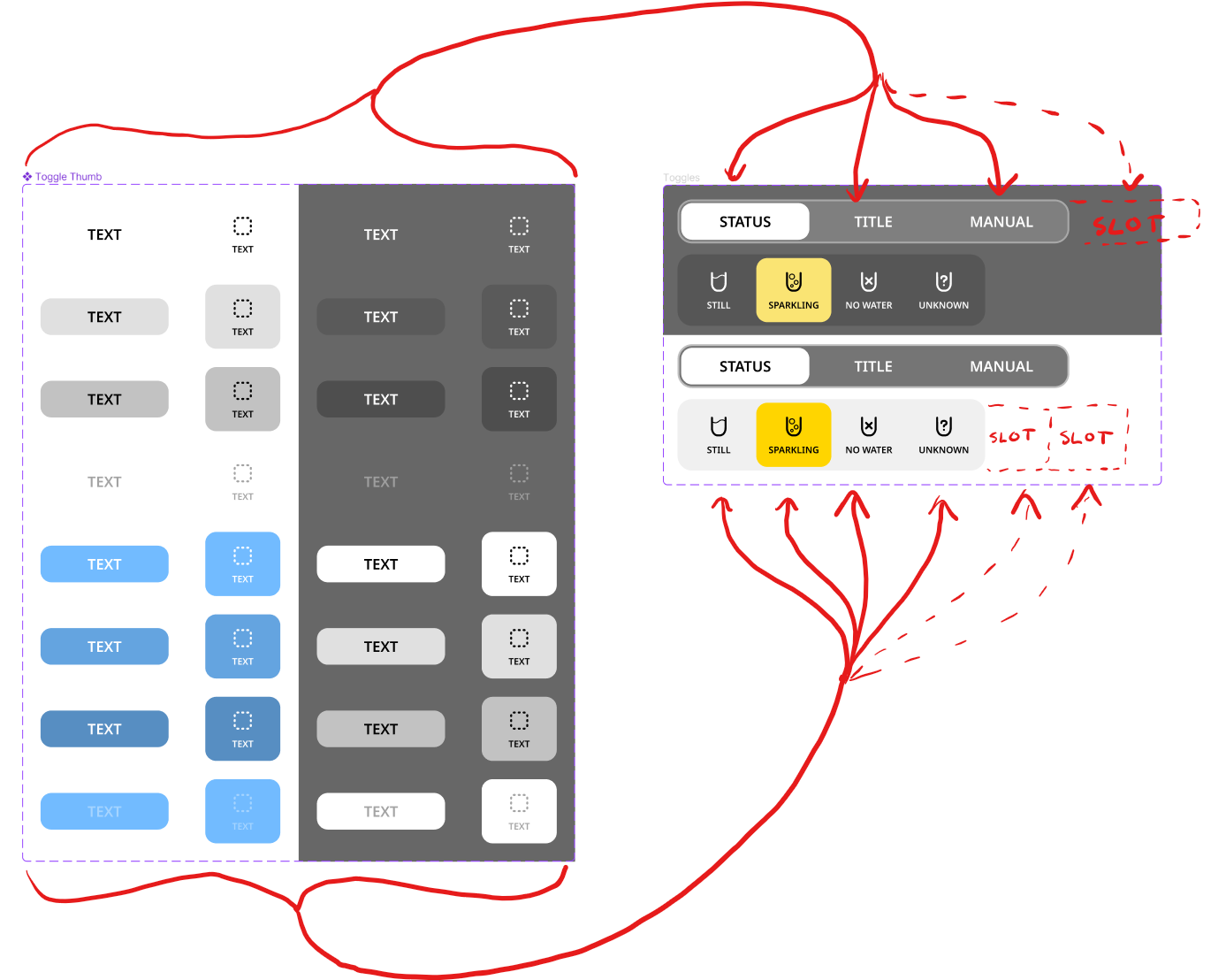
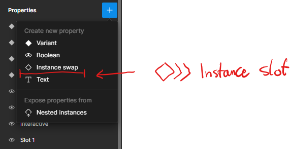
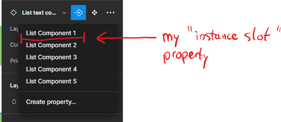
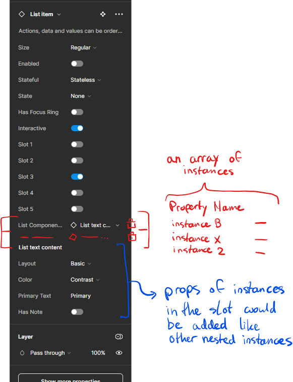
Every day I’m facing dilemmas regarding how to structure my components, because we lack this basic functionality. You have to improvise, make bunch of unnecessary, place-holder stuff, make components 10x more complex than they should be…
We really, REALLY need proper slots.
If front-end frameworks have this basic functionality, then Figma should have it as well, since it’s supposed to be a place where we design front-end.
HUGE +1 on this. We use modals fairly often in my company (for forms, not bombarding users) and it would be a HUGE improvement in maintaining modal style flexibility. Right now, we have to detach the instance every time we alter what’s in the modal and this means we lose the modal controls themselves (think labels, CTA toggles, Icon toggles, semantic feedback styles, etc). With slots, we could ensure that our modals remain consistent components while gaining the flexibility of adding unique content within.
We also need this as a native built-in feature. Currently, I ask designers to create a ‘local’ component that can be used to populate a slot. However, questions arise about where to store them. Also, when a designer wants to make an edit, they need to go back to the component instead of the instance. So, you get weird situations with a full section of local components next to the frames filled with the final designs. I bet Figma is working on this already, but please if you can share an update with us
Yeah, back in the day Figma was cool because it basically was built within the browser and had these concepts that felt 1:1 with building apps and websites.
It’s wild to me that you can’t make a component that can contain an arbitrary number of child components. Think: a website menu that varies in number of items, a listing, etc.
The web lets you create classes of parents and put children in them.
The lack of this functionality feels both profoundly unintuitive to anybody who builds digital products and actually makes working with any design that contains lists of things way way harder.
Something like this fits perfectly inline with the simplicity and speed that Figma currently offers with respect to UI design or making libraries, it’s a small change (in terms of UX) that adds a huge upgrade. It removes redundancy from designing layout components like collapsible sections and modals - I end up moving to Framer just for things like that. There are very few things that Figma feels lacking in and this is one of them.
It’s confusing to figure out the priorities of an app like Figma which assumes to be community-driven but feels random in what they change.
If I want to keep the Dialog component as a component, I need to pass a component to the “Replace with your content” area, making composition slow. And so I typically detach the component. I would love to pass whatever content to the content area (slot) and keep the component intact.
Now, if I ever wanted to change, say, the content area padding, I’d need to make that change everywhere in Figma (instead of on the component level). The header and footer I can keep as components, as seen in the screenshot, which is great.
I assume this might be technically difficult on Figma’s side, as otherwise, it seems like low-hanging fruit to implement and get closer to how frontend developers work.