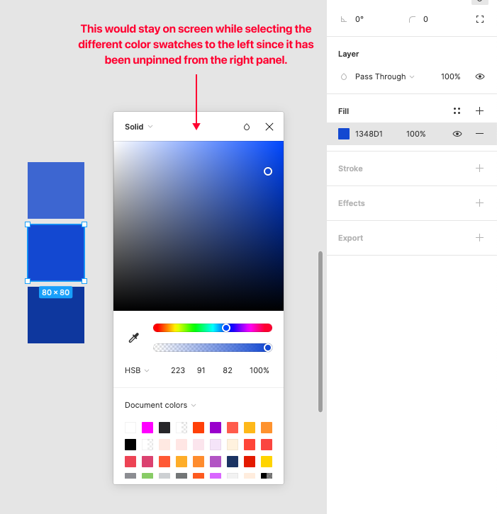
This would a great addition to Figma, opening the colour picker every time when comparing HSL values is tedious
+1 Please add this feature
+1 Please fix this! It would save so much time building color palettes.
Building a color palette to add to a mood board is too time-consuming, I also +1 this request!
+1 I really need this right now too 😭
Let’s say the forbidden words: Adobe does it well, in InDesign and Illustrator. Please adopt “keeping the menus open” idea.
The Ctrl+C was a nice tip folks, thank you.
I also suffer from a somewhat similar problem with the Effects menu. But right now I am working on Colours for the design system and this is really getting on my nerves, hence I found this thread 😁
+1
should be obvious that this is needed when working with colors.
A switch or context menu vor fixing menus and tools should not be that hard
I originally posted this back in Jan 2021 (almost 3 years ago) so it’d be great to see this feature in Jan 2024 as a nice New Year’s gift. 😛
We really need a persistant color picker
Building palettes is so incredibly tedious. Also the colour picker could do with remembering that which tab i was last in. So when i’m assigning colours I don’t have to switch the tab, every… single… time…
Having a persistent color picker would make creating palettes a breeze 😮💨
Please Please Pleases Please Please Please Add this feature.
-Click a frame,
-Click color pallet
-Scroll
-Scroll
-Scroll,
-Click a swatch.
vs.
-Click a frame
-Click a swatch
Upvoting. Having to work out colour tints and shades and omg this is painful… Persistent colour panels (and probably other windows) please!
+1 this would be very nice to have
Get this problem solved please.
Currently to edit an elements style, or even view what style settings it has, I have to open up 2 sublevels of pop-overs to edit a style, which dissapears if I then click somewhere else.
The same goes for when your editing colours. Incessenatly hiding the panels that contain the information i’m trying to process when I switch elements is straight up crazy.
Please for the love of god allow us to pin these views or dock them in an additional vertical panel.
I wonder if you did any user testing for your new UX. Because the fact you think this is good and haven’t changed it yet, is crazy. Its like your more focused on it looking good than being actually funcational.