Hey All, thank you for your continued feedback!
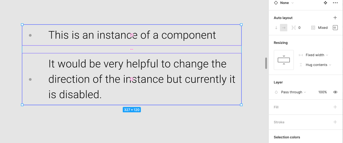
Right now, you cannot directly override an auto layout direction on a component instance in Figma because the layout direction (horizontal or vertical) is locked to the Main Component. But there are temporary solutions to allow you to change the auto layout direction:
- Use Component Variants: Create separate horizontal and vertical variants inside your main component, then switch between them using a variant property dropdown in the right sidebar on your instance.
- Detach the Instance: Right-click the instance and choose Detach instance to break the link, enabling you to freely change the auto layout direction on the resulting frame.
Hope this helps clarify and gives you a couple of new options to try! If there are any promising updates from the team on when or if this can be implemented, we’ll be sure to provide an update.
