Speaking of hacks, here’s what I tried:
- From prototype, clicked Share, grabbed the embed code
- copied the target URL and opened it in Browser
- used the Browser Inspector to target the header. As it was already absolutely positioned, all I had to do to hide it was add :
top: -50px
Unfortunately I would have to do this every time I wanted to make a Figma Prototype presentation. Otherwise it overlaps my buttons at the top. Come on Figma!
Probably good to specify which “below” we’re talking about. We mean the y axis (top to bottom), not the z (near to far - how it is currently). I wouldn’t be surprised if this language issue was the cause of this in the first place. I imagine this conversation in Figma team meetings:
top manager: The header/content should go above/below the content/header.
Then in another meeting, mid manager to UX designer / dev: why did you put the header over the content???
UX designer / dev: because top manager said “The header should go above the content”.
Or it could just be an email or vague task: “Put header above content”
+1 on fixing this. It’s incredibly frustrating.
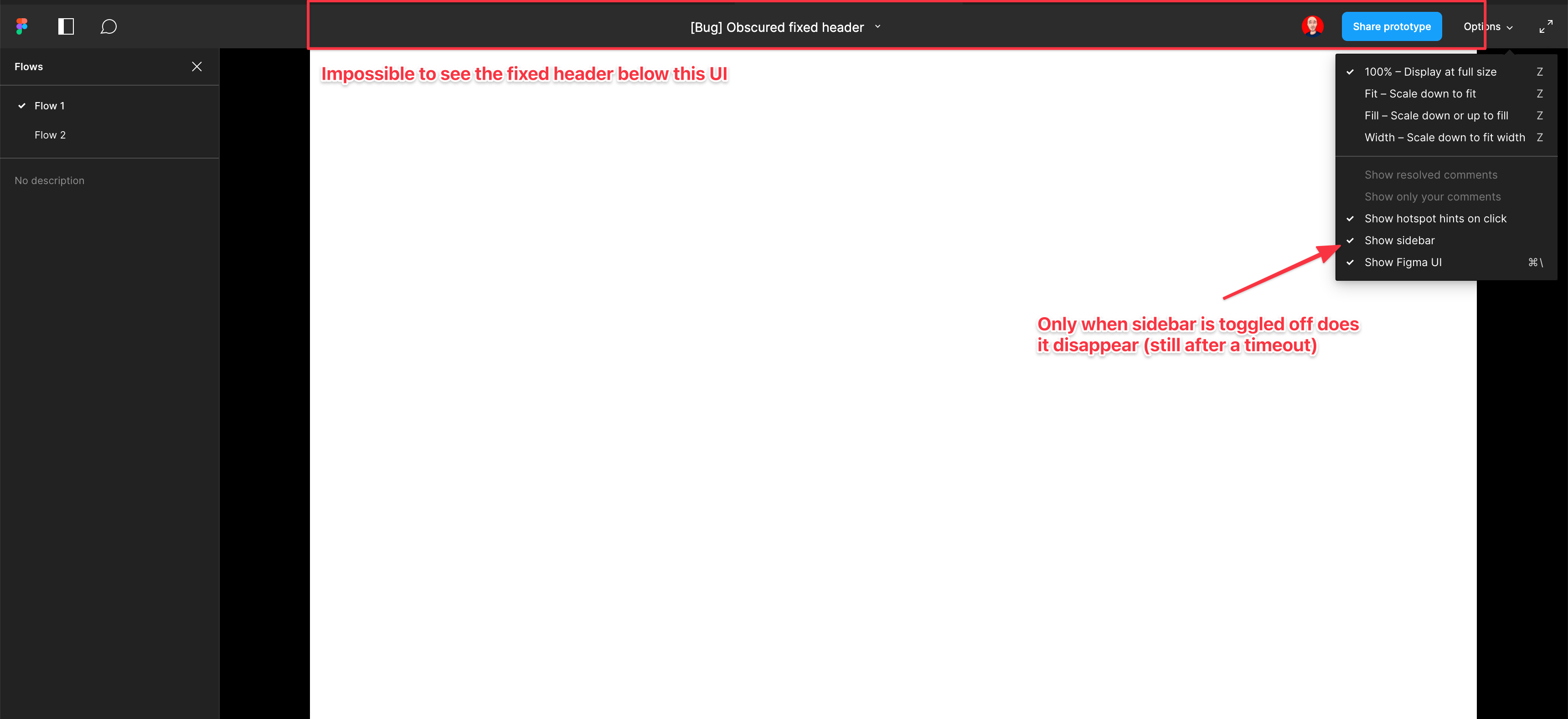
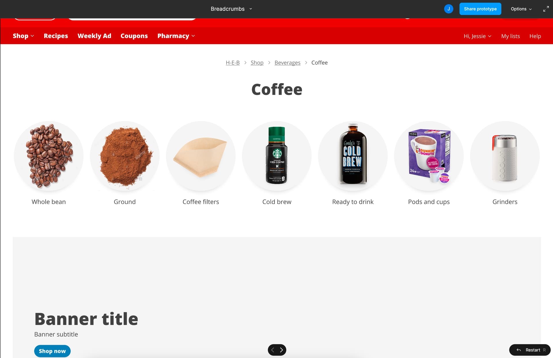
No part of the Figma UI should be obscuring and blocking the actual prototypes. Having to find workaround and fiddle with settings for every prototype share is pretty frustrating.
The obvious solution is changing the absolutely positioned Figma header UI to be in-flow and push the prototype content down instead of overlapping the prototype itself.
FIGMA - Please fix this!!! 🤨
To get rid of the black bars on the side in preview:
If you’re using the desktop version just zoom in to fit with your browser settings. That’ll make it easier to compare to the website you are working on.
This issue really makes it difficult to share to design with clients. The top of the design is not visible due to the menu, but when I turn off “Show Figma UI” then the clients won’t be able to see the side panel which they need to easily jump between pages (I’ve made a new flow start point for each page so that they can easily jump around). Sharing designs with clients is an area where Figma unfortunately is weak.
I am having this same issue. I used to use cmd + \ to show/hide the Figma UI but now my company uses 1Password and that is the default key command to open that up, so I can no longer use it in Figma.
My workaround is opening each of my flows into separate browser tabs when presenting my work, which can be very stressful to navigate during a presentation. 😦
Its embarrassing that Figma has not resolved this in the past 2 years
The “solution” did not hide the top black bar for me. The black bar is still obscuring the top maybe 200px of the design.
The solution that worked for me on mac was:
command . (period)
That hid the UI, but I had to hit it again in order to navigate through the flows, which is still frustrating. Please set the top bar to not overlap the design. 🙏
figma i can’t share my prototype with people who don’t know how to use figma. i have a header and when you trying to click header that top bar pop up out and you simply can’t click anything. fix this please! HEEEEEEEEEEEEEELP
Yes, please fix. It’s still good to have the “hide figma ui” option as you might not want to see the different prototypes, but it’s annoying to have to hide it just so you can see the top of the prototype you’re presenting.
Please can Figma fix this? PLEASE!
There are things concerning Figma, I simply don’t understand. This is one of them. How should I access the comments for the menu mockup hidden underneath the Figma’s topbar?!
And the problem is there for years!
Please fix this. Hiding the Figma UI is not a solution, the Figma UI would be useful if it didn’t overlay the top of the prototype.
Also FYI for others, Command + .
(Sketch’s shortcut for hiding the UI) does the same thing as Command + \
.
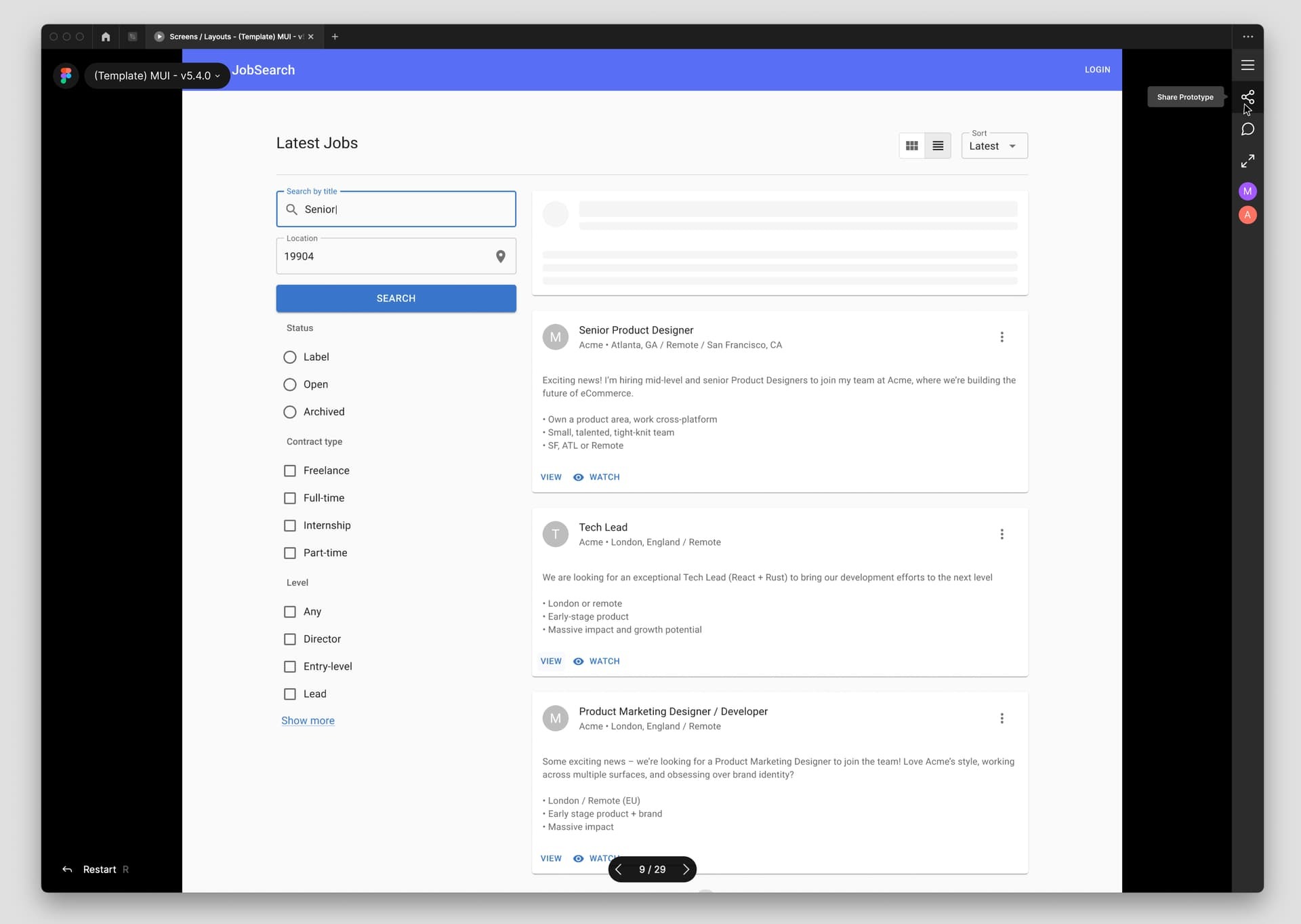
The best way to resolve that issue - is to move all items from the header to the side pane and remove the header at all.
Just wanted to share my suggestion to have a side bar instead of the top bar
It’s odd that the longer the page gets, the more of a problem this is. I’ve added empty space above my header but the amount of space that needs to be added changes depending on how tall my frame is (1400 px tall frame needs more additional space than a 1000 px frame).
Be cool to have this fixed…
I really don’t know why Figma is not caring about this issue, as Figma UI/UX tool. They don’t care about good user experience. This is rediculous.
This is too annoying. Please fix this.
Hey @Nandhakumar_A,
We hear you and understand your frustration. The best workaround was marked as a temporary solution in the interim.
To be completely transparent, our team is aware of this thread, but with only 115 Votes, developers are prioritizing other features with +700 Votes. Rest-assured, we will continue to pass along feedback and monitor Votes to determine prioritization of features for future release.
Looks like a perfect example of poorly executed “data-driven” design. So enough people need to be frustrated to the point where they register to this community, somehow manage to find this topic and upvote it, before you even consider fixing it?
Why is this trivial-to-fix bug being dumped onto the same pile as potentially month-long efforts to develop new features?
We hear you and agree 100%. The forums are primarily run by the community, and our team here is only for moderation and relaying feedback and top requested features, as needed.
While we wish we had more control, the teams (FigJam, Prototyping, Auto Layout, etc.) ultimately have full control over their focus. Feedback and votes can only do so much, but we’re doing our best to advocate on your behalf for a more transparent roadmap when it comes to future releases.
I appreciate your effort and transparency @dvaliao, and of course no one has gripes with the moderation team here. But, after two years I’ve personally resigned on the issue. Hopefully the number of comments and the contents themselves allow you to push this forward.
Absolutely ridiculous that such a simple and obvious flaw in such crucial feature is ignored for years. I don’t want to hide the sidebar which is used to switch between different unlinked screens at times, I just don’t want figma UI overlapping the existing design. Drives me nuts and very sad that Figma’s team obviously knows about this clear flaw and simple don’t care.
I don’t believe the community moderators need to defend Figma at all, it just helps them more easily sweep such glaring faults in the product under the rug.
Please, please make the navigation bar push the prototype down so we can see the whole prototype when the Figma UI is visible, and also add a way to hide the top bar but still see the side bar with the prototype links