Hello all! 😄
This post is LONG in the making, as I am trying to best explain what issue I am experiencing.
Background: I am working on a tab-like toggle switch that would allow users to filter search results.
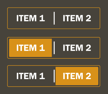
End / desired result: Using the auto-layout feature enables me to add a background fill to a text box. That fill would indicate which side of the selector had been clicked, as in the screenshot below. ⬇️

In order to achieve this result, I have actually nested an auto-layout inside of an auto-layout; one for the text background color and one for the layout of the selector element itself. I believe this is where my issue is deriving from—however, I cannot verify whether that hypothesis is correct.
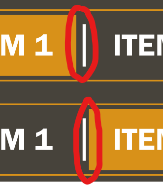
SO, the problem: after giving you that lengthy lead-in, here’s the issue. If you take a really close look at the image, you’ll notice a discrepancy between the left and right padding on the inside. I’ll blow it up and point it out:

As I said, I am unsure of what is causing this minor issue, but I feel that it has to do with the auto-layout-inside-auto-layout setup I’ve got going here.
If anyone can figure this one out, I would greatly appreciate it! Let me know if more context is needed, or if I need to spin up an example file for folks to experiment with.
Cheers and happy troubleshooting! 🥂
ML
