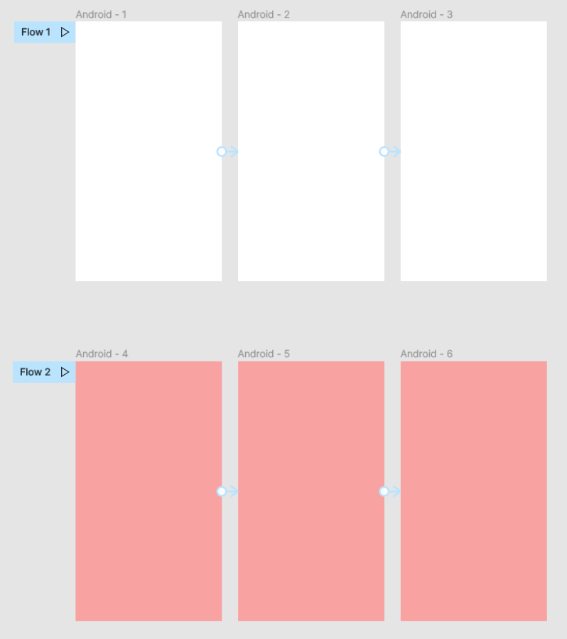
Multiple Flows Should Have Different Device Frames

Still looking forward to this feature. Doing a new concept now and having separate pages for the same content seems… unnecessary.

3 Likes

Isnt this feature finished already? Do they mark them as done?

1 Like

According to this request - we have another one:
Prototype Device for each Flow (not only per Page).
We obviously need to set a preview-device for each of the flows, too.
E.g. view prototype of mobile-screens in smartphone device and Desktop-Screens without device or with desktop device.

5 Likes

This topic was automatically closed 30 days after the last reply. New replies are no longer allowed.

PLEASE can we get this feature haha! :sob:

3 Likes

Just dropping a reply so that this topic doesn’t get archived.
This feature is very much needed.

I usually create one file per feature/platform area and inside each file I use the pages to tackle specific functionalities or flows within that bigger feature or entire area. This means that it’s not useful at all to have to create one page per device to be able to share the preview with the stakeholders.

Without this feature, this is my organisation inside a Figma project:

Prototypes [Project]
┗ User profile [File]
┄┗ Settings - Desktop [Page]
┄┄┗ Flow
┄┗ Settings - Tablet [Page]
┄┄┗ Flow
┄┗ Settings - Mobile [Page]
┄┄┗ Flow
┄┗ Upload picture - Desktop [Page]
┄┄┗ Flow
┄┗ Upload picture - Tablet [Page]
┄┄┗ Flow
┄┗ Upload picture - Mobile [Page]
┄┄┗ Flow

Why is that? Check this screen recording: Screen Recording 2022-04-26 at 14.42.46.mov - Google Drive

With this feature, I could save so many pages! Like this:
Prototypes [Project]
┗ User profile [File]
┄┗ Settings [Page]
┄┄┗ Desktop Flow — with a desktop device selected
┄┄┗ Tablet Flow — with a tablet device selected
┄┄┗ Mobile Flow — with a mobile device selected
┄┗ Upload picture [Page]
┄┄┗ Desktop Flow
┄┄┗ Tablet Flow
┄┄┗ Mobile Flow

Hope this makes sense, it’s not easy to explain in writing.

10 Likes

+1 We need this feature!

2 Likes

Needed! I don’t understand how FIgma could add multiple flows per page yet not give the ability to have multiple viewport sizes? You can’t assume that designs using a page per viewport size?

It’s more efficient to have them on a single page to compare a viewport against the other viewport sizes. Without it, we’d have to design in one sandbox file and then push the designs out to separate pages each time just to separate the flows.

3 Likes

+1! Super crucial for presenting and ease of switching devices.

3 Likes

Device frame per flow is a must have.

3 Likes

Same need here!

1 Like

+1!
I made the switch from XD to Figma, because Figma has moved ahead of XD on most of the features, but this one XD does a lot better.

There you can set a ‘viewport height’ per screen you make. So then the preview mode inherits this together with the width of the screen, to portray your screen. And then you can switch between desktop/mobile just by selecting that screen and previewing it.

3 Likes

Really need this feature, I can’t keep sending different links to a client for every device size – they need to be able to click between the devices easily. When I use presentation as the device size, viewing the mobile screen means it’s cut off at the top and you can’t scroll realistically through the viewport. I think I am going to have to put them on separate prototype links but it is certainly making me feel like exporting them to Invision instead – which I don’t want to do!

2 Likes

@Figma_Support Legit! We need this!

2 Likes

+1 needed!! Very surprised that there’s still no way to do this!

2 Likes

As a webdesigner i design for different screen sizes, and I like to keep everything on the same page. To prototype different sizes i need to copy them to separate pages - which halts my workflow.

3 Likes

I’m planning to run through desktop and mobile designs with my client on Monday so I clicked a frame designed for Desktop, chose Prototype > Show prototype settings and set Device as 14" MBP. Clicked a frame designed for Mobile, chose Prototype > Show prototype settings and saw it too was set as 14" MBP. Changed that to iPhone 11 Pro. Clicked back in the desktop frame and that had changed to iPhone 11 Pro too.

I’m shook! You guys usually have it all figured out.

This thread is getting pretty old, when do we think we’ll get this fixed?

2 Likes

We are still in desperate need of this features. Having separate pages for Mobile / Tablet / Desktop doesn’t make sense. All our developers prefer to have all the breakpoints next to each other. The current setup is unnecessarily complex and time-consuming.

2 Likes

Yes I agree that this is the best workaround so far :+1: but we desperately need this feature!

1 Like