And then I made another component that supports multiple sizes and lets me swap the glyphs via component props. I made that generic icon component with auto layout so I can have dynamic sizes in all other instances where I have to support an icon
Thank you Pavel!!! I’m going to try this out today
edit: may I ask why you have a property for names? I tried putting this into components and I couldn’t figure out why you did this
Ah, it’s a workaround for export! Figma does it in a weird way, when exporting individual glyphs that are variants there is no actual component name, you are going to get a file names something like “size=sm.svg”. Adding a name property would make it into “name=mail, size=base.svg” so it would be much easier for my dev guys to get it right
Thank you my friend! I appreciate your response. I also am impressed how you made spacing tokens in your components. Hopefully I can do that for my team, but I’m concerned it might be too advanced for them haha
You are very welcome my friend!
Designing an icon library can be challenging, especially when it comes to managing different sizes of icons. Here are some best practices to consider when setting up an icon library with small, medium, and large icon sizes:
Use a consistent naming convention: Use a consistent naming convention to name your icons, so you can easily differentiate between small, medium, and large sizes. For example, you can use prefixes like “sm-” for small icons, “md-” for medium icons, and “lg-” for large icons.
Use a symbol master for each icon: Create a symbol master for each icon and adjust the size of the icon within the master. This way, you can easily update the icon’s design and ensure consistency across different sizes.
Use overrides to adjust size: Use overrides to adjust the size of the icon within the symbol instance. This way, you can easily switch between small, medium, and large sizes without having to create separate components for each size.
Use nested symbols: Use nested symbols to create variations of an icon. For example, you can create a symbol for an icon with a filled background and another symbol for an icon with a transparent background. Then, use overrides to switch between the different variations.
Use frames to organize your icons: Use frames to organize your icons by size and category. For example, you can create a frame for small icons, a frame for medium icons, and a frame for large icons. Then, organize your icons within each frame by category.
In summary, use a consistent naming convention, create a symbol master for each icon, use overrides to adjust size, use nested symbols to create variations, and use frames to organize your icons. These best practices will help you create a scalable and organized icon library with small, medium, and large icon sizes.
@Pavel_Kiselev@hassanizhar is there a trick to creating icon components whose instances can be placed inside groups or frames in a way that they will fill either the width or height of the group/frame, while maintaining the icon’s aspect ratio?
Basically, I’d like the instance to just “fill” its container (a group or frame) but not get distorted.
One benefit of being able to do this, would be to very quickly change an icon component, and see how the change looks in various sizes, all in one shot (instead of changing the size property for every size).
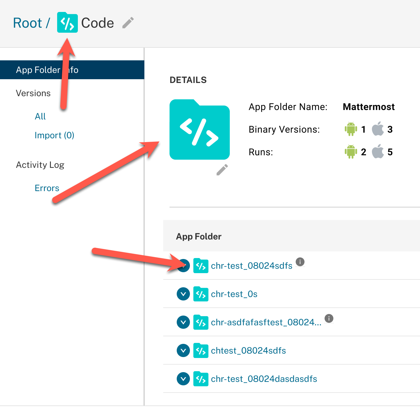
For example here I’d like to change the </> graphic in the icon component, and see it be reflected in those three icon sizes. Right now I have to change props for each of the 3 icon size contexts.