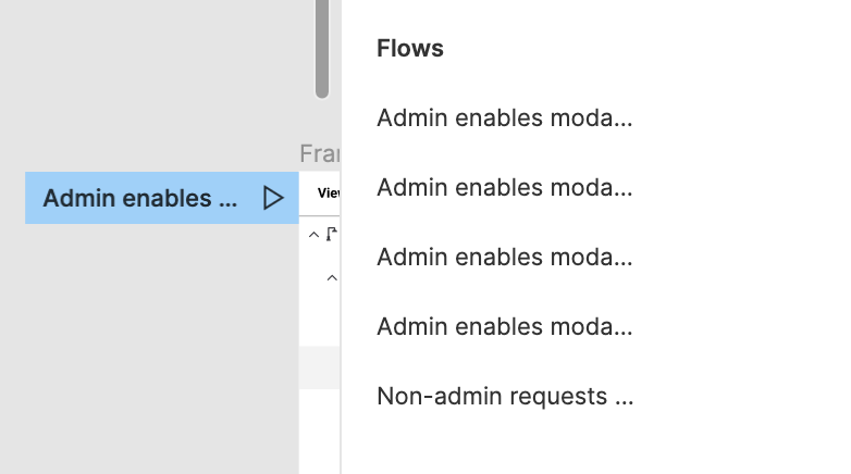
Flow start point labels are too truncated

Flow starting points appear truncated in the following places:

  • On the canvas (blue label with the little Play icon)
  • In the Prototype panel in the Flows section

Not very convenient, considering no tooltip shows when you hover. Can we improve this? Thanks!

This topic was automatically closed 30 days after the last reply. New replies are no longer allowed.

6 posts were merged into an existing topic: Frame selection dropdown in the Interaction details modal is too narrow

8 votes have been moved.