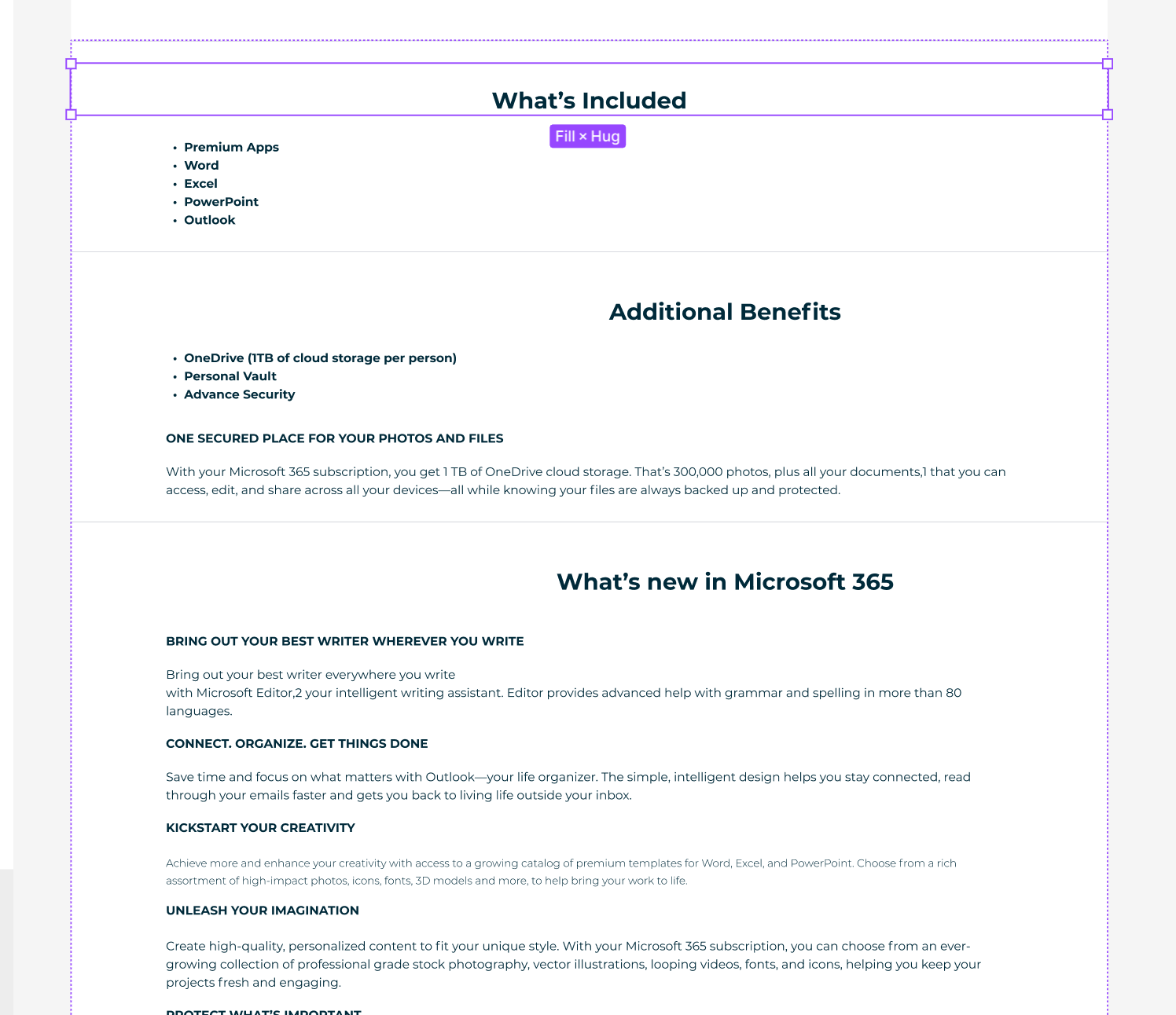
I’m getting this recurring problem where components don’t display as they should.
As an example, in the image, all the headings are meant to be centered like the top one. All the settings are so yet they display to one side. If I click on them they suddenly start displaying as they should.
This is getting really frustrating as it is a constant game of whack’a’mole and I never know if there’s something that needs fixing or just Figma being annoying.
As it happens, this problem is also visible when viewing a prototype. Even after fixing the issue in design mode by clicking on the culprits.
Ok, this is actually REALLY BAD. I’m getting similar issues all over my document which was fine up to this point. Suddenly components all over the document are displaying wrong for no apparent reason, clicking on them fixes the problem but this is hardly a fix as I first have to go fishing and then I have to trust that they will stay as they should!
I went through my document clicking everything to fix it.
Closed Figma, reopened and all the issues reappear. I need to fix this urgently!
Did you fix this? I am having this issue with a client and its really bad. Please help!
This issue is still occurring in 2023. Any fixes? This is a bad experience when you are presenting to stakeholders.
+1 I’ve had the same issue, and I see it once in a while in my components, some of the layers of my buttons kinda get expanded, and right after I select it, it goes back to normal.
it seems it’s a bug rather than a problem in layout (I’ve checked it multiple times, I use base component and I didn’t override bases, but this change happens only to some of my buttons and not all, makes me feel it shouldn’t be my mistake)