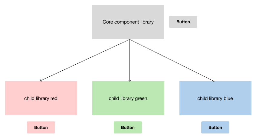
How would you architect a component library for multiple brands? The only difference would be the color palette. Would it make sense to provide all the components at the core, with the color removed, then at the child/brand level, wrap it in a new component and add the color. I think this would this provide updates to things like size and font, but the color would remain autonomous.


Exactly like this. One component library without colors, then several color libraries. By default, one would have to be applied to the main component library, but the switch can be made using “Swap libraries”.


If your users need to have multiple brands in one file, this solution doesn’t work, though.


I wasn’t aware of the swap libraries but it looks like a winner. Thanks


So, the swap takes place after the design. I think optimally, you would set one base component library, then overlay a theme from the beginning.


in order to achieve that you would need to have a duplication of the core component library for each brand.


Yeah, I can’t seem to find another way than that. Thanks


I’m currently facing the same thing, already maintain 8 libraries (4 platform scales, 2 color themes) and now teams want to add branded color themes. Unfortunately, they don’t like the idea of designing with existing components and swap the color later.


But really, I can’t multiply 8 libraries endlessly… With color themes, or in native theming via tokens, my workload nightmares might be prevented 😅 So please Figma, I hope you hear us 😬


We ended up with a themed core library that feeds into satellite libraries so we wrap (nesting the instance) the core component in an additional one for two reasons - to re-theme it and so end users of the satellite only need to open one library and not the core library in addition to the local one. This adds a little complexity to the components with an additional layer. I don’t love it but it’s what we’ve gone with.


We looked into the Figma Tokens plugin for theming but there’s a lot of uncertainty about what that workflow looks like to the end user. Some small tests we did run - it was slow, and the interface is a lot to consume. For small projects it may work out but in a large org with many designers and large files, I have some reservations.


That sounds very similar to our approach, we also keep a library with unstyled “root” components which includes variants for different contents of a component as well as four platform scales. We then wrap these into styled components in eight “preset” libraries, providing light and dark theme.


We also did this so that our designers can work with one isolated combination of scale + color theme. Although our users already start activating multiple libraries, mixing themes which is not how it’s intended. It also

quickly happens that someone accidentally copies a base component around… All not ideal and in the end difficult to maintain, impossible with even more colors. So we’re now looking into developing custom plugins. But I assume this won’t work seamlessly because plug-ins need to be launched to do anything. Im really praying for some native solution 😅


In the research I did, I was surprised that many companies were developing their own plugins for this. I don’t think we have the resources for that. Hoping for that native solution.


This is an unhelpful reply but I’m actually on the verge of tears because I don’t know how to set up a multi-brand library without making work-life hell for other designers!


Sorry to hear 😦 If you only have colors and fonts as variables, it can be doable with using the swap library functionalities or some plugin that allows for theming or token application (we can’t use most plugins because of security restrictions in our org)


I also found some interesting design talks on Figma’s Youtube channel where different approaches are discussed. The approach from Condé Nast with a custom plugin really looked quite spectacular.


Rebuttal accepted : ) thanks for having a look tho


Yes we need this!!! same components, just switching colors, typography etc.


Reply