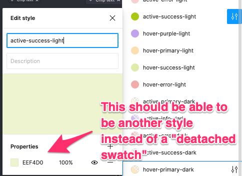
If I’m reading this right, you mean something like color styles based on other color styles right? If so, I’m all for it. Something similar to Sketch’s color variables would be immensely helpful.
Oftentimes I set my color styles to have regular names assigned to the initial color color set (primary blue, primary yellow, secondary black, etc…). Then I have color styles set to specific UI elements such as text (text-heading, text-body, text-link) that are based on the main colors. But you have to create a separate color style; which make updating/changing colors in the future very time-consuming and error-prone.
Color variables would allow us to create a main style of colors and then create other granular styles more efficiently.
Being able to create tints and shades without having to create a brand new color style would be amazing as well.
Exactly, that is a very common case. So is creating shadows with your color variables.
Title says it all really.
By having a default color, and adding a white or black opacity layer over it, shades and tints can be generated. Nesting color styles would allow users to quickly change every tint/shade used in their file from one color swap.
I feel like this could work more easily if you could apply multiple fill styles to an element. but definitely agree. you should also be able to access colour styles from the selection window too.
My use case would be theming. Being able to nest colors into semantic containers would be really helpful to having a single source of truth for base colors while maintaining actual color name definitions used in code (Android in this case).
Yes, exactly the same here. Would be such a great feature!
We’ve been looking at Figma Tokens as a possibility but like others are concerned about relying on a plug-in for Production work in our Design System. Having the ability to have styles drive other styles would better match our user’s workflow, to have a baseline set of say brand colors, that drive myriad usage colors, that would automagically change at least the hex value (leaving other styles like say opacity for a modal set the same) if one from the brand was updated. The mapping is something that’s necessary for light/dark mode as well as theme switching from one brand to another. Does Figma have any plans to add this to the roadmap in 2021?
I agree with the need, but feel this should be wrapped into Design Token support in Figma - it covers this and a lot more as well.
+1
For design systems and, more specifically design tokens this is so important! Massively time consuming going through and changing all individual colour (and type!!) styles across all the different tokens (primary button hover, disabled, etc etc etc) whilst they largely share all of the same few core colours (+ respective tints/shades).
Is this at all in the works? We have a pretty large design system and we deal with state-based color variations by overlaying “Action Colors”. If we can nest multiple color styles, the design intent would be more clearly communicated to engineering. Right now, we have to create individual state color styles with stacked raw hex values.
So if you have hover for your primary, secondary, success, danger, etc etc you have to create “hover” color for all those rather than just stacking each color style with an “action-hover” color on top.
For users who work with a very large design system, we need ways to control styles on an atomic level.
Hopefully, this is just an oversight that could be easily corrected.
They already have an interface for selecting colors by using color styles.
The heart of this request is simply to access color styles from any part of the interface from which one might choose/assign a color.
In our case, developers use color variables that they take directly from the design specs. This is something we could never do in XD and were excited about in Figma. However, if effects use color, but do not access the styles by name, there is no way for developers to glean the color variable (style name) from the effects spec.
I’m fairly new to Figma. Recent convert from the hideous Adobe XD.
Does Figma provide any feedback on feedback?
In other words, do these feature requests just sit here unattended with no “light at the end of the tunnel” response from Figma, or do they periodically let us know that something may be in the works?
This is a very reasonable request that has been languishing for a year now. It would be nice to know if anyone from Figma has acknowledge it.
Hi Figma!
I am creating a design system and came across the idea if there would be a possibility to have the main colour as the Master style while having instances of that colour into 75%, 50%, 25% & 5% opacity style instances.
Here is an example of colour shading:
I have to create manually all these styles which is a bit of pain when you have to change them at some point. Can you imagine how much pain would it be if the shades had 10% decrement? 9 Styles to update for every colour.
It would be great to have a hierarchy like how I can do it with components where we have _MasterComponent for the design and instance of that instance inside of variants for different states.
I guess the colour style would look like something like this:
Master colour
| 75% Shade of the colour
| 50% Shade of the colour
| 25% Shade of the colour
| 10% Shade of the colour
When I update the Master colour, it should automatically update all the instances below it.
Is there anyone else out there having a similar struggle?
This!! Really need Figma to update this because this is affecting my Design System. I can’t create different component (button) states without having to unlink the color styles.
This would be a tremendously powerful feature, especially for the application of different colors (skinning) to a single design. With the way colors are right now, you can layer fills and add blend modes to them. If you could set fill layers to a color style and then add other custom colored layers above and below, you would then be able to change the main/base color and all other color instances that use that style within its own style would be updated. This would make the creation of tints, shades, and other color palettes so much easier to create, use, and modify. I am currently using the Google Material design library and the idea of recreating all of the color styles is not appealing.
Basically the Purple in the image above should be a color style. The secondary color (the effecting shade) are shades with the luminosity blend mode selected. I should be able to create the 3 different color styles. If the base color is an embedded style then all I would need to do is update my base color and the tonal styles will update.
As you can see in the image above, I have a series of grey scaled tiles with the luminosity blend mode applied, over top of a solid purple rectangle (which represents the base color).
Food for thought.
I see this being particularly useful in a few key areas.
- Effects (drop shadow, inner shaddow)
- Gradients
I also see a need for layering as mentioned above. Being able effects is pretty common… background blur and a shadow for example, or compounding shadows of different colors.
This would make so much sense for us!
this would be super helpful - immense help when creating a design system and sharing it with devs
For it will make sense to can use style colors to create another one. For example, in code, I have neutrals and branding colors as base colors and these CSS variables are used to create other variables → --xx-color-text-primary: --neutral-100; This will be amazing!
We need this feature asap!
Nested Styles are a must for anyone making a design system.
+1, need this feature asap.