Omg yes thank you, I wasn’t aware of this feature!
Only certain parameters of instances can be modified. For some reason, you can’t move or resize layers within an instance. There are some workarounds (i.e. using auto layout within a component to move the X,Y position of layers, or duplicating the layer resizing it, and using visibility to turn it on or off), but these workarounds require a lot of extra steps. This is a basic feature in other programs (i.e. Adobe XD). I’m confused why this isn’t an option in Figma.
*No pic included because I think this is self explanatory. Let me know if it isn’t.
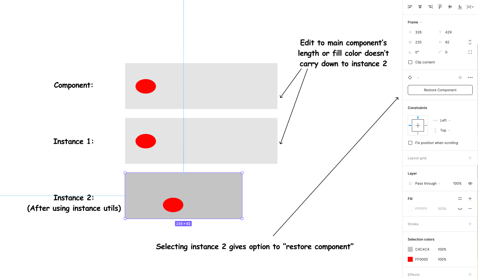
It doesn’t seem to be working for me. After using the “local edit” feature, it seems to detach the instance entirely from the original component.
@Wolfgang_H Yes that is the only way to make things work at the moment, you are using it correctly, one thing to keep in mind while using local edit is that it doesn’t affect its parenting instances nor its children instances, but only the one instance you made radical changes to, consider it “minimally invasive” lol. Much much better than having to detach all the way 🤣
In your example above, you can make the red circle an instance nested inside of the component, so the changes to red circle component is reflected on its instances, also make a bunch of the grey box component and make them form a “list” component. Then you’ll see what I mean
Hi im sorry that i comment this here but
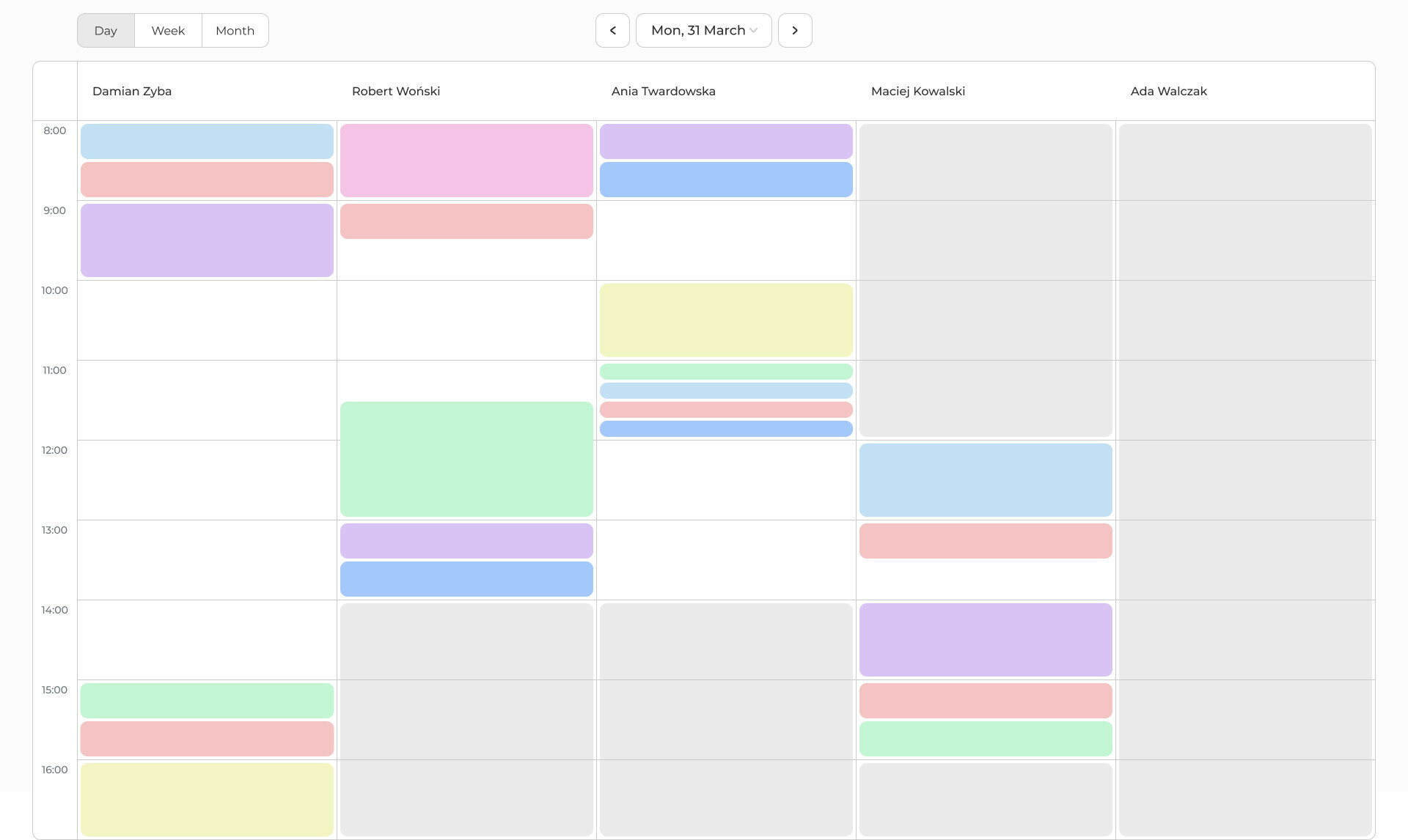
im just starting with design and I have problem with table in figma, I would like the corners to be rounded as shown in the attached picture. I’ve made an outline for each individual rectangle here (which doesn’t work with the tables in weekly and monthly views). I’ve seen other ways of creating tables, i.e. adding a line to each rectangle and hiding some, but then I can’t make round corners.
Hi Damian,
Hope you are well. If you post your question as a separate post or in Slack you might get more responses. Otherwise, feel free to message me directly if it’s a question related to the Table Creator plugin.
From my experience, the only way to create rounded corners on the whole table is to apply a corner radius to the table container.
When I turned a list (for exemple) that I’ve created with auto layout into a component and then make an instance of this component it’s no longer possible to move the list items up and down. This means that every time I want to swop place of two list items I have to copy paste text inside the instance. This feels extremely old school and is time consuming.
Nor is it possible to or copy past to create a new item. To solve this I add more list items than necessary to the component and hide them. Then I can show them in the instance when I need more.
To sum it up: It would save a lot of time and effort if the instances would work like the way a a component or a non component auto layout do.
I know it bugs my collegues, but does anyone else experience this? Is anyone using a plugin or workaround to help solve this?
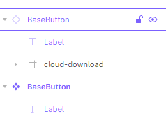
Describe the problem: Icon tokens that are used in main components are locked in instances.
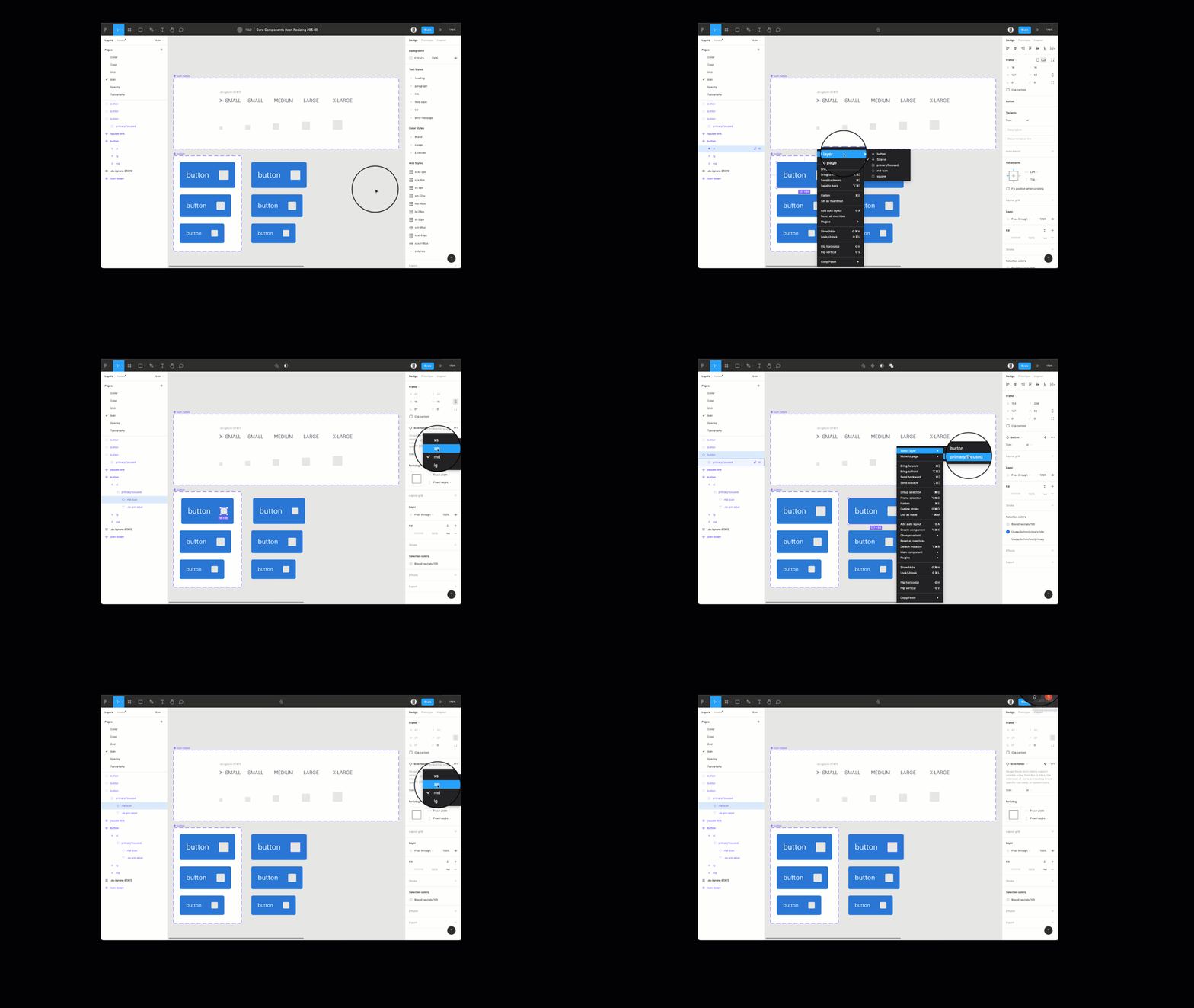
We are attempting to create components with an icon yet allow other designers to swap variable sizes in conjunction with the right line height of different typefaces when using component instances.
Does anyone else experience this?
I love auto-layout and the way overrides are implemented in Figma.
But when an auto-layout (eg. a stack of list items) is made a component, then all you can do in the instances of the component is hide some items. You cannot add items in the instance nor can you reorder items. I guess the former might be difficult, but I don’t see why you couldn’t at least change the order of existing items.
In other words, I often need to “override” the order of the original list, but I don’t have a easy way to do that, other than overriding item 1 so that it looks like item 2, and vice-versa.
Anyone knows why it is not allowed to reorder or even add items to an instance of an auto-layout?
If I create a component that is a collection of other objects (list, menu, table, etc), then the instances of that component don’t allow me to add objects (list items, menu items, table rows) - I’d have to detach the instance in order to add items, which negates the benefit of being able to propagate component changes to my designs. It does allow me to delete objects from the collection that are already included in the component, so I suppose a work-around is to make collection components that have many members and just delete members from the instances. Still this doesn’t seem like a great workflow.
Is there any way to customise the fixed width of the placeholder component inside an instance? I struggle to resize swapped components to the width I need …
Provide a way to share components that I can add elements to it?
example:
Table component… I need to add more rows to the table
List of users
Form fields
etc
With the addition of variants if could be super powerful and I could share them as a component in my library (instead of having to detach and add more items, what it defeats the point to be honest).
I think if would be super handy… what do you think?
A lot of good info here… what I would like to see:
If a component have autolayout on it I could:
- Copy the elements in autolayout and add more of them
- Insert any group of elements into the autolayout
From that point on I could create a variant for the original component more easily.
Just piling on here:
I am suffering from the same limitations here as everyone else. Someone else mentioned perhaps designating a frame or container inside of a component that could be “unlocked” to allow for content to be arranged or inserted. This would solve a lot of the issues I am having. There is currently no easy way, for example, to make an accordion component without detaching the component instance to edit the content inside.
If there was a way to designate an area within these components as editable in an instance we would be able to accomplish this, which would really eliminate some issues we are trying to work around.
I’m creating component variants of containers (popovers, cards, accordions, etc.) where the content/layout can’t be determined at the master level. I need the flexibility to build content layouts within the “body” area of individual instances without detaching my instance and breaking my design system. Once I detach my instance, any updates to my libraries will no longer flow through to these components. Does anyone know how to achieve this result?
I actually found this in another post (Fully Editable Component Instances - #17 by Hossein_Boroji) but a plugin exists for this thanks to @Mr.Biscuit — https://www.figma.com/community/plugin/913055393462842774/Instance-Utils
I would personally LOVE to see this become native functionality within Figma.
Just chiming in myself here. I tried AdobeXD a few weeks back, much prefer Figma still - but to everyone in this thread saying Fully Editable Instances isn’t logically possible - XD has this option.
That is, by far, the one pro XD has over Figma. You can fully edit component instances.
adobe.com
@FigmaTeam - you guys have to make this an option (and add native spell check!)
When creating components I often feel Code has much more flexibility than what we can design in terms of components. For instance if I wanted to design a popup design, I know the style of the Title, action buttons, but I never know what the contents of that popup will be.
In many such cases I need to create the content outside the component when actually it should be inside the component.
My proposal is when the Frame is created as a component then any from inside the component should have a option to mark it to accept children. That way in the instance the marked Frame will work like a regular frame which will accept any elements we put in there. This will be helpful Header designs, Card designs, List Item designs and much more.
You can actually do this at the moment.
- Create a placeholder component, and put it inside your Card component within the library. Adjust the spacing, scale etc.
2.Then in the project, create the content of your custom card. Make a component, then use “Instant swapping” to be used in the card “placeholder” area.
Enjoy 🙂
Need!
We are currently creating a listBox component in the library. And since this component can have any amount of items, the workaround I have is to just clutter the component with an ample amount of items (groups incl.) and just annoy the designers by deleting (hiding) those that they do not need.
OR they can copy the component, edit it themselves, and hope that we do not re-do the component anytime soon. 🤣
have you considered using slots for your lists? you can create auto layout components that contain various slots so you can vary the number of items on a list without creating a specific list component. So instead of creating a List component with variants for each amount of ListItems, you can create column components containing slots, and create variants of that component for columns with 2 items, 3, 4, 5, 6, etc. That way you’ll also have a general component for column layouts.
As an experiment, I have been trying to move from Adobe XD to Figma and this one really bothers me quite a bit. I’m so used to having the freedom to do whatever I want with instances without restriction in XD (changes just become overrides). You can do literally anything, E.g. extreme example: completely change a vector’s shape in an instanced component and still change the colour of the same vector with the master component.
I hope Figma give designers the freedom to choose what can and can’t be overwritten within variants. 😦
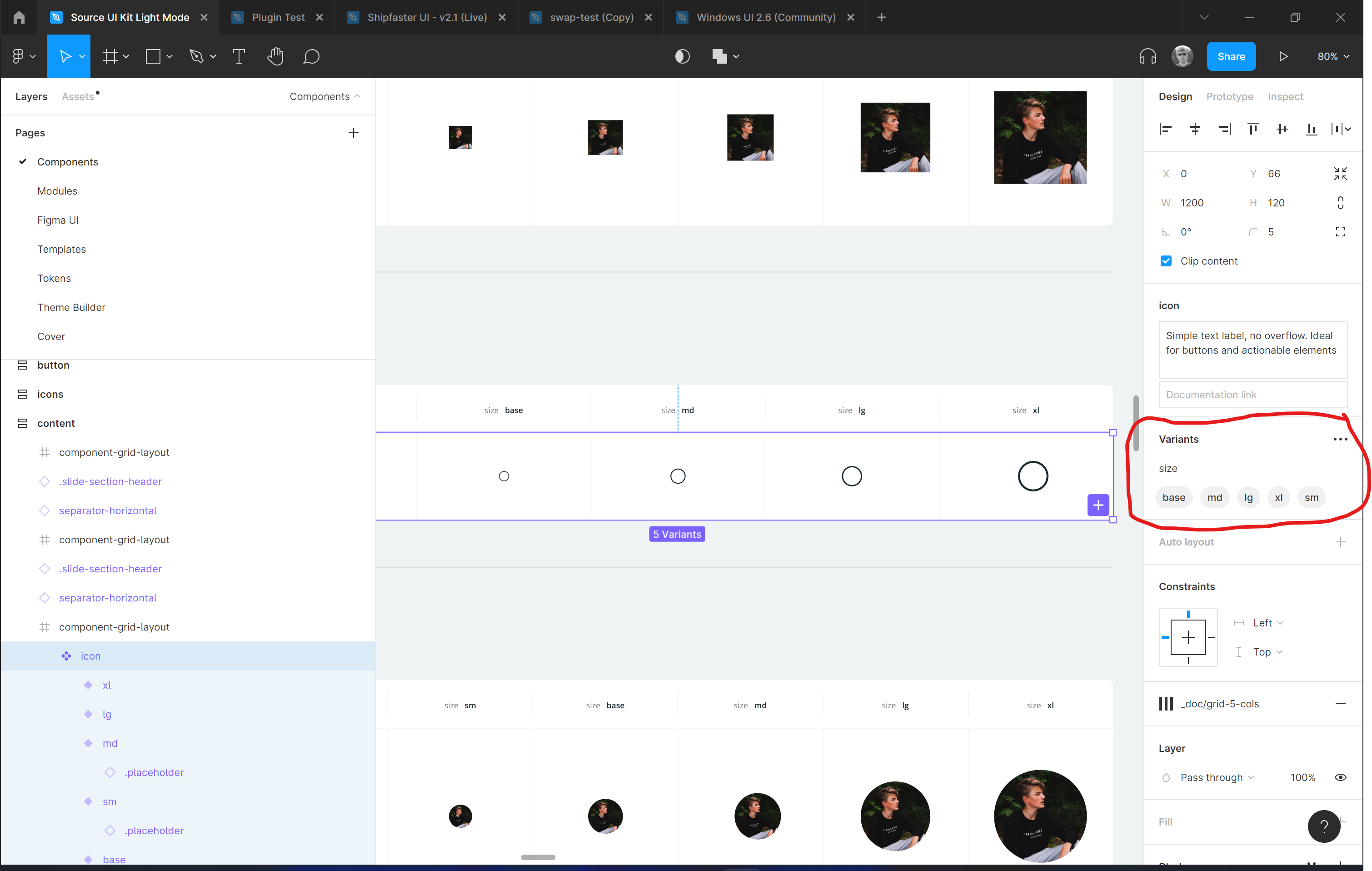
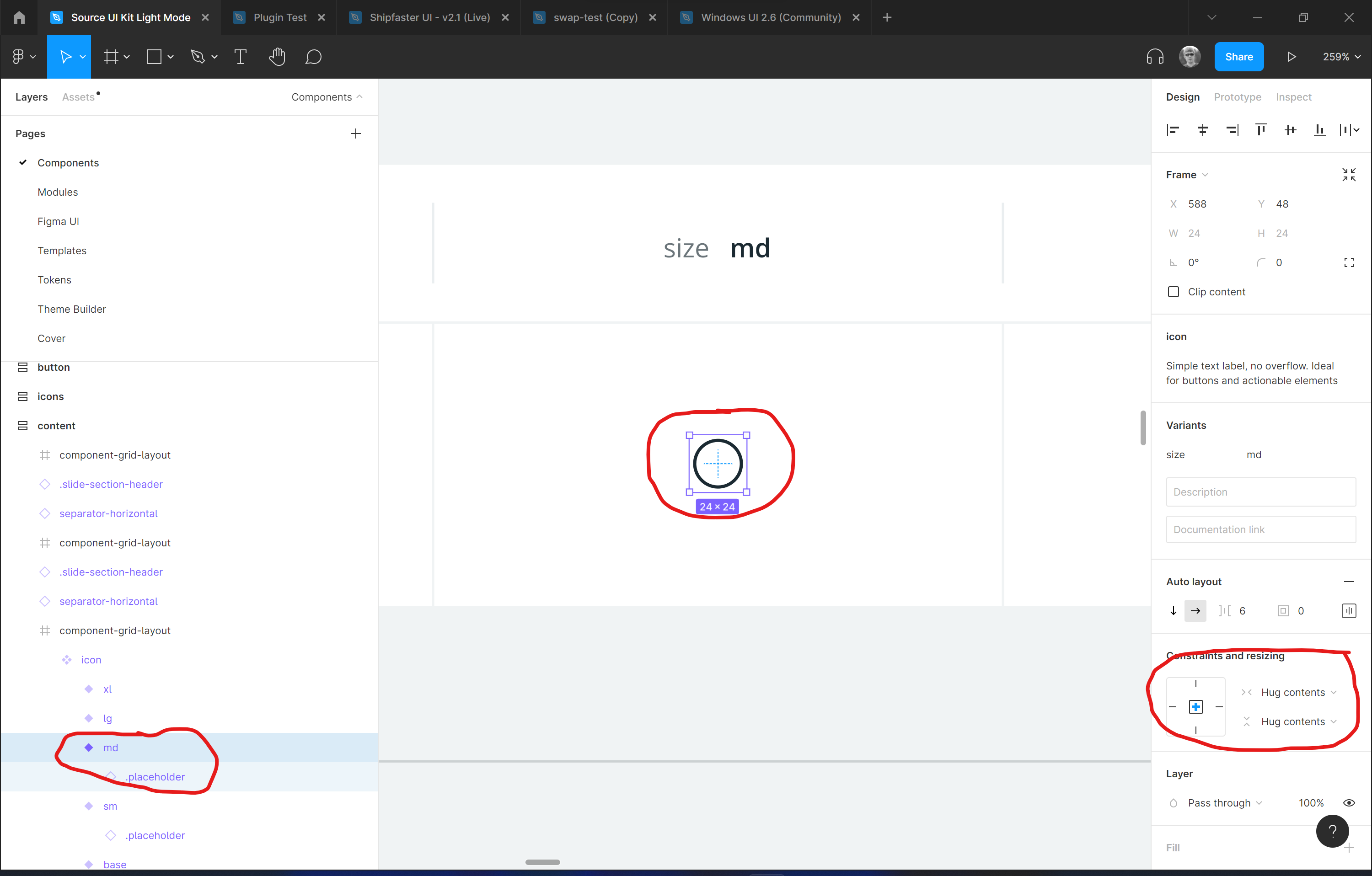
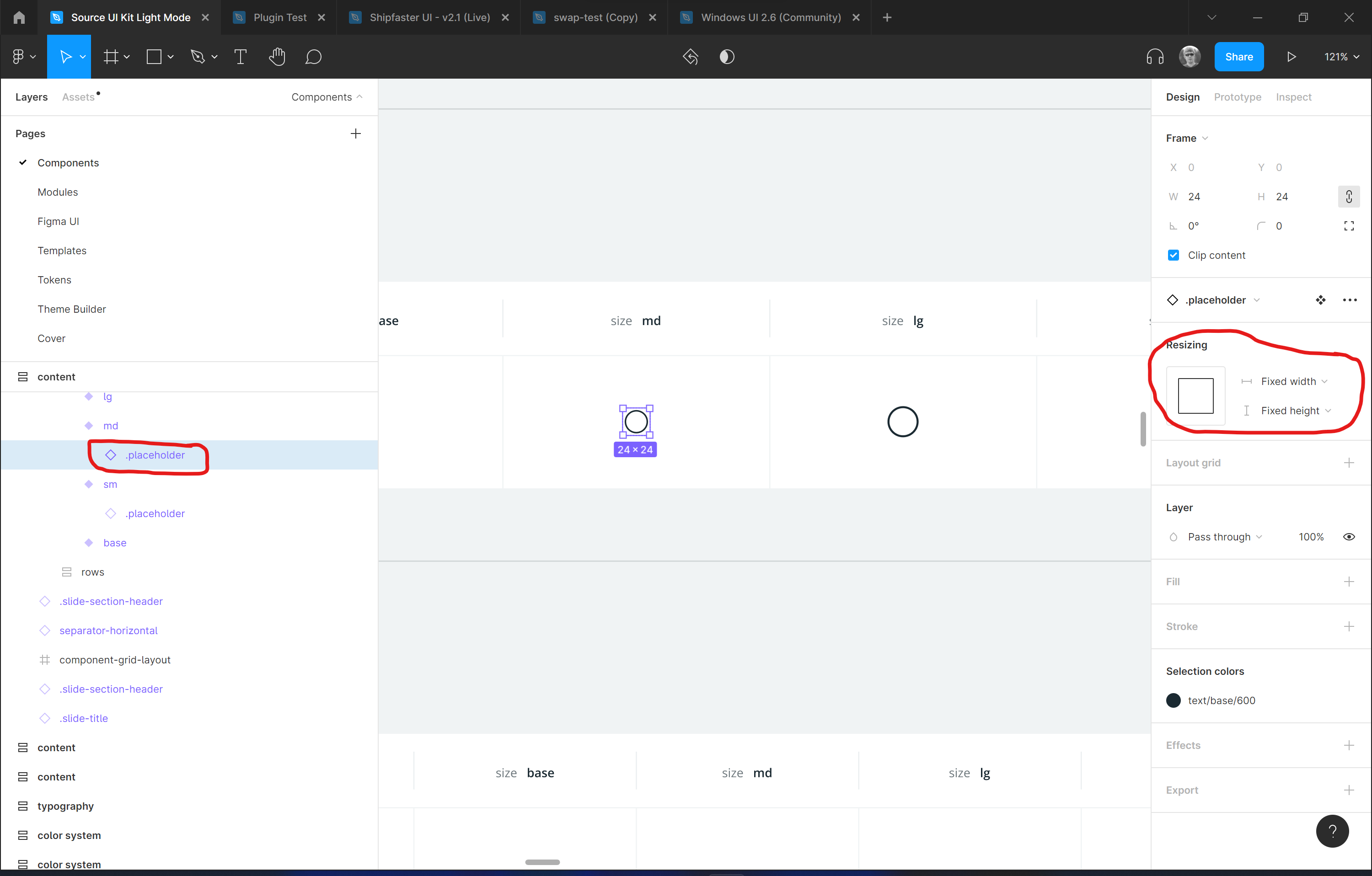
I made it this way
Made a component to render an icon, multiple different sizes
Each variant use hug contents for auto sizing
And there is a fixed size placeholder that I swap with another instance like icon, image etc
It works like this, I use top level icon component instance to set a size and then swap the icon that sits inside
I found this method quite flexible, but at a cost of more complex layer/component structure
This is a good suggestion that would make components more powerful and useful. For example: you could make templates for things like a modal or wizard style UI that can have replaceable or customizable content.
In the case of tables, dropdowns and lists, even a component property that accepts a number input like “Number of Rows” or “Number of Columns” would be helpful.