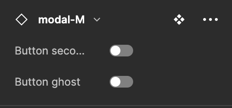
Can you please do something about the truncation that happens in the panels in Figma?

There is so much space remaining on the right, doesn’t make sense why the text is getting truncated like that. Why not make it wrap on two lines so that people can understand what they are toggling. It is impossible to shorten everything sufficiently to avoid this truncation. The same issue happens when looking at the right panel at colour or text styles.


