Hello. First, I have to preface this question that I’ve very, very new to Figma. I’m a student and I’ve only been learning/using Figma for the past 2 months since the beginning of the semester. So I please ask for understanding, forgiveness, and support, especially not knowing what to do.
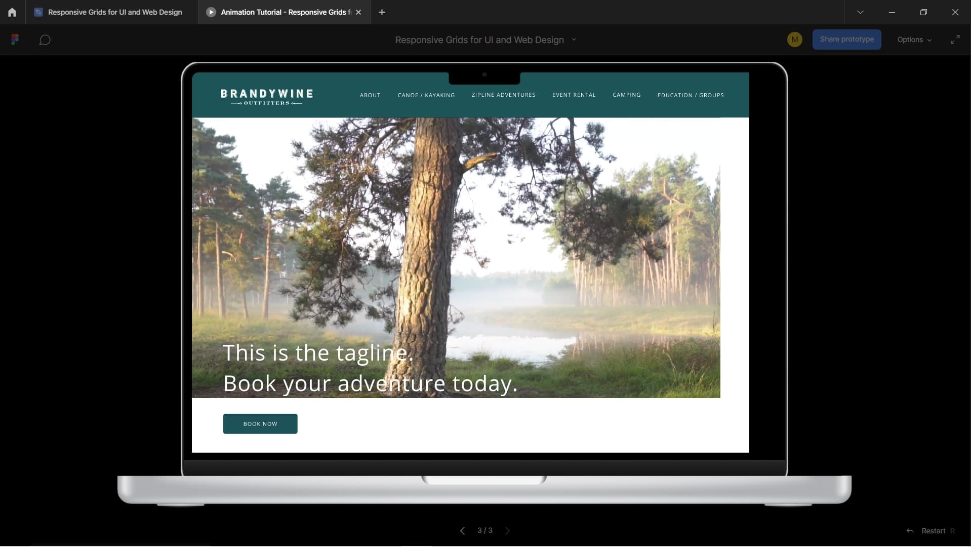
For my school project, I’m designing a website at 1440px wide. When I go to present my prototype, let’s say for a Macbook Air, my prototype is not displaying correctly to size. Also, the video that I’ve included as a hero image is not scaling (it looks fine in Design mode but truncates in Present mode).
I understand that this is a responsiveness/autolayout/scaling issue, but I’m not sure how to fix my prototype to be responsive and scalable, especially in different presentation formats (i.e. Macbook, Surface Pro, etc.).
I’m aware of and I’ve completed a tutorial on autolayout, but I still am unable to fix the issue.
Do prototypes scale and are they responsive in present mode, no matter what you choose? Or do you have to design for each breakpoint/screen?
I’ve attached screenshots of the issue.
Thank you for your time and take care.

