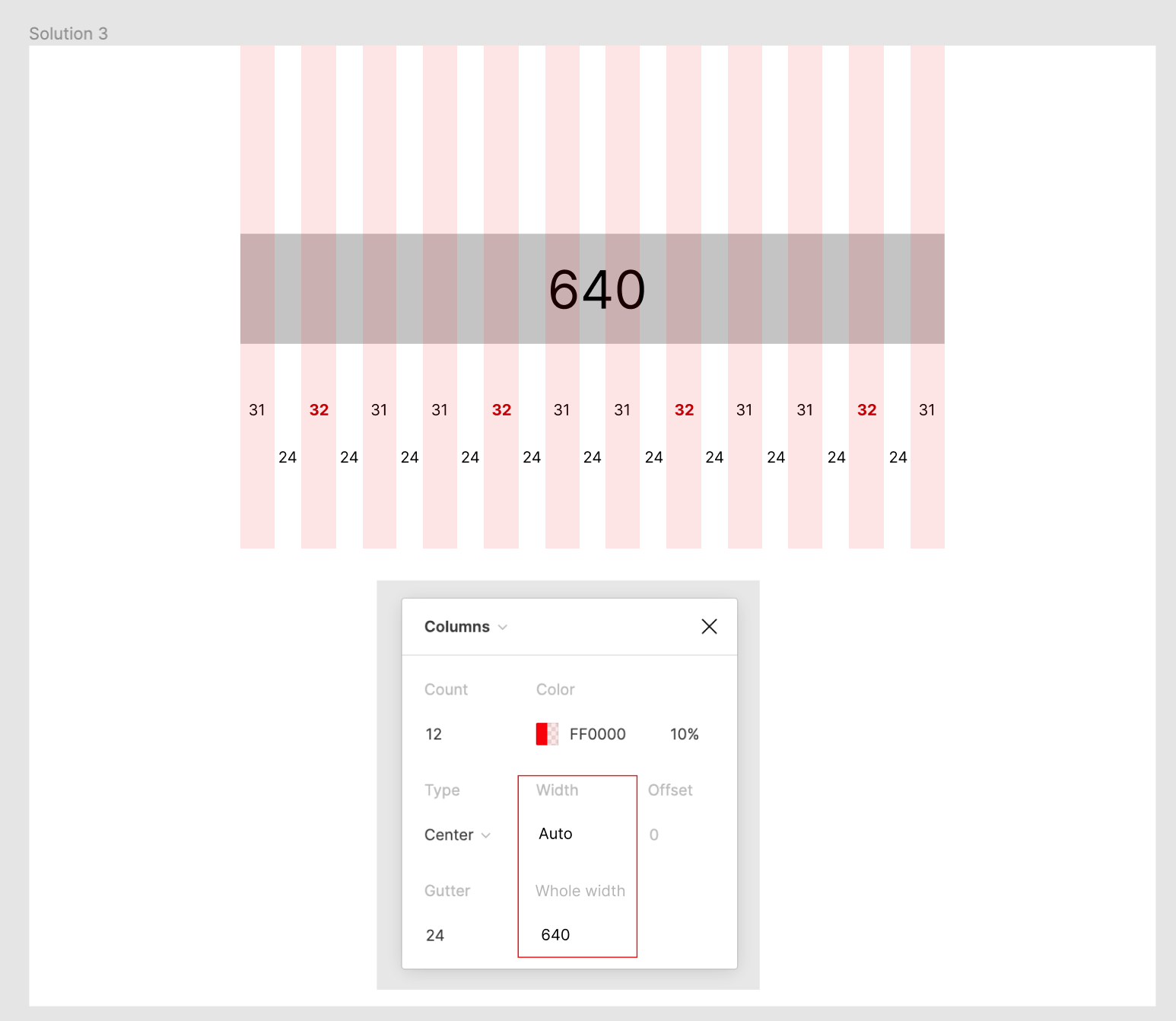
Currently, it is possible to generate a layout grid based on the width of each column, but I would like the option to generate it based on the whole (content) width.
When flex-based grids are achieved with CSS, you usually specify the left and right margins and the gutter width (and sometimes additionally the overall width), and the width of each column is set automatically.
Currently, it is not possible to achieve the desired whole content width.
@Gleb
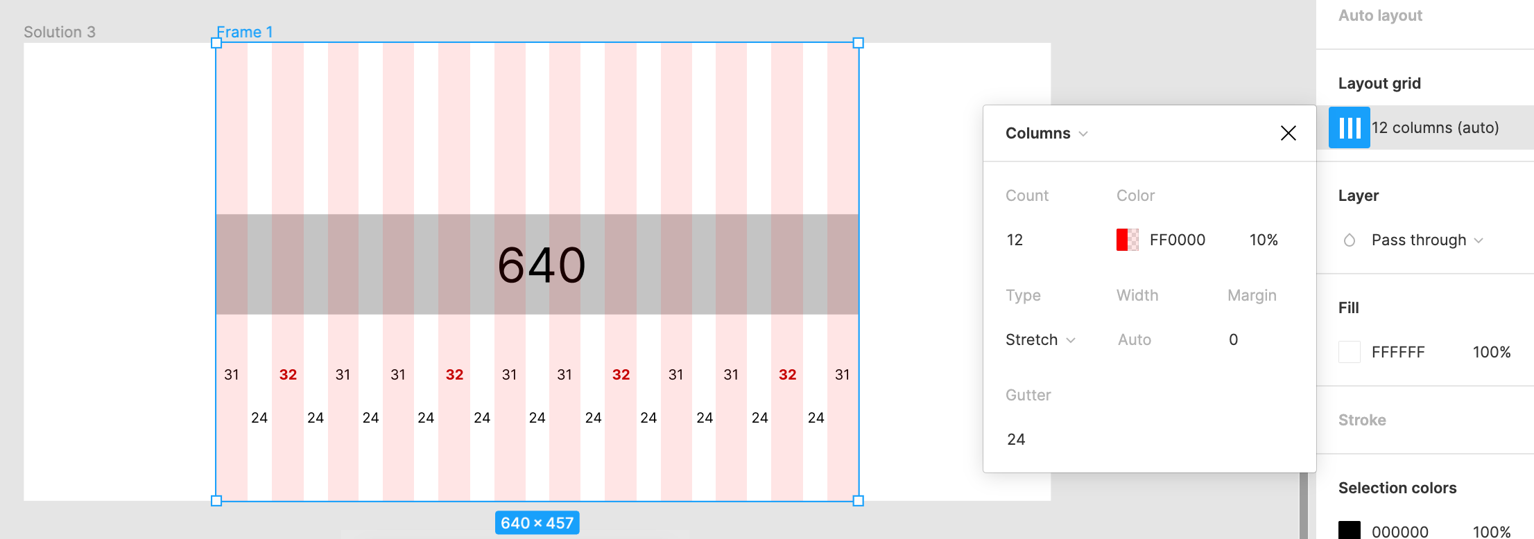
In that case, need to add another Frame inside the Frame and set the Layout Grid there. This way, it is more complicated to rule it as a design system and expand it to other Figma.
Since the Layout Grid can be shared as a library, it would be convenient to define it only in the Layout Grid.
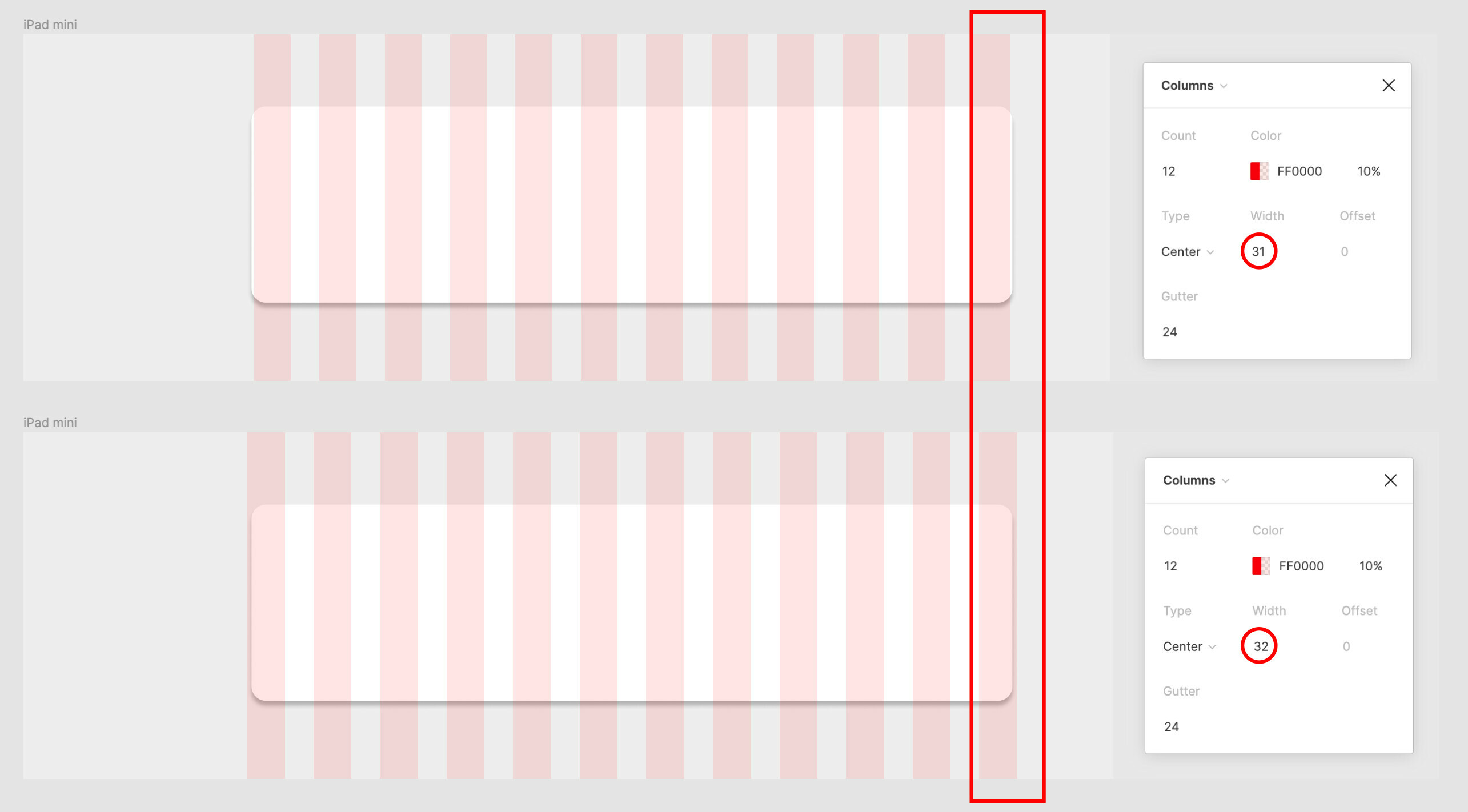
The example in the attached image shows that I want to set up a 12 column grid with an whole width of 640px for an “iPad mini” Frame, but I can’t make it exactly 640px.
Is there any way to achieve this with just the “iPad mini” Frame, and then define it as an auto layout to share with other Figmas? Isn’t the only way to do this is to nest a 640px wide frame inside the “iPad mini” Frame and set a stretched layout grid there?
Note that the width of the Viewport is not limited to 1024px. I want to create a layout grid of 640 px for any viewport width.
Now I fully understand what you are looking for and why. The grid you are trying to use with column width = 32 and gutter = 24 obviously doesn’t fit. Not every random combination of numbers would fit. If you use the stretch grid with gutter of 24, it would result in non-pixel perfect grid which would give you all sorts of headaches.
To make the grid fit perfectly, you’ll need to calculate it! I just spent about an hour trying to come up with a formula for that and I think I did it. You need the input full width, column count and gap width. The column width would be the result of the formula. To make things pixel-perfect, total width + column gap should be divisible by number of columns.
Formula: c = (total + g) / n - g
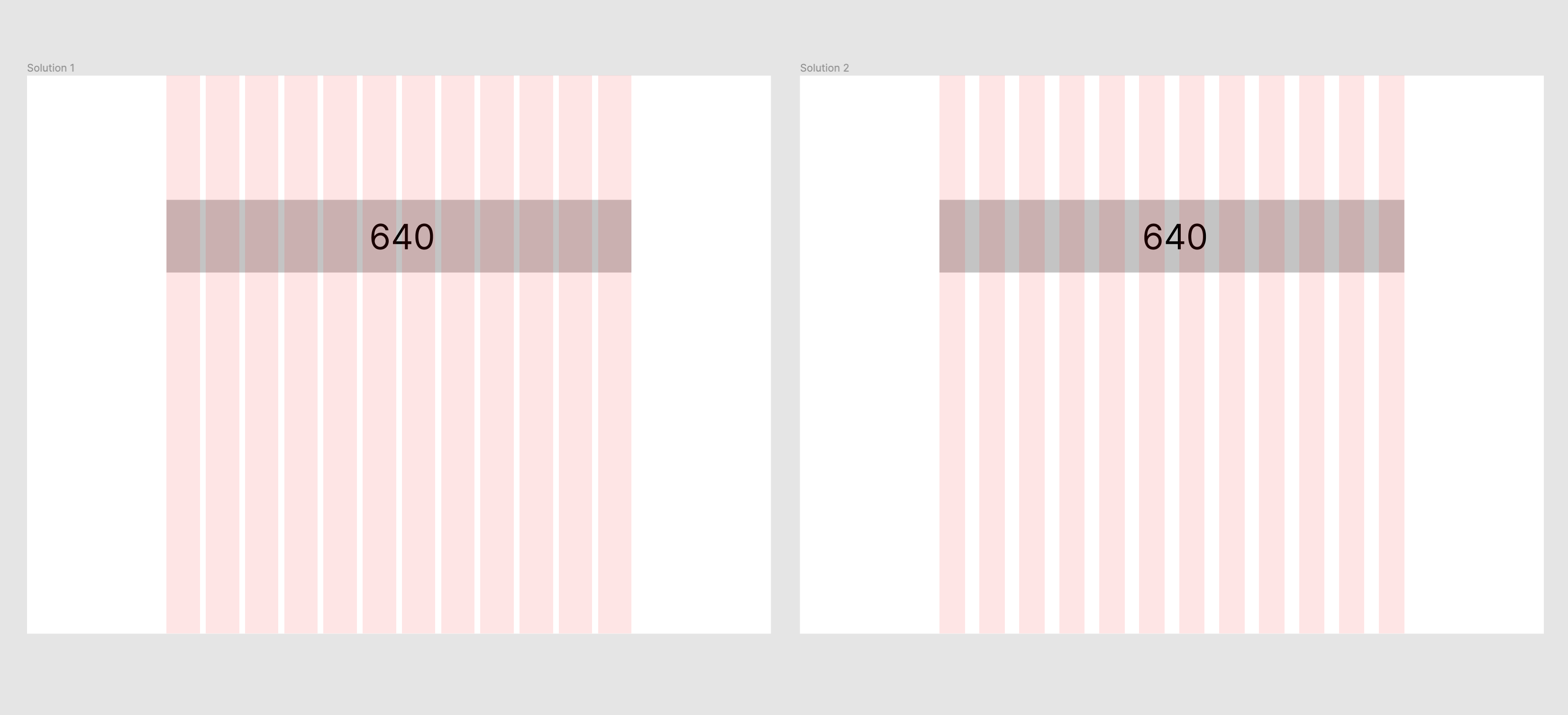
In your case total = 640, n = 12 and we need to pick g so that 640 + g would be divisible by n = 12. So I picked 8 as 648/12 = 54 exactly (whole number). You can increase the gap by 12 however many times you want, e.g. 8 + 12 = 20 gap would also work. When we plug these three input numbers into the formula above, we get the column width value. Both examples are illustrated below, as you can see the grid fits perfectly:
Yes, I understand. But why do you choose to use this grid? And not the pixel-perfect one like I suggested? This is not pixel-perfect — you get different for different columns. Why are you ok with this?
Note that with this setting, the width of each column will not be equal: column width = (1024 - (60*2) - 20*(20-1)) / 20 = 26.2
Following this rule, let’s assume that you need to create a mockup with a viewport width of 1024px and 1440px on Figma. In addition, it is required to share this rule as a Library to other team members.