Problem with Line height in auto layout component

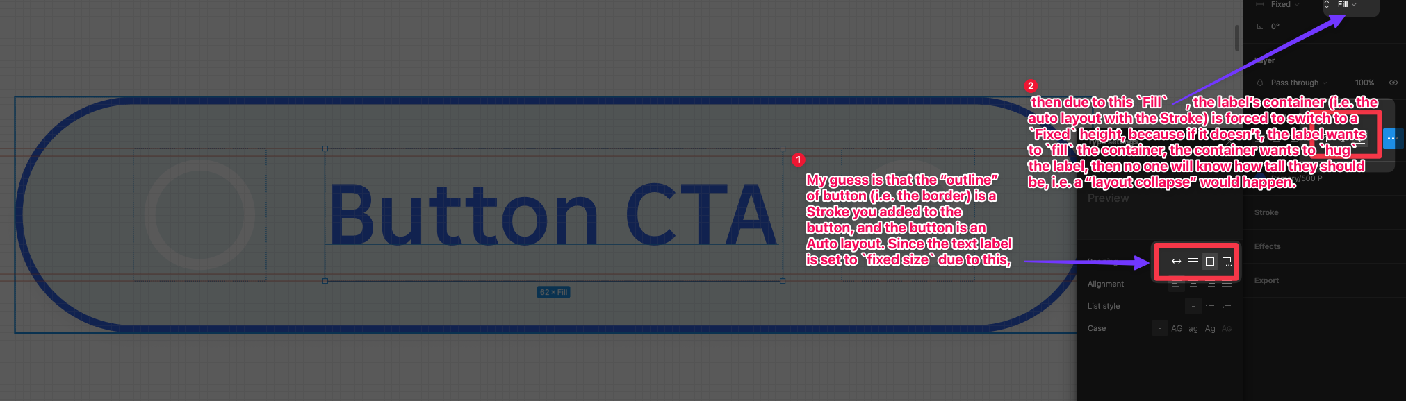
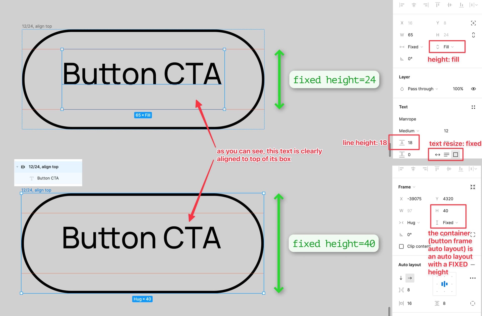
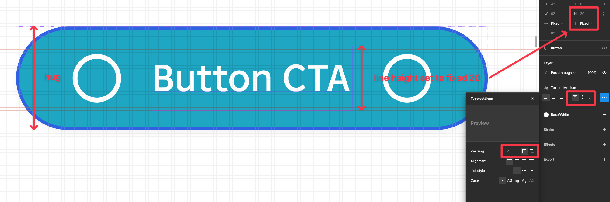
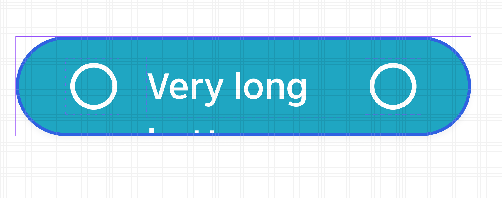
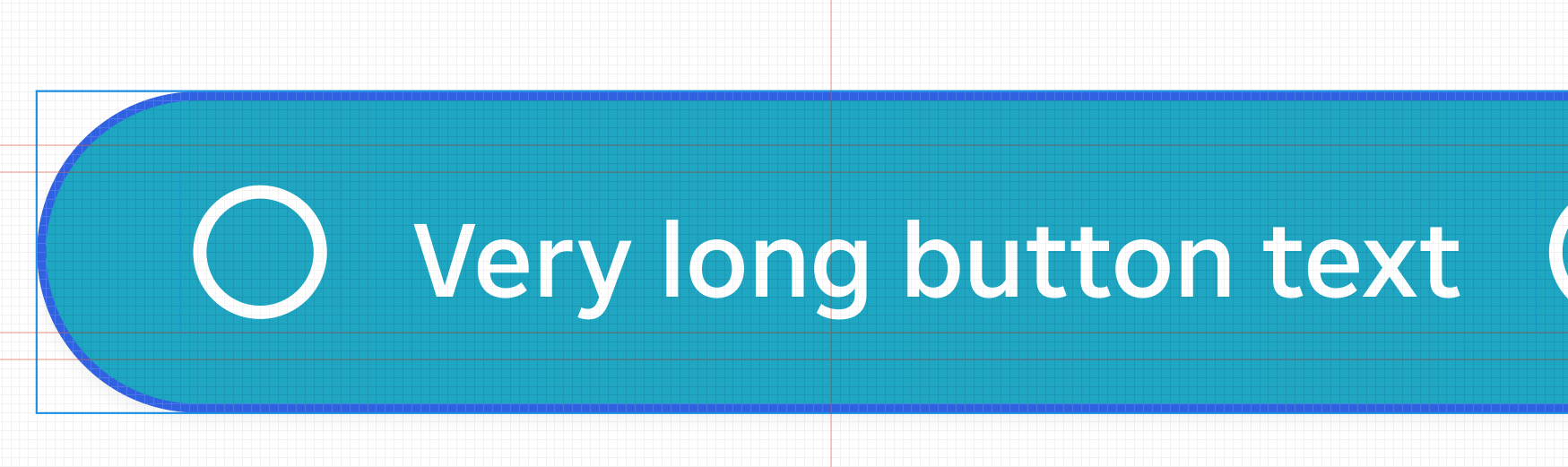
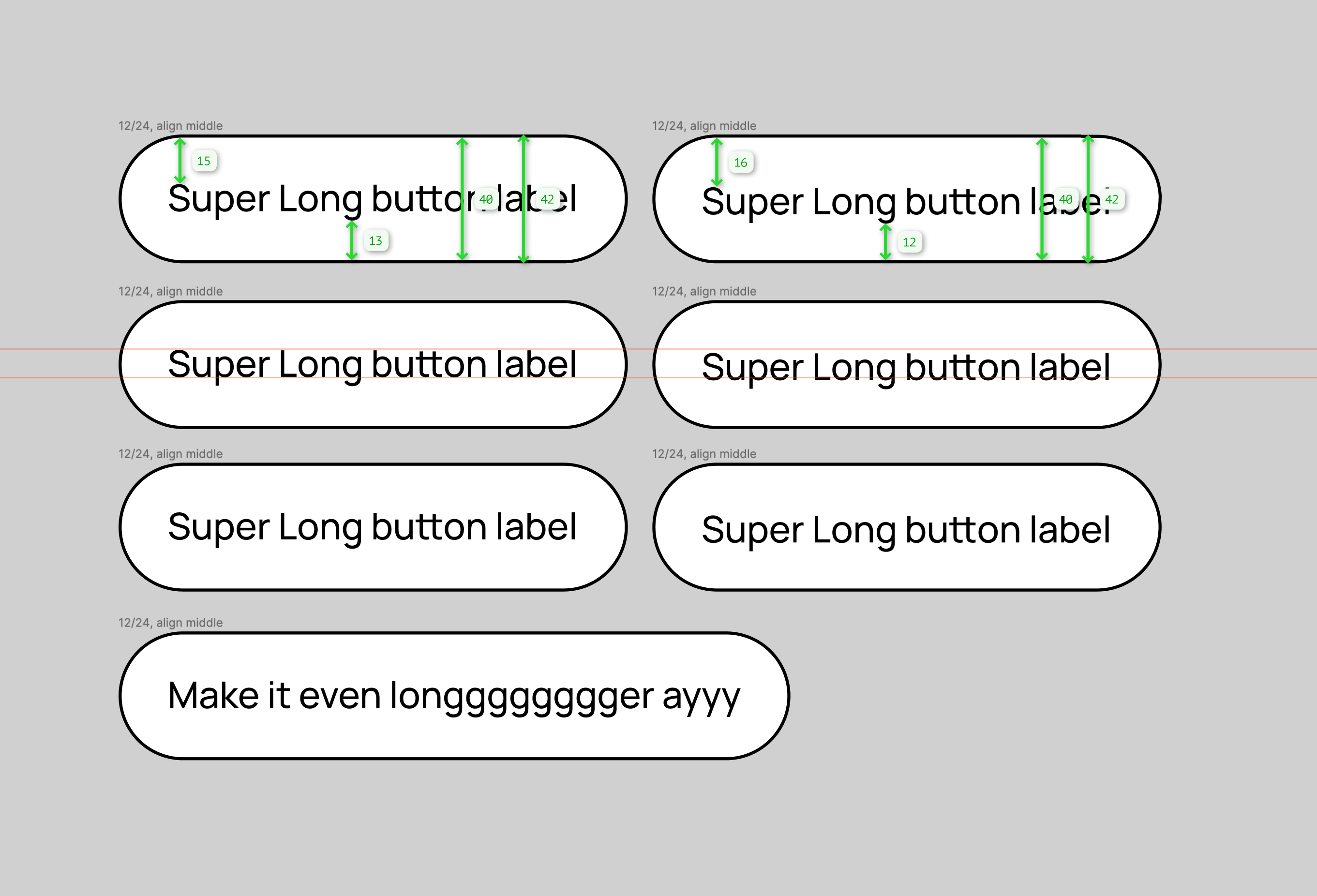
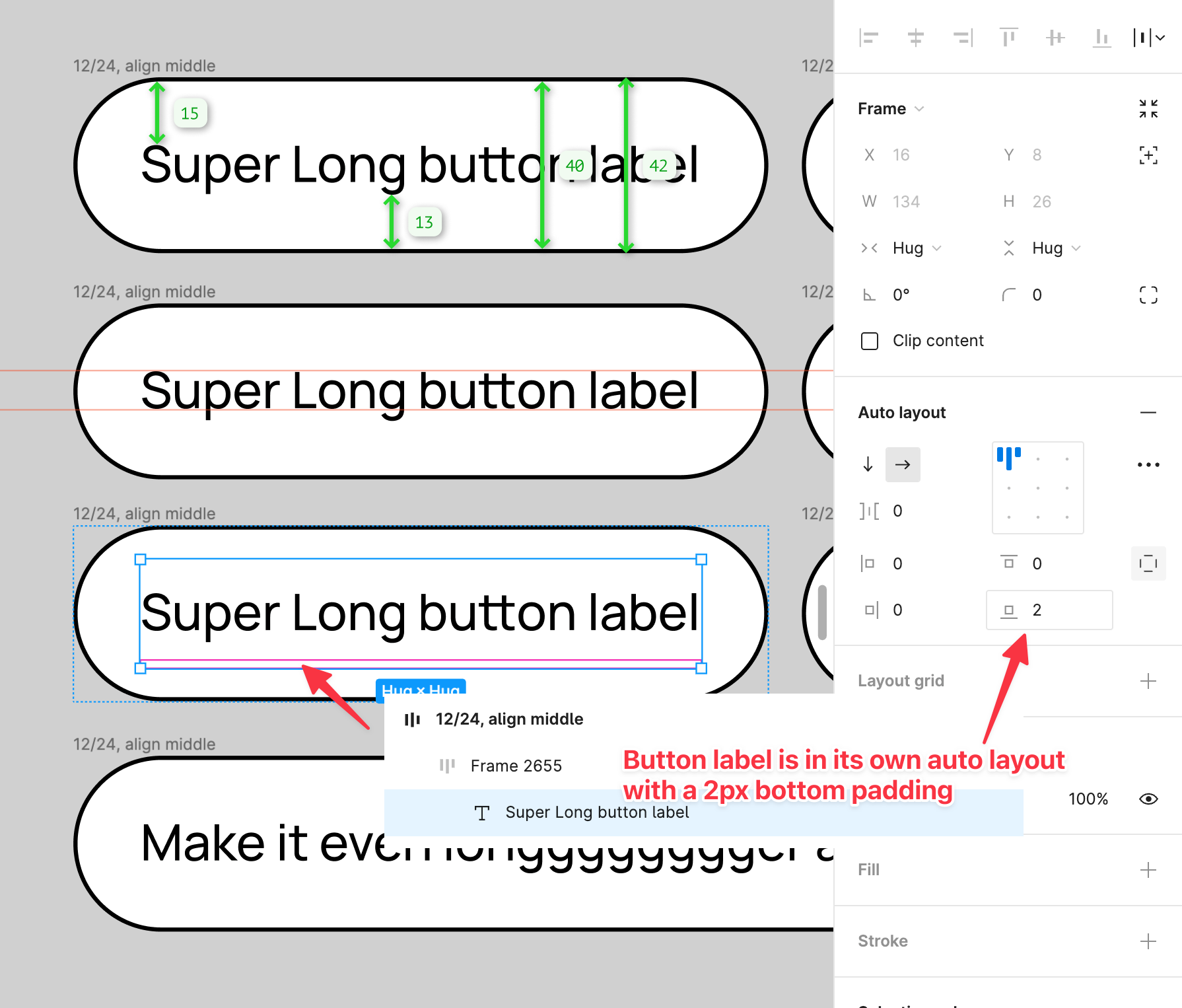
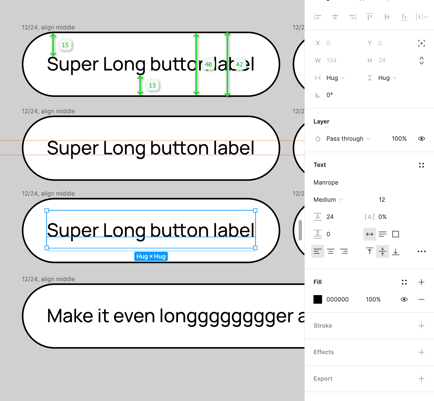
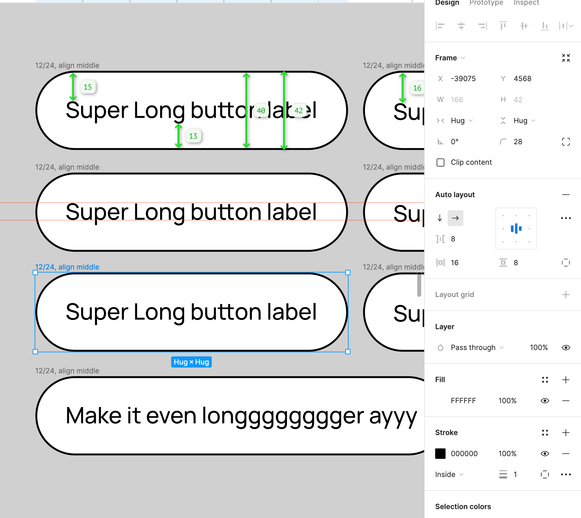
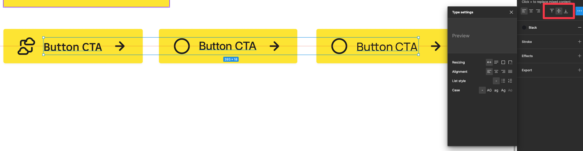
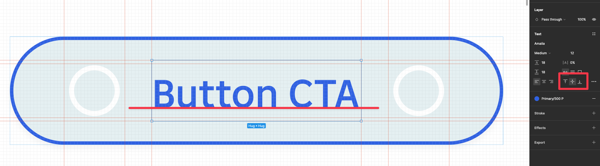
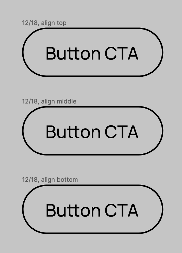
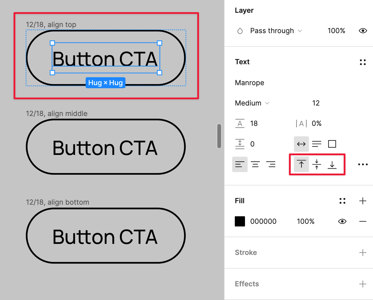
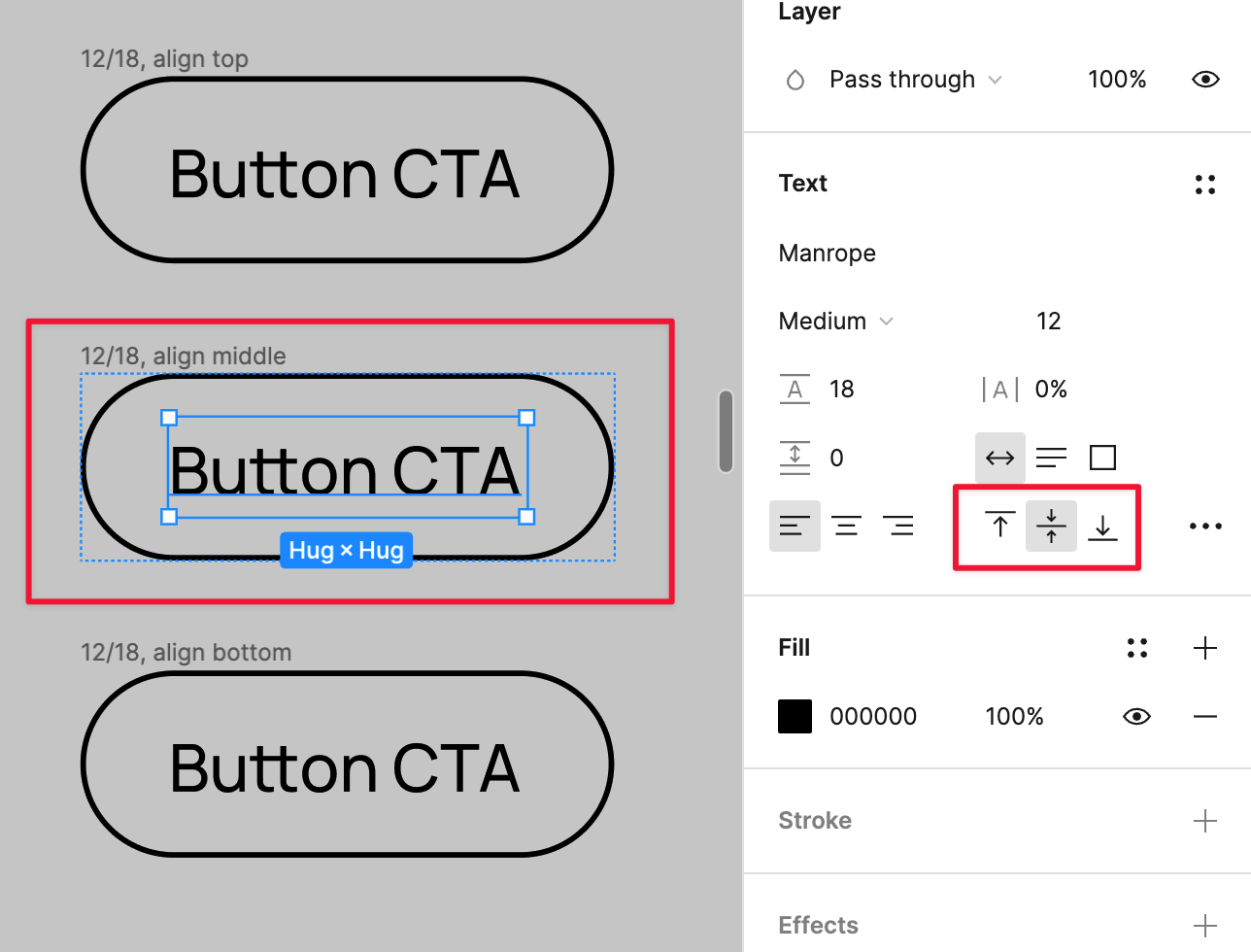
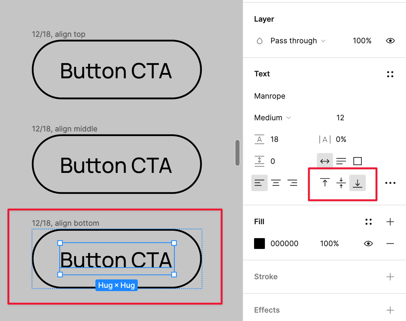
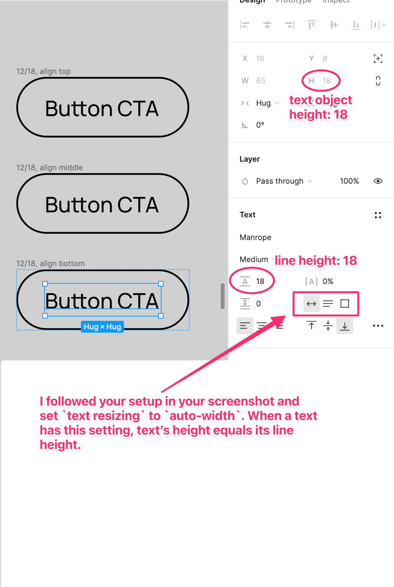
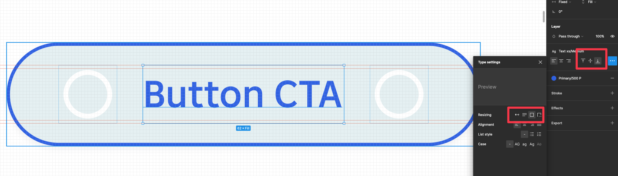
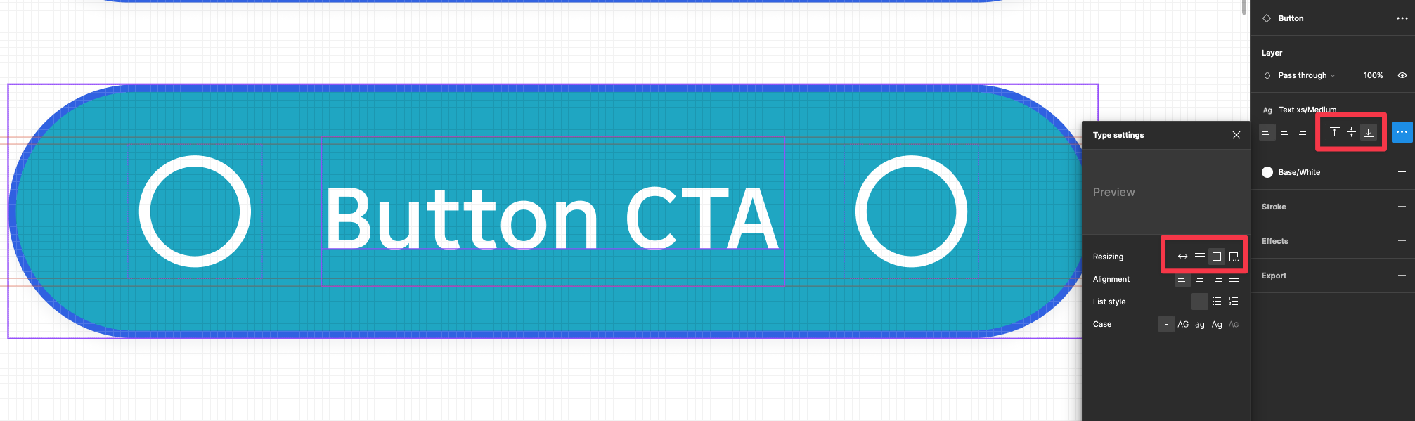
Hey, I noticed a line height problem in one of the components. Regardless of the selected option, the line position does not change. Have you encountered a similar error? Is it a bug on the Company side or more of the font itself?

would you mind posting screenshots of how the button looks like with the other line position options selected?

The problem is that it looks exactly the same. Nothing changes

I tried replicating the button you are working on.


The three of them are exactly the same except for the text alignment setting. As indicated by the frame name, first one on top has the label text set as align: top, middle one has align: middle, and bottom one has align: bottom. See these screenshots:


And you look closely you will notice that these three buttons look all the same. No difference. The reason why this is happening is:


Basically, since you selected auto-height, the text object’s box is exactly the same height as the line of text, therefore there is no extra room for the line of text to align to top or middle or bottom.

Thanks for your time. Your tip allowed me to approach the problem a little more broadly but this is stupid. I took into account what you are talking about and did an experiment.
I enlarged the line height to 20 px as you mentioned to give more space.

And this is the result with a simple object with auto layout. You can see that the text is centered but with the “align bottom” setting:

But if I make exactly the same settings to the auto layout object which is already a line height component does not change

I checked how line height behaves with other components (larger buttons) and here visually it looks good despite the old settings

To be honest, I don’t understand

1 Like

Not sure if this explanation is helpful (it is very confusing, I even got confused when I was writing this), but this is how I understood this situation.

You mentioned you set the text object height to a fixed 20 to further isolate the issue - I did the same thing, except I used 24 instead of 20, just so I could see things clearer and more obvious. I got this result:


To add to this screenshot - I achieved this by having a button that was

  • label: auto height
  • button frame (auto layout) - height: hug

then changed it to

  • label: fixed size

then the button frame (auto layout) automatically changed to fixed for height.

I tried a few more options looking at your screenshots. What worked (visually it looks good even though the aline is set to top and in my opinion it should be to center) is to set the whole component to hug but the text object to fixed and 20 px.

But it generates another problem. When you enter text into the button, it wraps down instead of expanding the entire element

If I set the object so that it behaves appropriately (Expands depending on the length of the text in the button) the height line gets dumped again and we are back to square one

1 Like

hmmmmm, I see what you meant. I’m afraid this cannot be addressed with text vertical alignment and resizing alone. I was assuming that what you are trying to achieve is to have the button label visually vertically centered, even with upper-case letters and the descenders / legs (see here: Anatomy of a Character - Fonts.com | Fonts.com).

So I got a bit creative here -


In this screenshot, the third row’s two buttons are identical dupes of the two in the second row - the second row has guides over them so I thought I would put a pair of dupes below so you could see better. Is the first one in the second/third row how you want it to look?

More on how I achieved Row 3, Button 1:

This is how the button label was set up inside its own auto layout:

Then the button frame.

The Make it even longggger ayyy button used the exact same setup as Row 3, Button 1. Not sure if this is what you want to achieve…

Thanks Jessie a lot great work here! It seems to me that the problem is more on the side of the font itself than Figma. I made a simple example of some other buttons with different fonts

As you can see, in each case it gives a different effect despite the fact that the settings are the same. I also noticed that an auto layout object that is not a component behaves a little differently than one that is already a component

I wrote to Figma support, if they write me something I will let you know

1 Like

Thank you too! Hopefully the time and effort we invested in this get you a satisfying solution =D

1 Like

This topic was automatically closed 30 days after the last reply. New replies are no longer allowed.