Here with the same request!
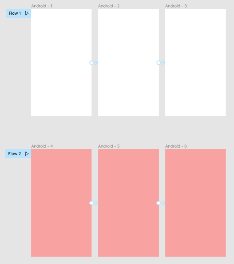
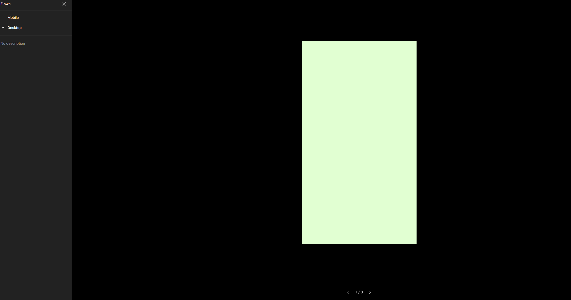
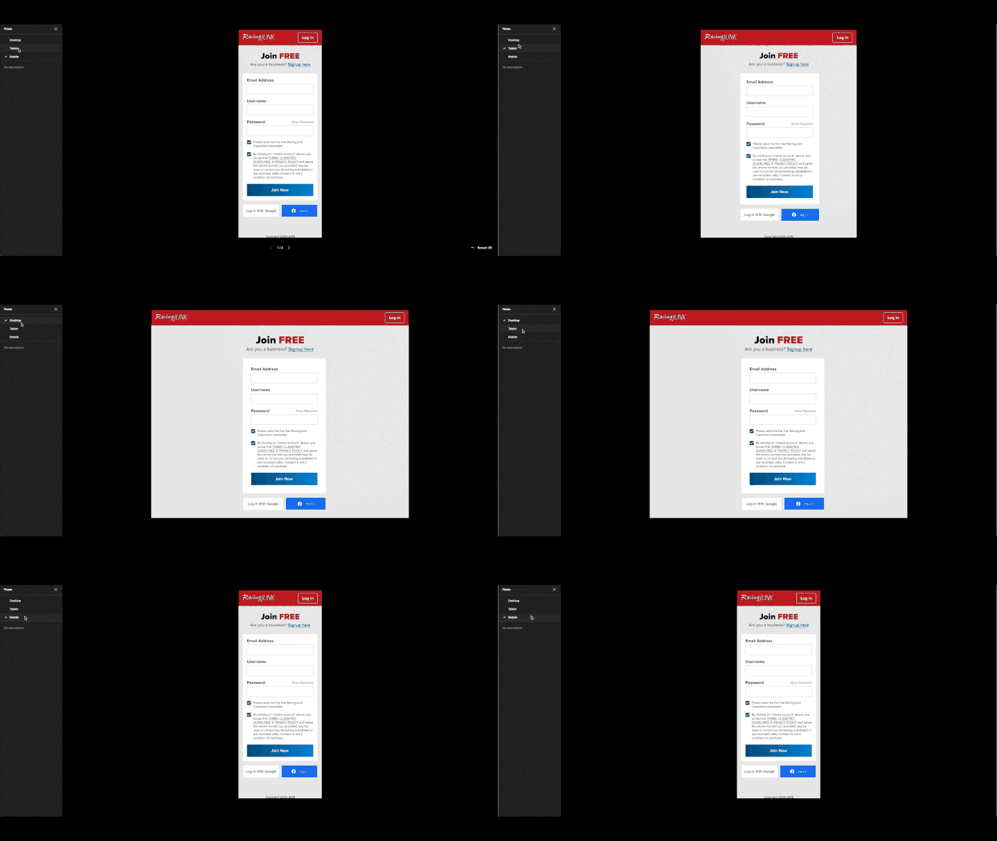
My use case: within one file, I have both mobile and dekstop flows. I’d like to be able to have a distinct link to each flow, which opens them up with the correct UI (eg Macbook or iPhone) wrapped around the designs.
Here with the same request!
My use case: within one file, I have both mobile and dekstop flows. I’d like to be able to have a distinct link to each flow, which opens them up with the correct UI (eg Macbook or iPhone) wrapped around the designs.
So need this feature!
+1 Really-really need this, since some pages in my app need to be demonstrated in landscape while other only exist in portrait.
May be when the prototype device is set to a phone or a tablet we could assign ‘orientation’ to frames, so that the device could rotate depending on the frame…?
PLEASE, Please, allow us to have both Mobile and Desktop designs in the same page, and set prototype devices per frame, not per page!
+1 still would love to have this feature! Our company likes to have mobile and desktop mockups on the same page for our developers to easily compare them side-by-side.
Currently, our workaround solution is having three pages: one with the internal-facing side-by-side page, one with a mobile client-facing pres, and one with a desktop client-facing pres. We have to make the internal-facing frames into components so any changes are reflected on all three pages, which feels like a hack for a common issue.
It would also be great to be able to change to prototype settings per flow (eg. fit width for desktop, actual size for mobile).