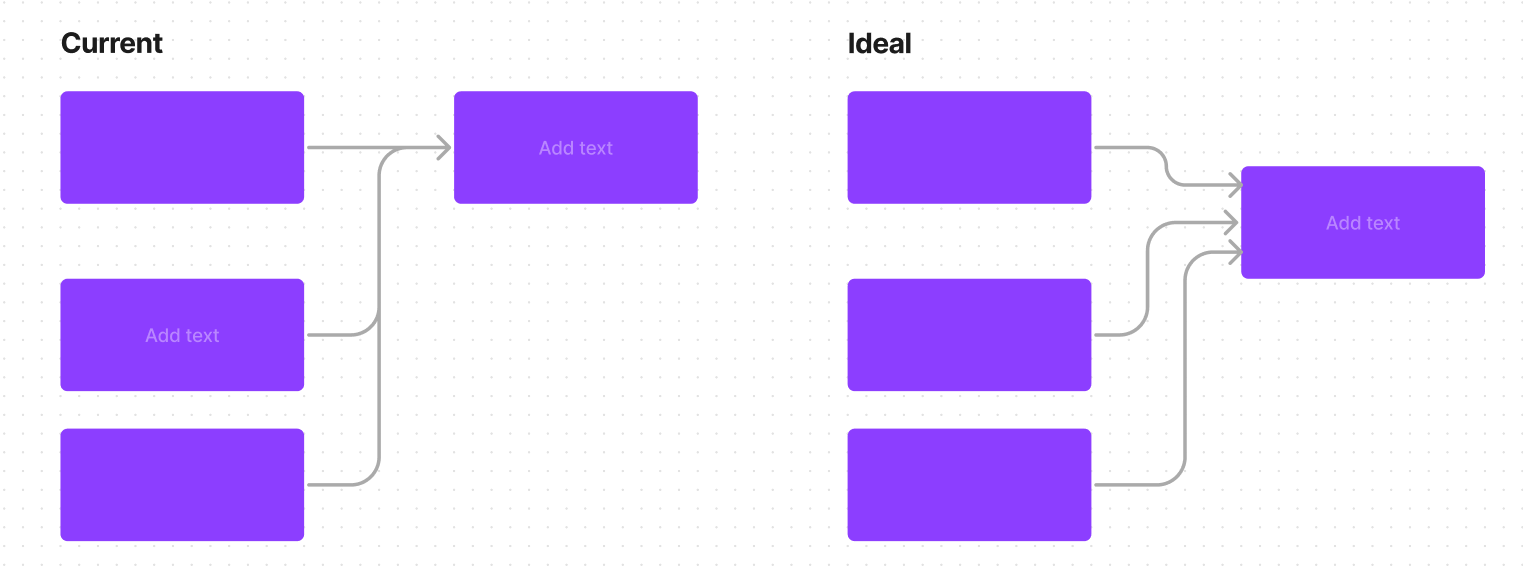
Often when mapping out user flows, I have multiple connectors terminating into the same side of a shape (fig left, “Current”). It would be a lot clearer if I had the option to show all the different connectors individually (fig right, “Ideal”) without having to zoom in, adjust the connector terminals while also avoiding snapping to the center point, and then having to re-do it all over again when moving the shape).
This would also eliminate ambiguity about connector direction when both “incoming” and “outgoing” arrows are on the same side, or some of the flows are bidirectional and some are unidirectional.
Prior instances of this same challenge being reported

