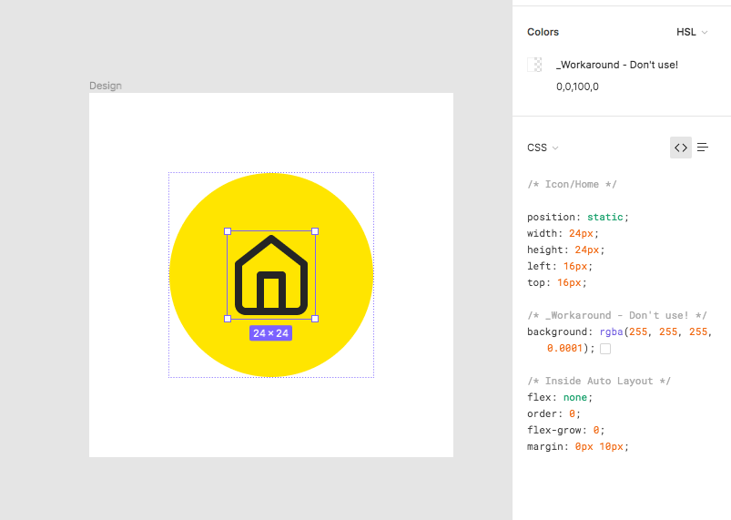
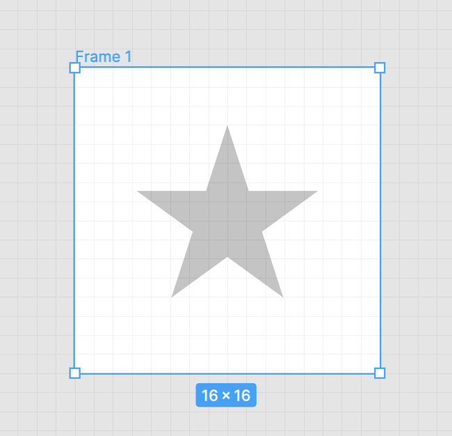
I think this goes for designers using component libraries as well. So for example, in the Microsoft Fluent iOS library, if I click this progress indicator, it selects the child layers (the grey bar OR the blue bar) but not the entire component by default.
Maybe this is just a difference in muscle memory I need to get used to still (from, say, Illustrator which always selects the Group first and then you can continue to double-click to delve deeper into the hierarchy), but I find it far more common that I want to move/copy/select a full group/component rather than going to the bottom of the ‘depth’ to grab the deepest child object.
For designers deep select works the opposite way so you would select the group first unless you hold Cmd/Ctrl. File viewers can reverse this too: they can hold Cmd/Ctrl to select groups before contents.
By “designer” do you mean an editor vs a viewer? That may be true, but at a large design org I won’t have edit access to all files, so therefore I (a designer) only have view access and it appears to be depth-first.
It would be great to be able add some special symbol to layer name to resolve this issue (*layername)
1 symbol added by designer - 1 pick for developer. No more mistakes and stretched vector shapes instead square icon
We’ve transitioned from Sketch to Figma too, and are slowly moving things away from Zeplin at the moment. Maybe its a designer thing too, but I was testing out this issue and had a similar problem, that I only want a developer to be able to click the top layer - especially when I’ve dragged in global icons from our library. Just something that we’ll need to train our devs on if they don’t know already.
What is also slightly annoying on top of this is that marking an icon/layer for export in your global library does not mark it for export in your working file. So you have to still go through the trouble to marking them all again.
When using cmd+click to deep select an element the deepest element gets selected. This is less than ideal when using a fleshed out design system with complex variants as a lot of the time you will select a layer inside of the component and have to move up the tree to select the actual component.
Aside from being annoying in general it also means that consumers of the design system are more likely to set manual overrides instead of utilising the provided variants as it’s easier to miss variants if you happen to select the wrong layer.
It also makes it harder for devs to select the correct component when inspecting.
The logical solution here would be to make it so that locked layers aren’t selectable through cmd+click (they already aren’t), but have the component remain selectable. Allowing for this flexibility would be very helpful for selecting the correct elements with the fewest amount of clicks.
Does anyone have another good solution for this that I’ve missed?
To add to the discussion… I find that it’s fine, and I can click a component though the cmd selection, and then cmd + shift (repeat until necessary) to get the parent component… However, when I want to select five more of the same component and move them / align them I can’t just select the parent component. This is seriously hindering my productivity. Why can’t I just select the same component, from different frames?
Yes, same problem here. We are trying to teach our client to use a complex design system with many nested layers, and there’s no way to easily get to the container that allows you to switch the variant without command-clicking and then navigating back up in the layer tree.
It would be great to be able to switch off ‘Direct deep-select’ for certain layers.
I have the same need, I find that the current viewer setup is better suited for organizations that lacks an established design system (or a more loosely defined system).
My developers always complain that it’s hard to find what actual components were used as they constantly find themselves selecting shapes instead of the actual components that they’re trying to implement.
(Actually, I would say that Sketch handles strictly defined design system components better with its more rigid and configurable controls)
Thanks for replying!
Yes, sort of. But I’m not sure it would be enough if only preventing viewers from selecting content of a frame.
In our case, we frequently use frames to distinguish different modules and label editable areas. So there’re going to be multiple layers of frames. Developers actually need to be able to select frames to check the margins between a frame and elements within, as well as select elements within a frame directly.
We tried: 1) pressing ‘cmd’ while selecting. But as suggested in your link, it’s still a bit confusing; 2)add a transparent layer. But it won’t allow us to apply auto layout to the frame anymore if another layer exists.
Changed the topic title to make it more clear as I think this all is pretty much the same problem just in different contexts. Feel free to add your vote.
why is there a difference between what I, with a creater account, can see when I click on a component/element and what a developer sees with his viewer account?
A dev clicks on an icon and only gets the inner shape of the icon, but not the relevant bounding box for correct measuring. He needs to click every time on the small “parent component” icon to get the correct size, whitespace, margin.
Why? If you want this to be an option, at least make it a permanent switch. Otherwise the work of our developers gets messy and takes longer, also to many design reviews.
Hi Gleb … this thread is not solving the issue. Just make the same view/inspect ability for the viewer account like the creater account has. It is not about the ability to download the icon correctly, it is all about the measuring.
Same here,
Sometimes using components, the element have more layers.
And when viewer want to select he sometimes selects other elements inside & wrongly export them. Maybe some Lock export icon added to layer. So if parrent group is locked everything under it can’t be selected.
Also this is same for measuring, separate lock option for measuring so it won’t be confused for a viewer what is correct element he need to measure values to, especially when we are using more advance components, variants, etc.
I think the one issue I find with this solution is that we have devs designing for different platforms, and they need different asset types. We’d have to provide each platform its own file type (SVG, PNG, PDF). When an iOS dev uses the Export panel for example, there’s no way for them to filter down to the file type they need. They have to download all file types or spend time unchecking the ones that don’t apply to them.