LAUNCHED: Fixed panels are back!

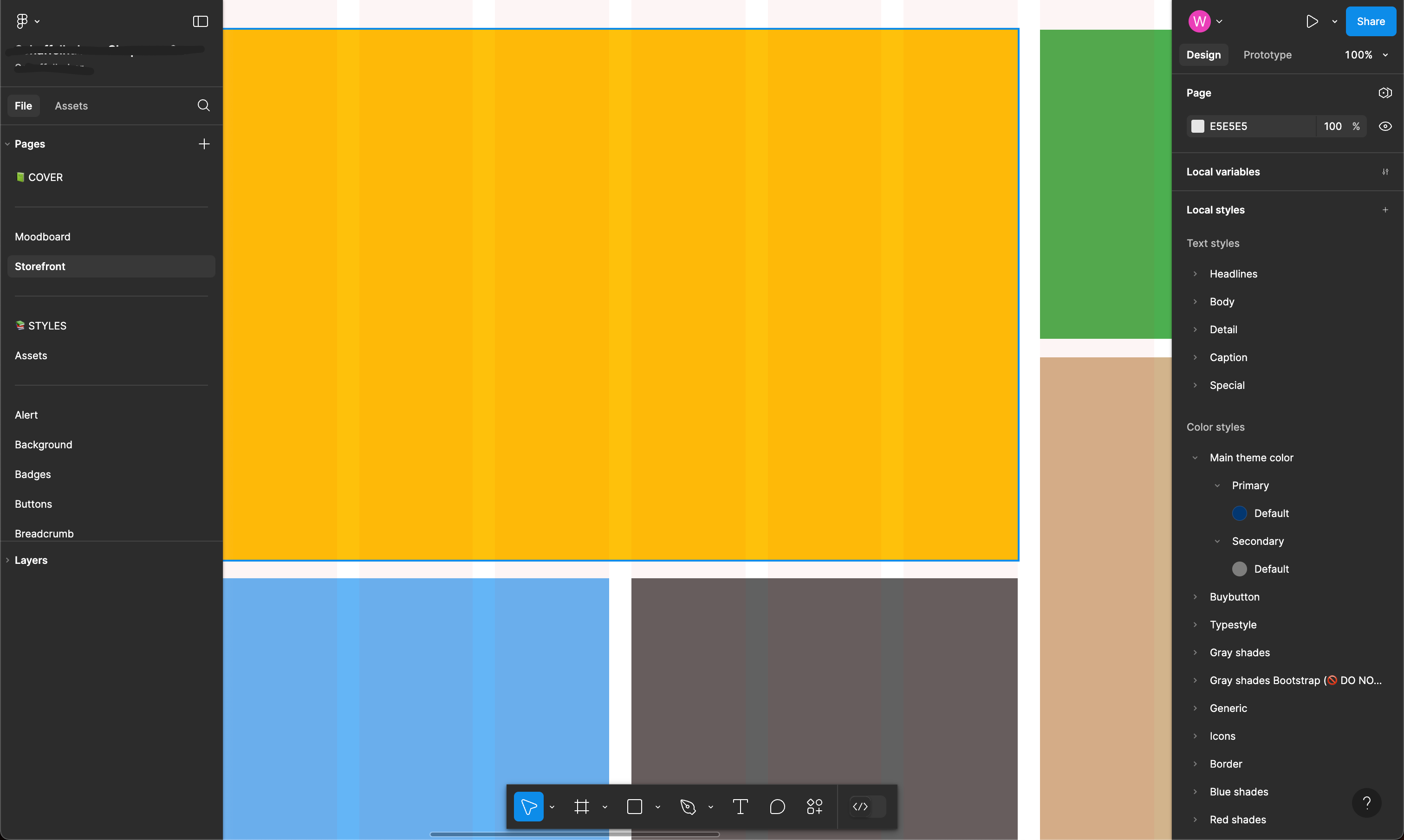
Floating bars with rounded edges are only aesthetically pleasing, but they add an annoying border between the tools and the window, creating annoying elements for the view that peek out from the edges. Lessi is more, remember? You seem to have copied other systems such as Miro or from your own FigJam. Truly, this choice is terrible, adds nothing of value and really worsens concentration and vision. Figma must remain a technical tool, not a video game. It must have the canvas CLEAN, without things popping up here and there from the edges of the windows. This thing doesn’t even look like it was designed by UX/UI professionals who have to work with software. It is really disturbing to work with something like this. Please: go back or at least give (forever) the option to use the old version (which is NETTLY better) with the exact same tools and functionality. Thank you.

19 Likes

Agreed 100%.

One of my biggest gripes is getting distracted with movement in the corner of my vision every time I move the canvas around, just because it looks cool to have “floating” panels.

6 Likes

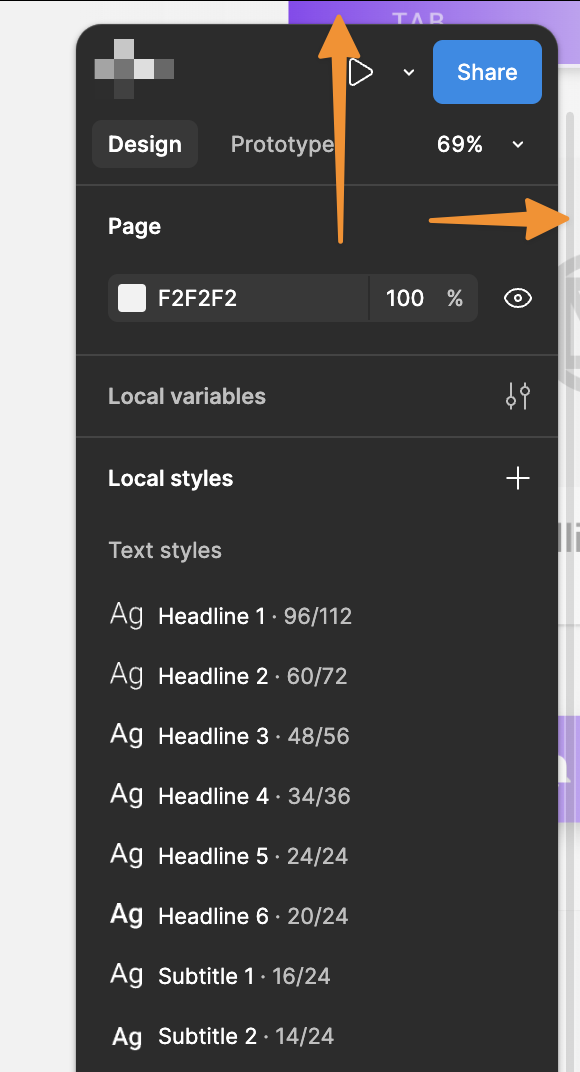
I’m unsure why we need both floating panels on the left and right. The scroll bars are currently overlapping the UI, particularly noticeable in the right panel. It would be beneficial to allow users to choose between floating or non-floating panels. Placing the scroll bar within the side gap of the right panel would prevent it from overlapping with components. Additionally, the vertical ruler is positioned too far from the artboards, requiring users to drag it over the left side panel, which is inconvenient for me.

The gaps could also trigger events for neurodivergent users as the parts of the UI flash in the gaps when scrolling the artboards.

15 Likes

Thanks for the feedback, @Mike_Hone!

This is already on the UI3 team’s radar for improvement.

3 Likes

+1 to this. It’s visually noisy and it wastes space.

Immediately spent 20 minutes trying to find a way to turn it off.

+1 to this too - thank you.

This is incredibly distracting and is wasted space - please remove the gaps and fix them to the edges.

1 Like

Agreed, the floating panels are very annoying and aren’t saving any space either. There is an annoying padding where design work peaks through and takes more time to work out where the edges are. The sticky panels on the left and right where much more inline with efficient complex application based UI which is what is required here (in my view). Also having the main controls on the bottom while the tab bar to navigate between files is on the top. I have found the need to continually move my eyes and cursor between the top and bottom of the window, whereas before all the controls and navigation where at the top in one place. After a day of trying the beta I’m moving back to the one UI. I also don’t see need for rounded corners either in this instance, it seems Figma are trying to unify the FigJam and Figma UIs, but I much prefer the efficient use of space and more concise UI in the previous version.

1 Like

Totally agree. Additionally hiding/showing rulers makes the whole ui move. toolbar should be movable or you should be able to choose if you want it at the bottom or top.

Agree !!! We’re designing on webapp not mobile. This version is totally a copy of Webflow canvas.
Floating edge, space, these are really annoying and time-consuming. Please revert the old version

:melting_face:

Just left feedback about this too. Terrible. Navigating layers was already fiddly with my screen size (I’m using a laptop), now even less screen real estate for my panels, and a bonus distraction with the edges flashing small bits of my designs as I pan around. Super distracting and feels like design for the sake of a redesign.

2 Likes

Agreed - they looked great on the pre release as a concept but in reality they’re a waste of space, with the exception of the tool bar at the bottom.

The only way this would make sense is if the panels were dynamic in some way - either shrinking or skewing perspective to save space when not in use and becoming active when you hover/move toward them…?

Something like the Mac OS dock hiding :ok_hand:

2 Likes

UI3’s floating panels feel like an attack on my workflows. I want Figma’s UI to be as compact and dense as possible, allowing my work to take up the rest of the space. I’ve already reverted to the old UI, but encourage you to adjust these floating sidepanels before rolling this out to everyone.

2 Likes

The new floating panels waste so much design space, the gaps between them and the edge of the screen are now wasted…

1 Like

Hey All, thanks for the feedback and apologies for the frustration!

This is already on the UI3 team’s radar for improvement - stay tuned!

4 Likes

Respectfully adding my vote here. I’m not sure if there was a practical reason for it, but I agree with @Alan_Bauchop’s points. I find it adds visual noise / distraction at the periphery of my vision as I work on the canvas.

+1 to this, or allow the users to snap it in place.

+1

  • Removing the padding feels like a no brainer.
  • Gray font on gray boxes reduces contrast (this is no longer even WCAG level-AA conformant - this deserves a separate post)
  • And are we using a smaller fonts to make up for that added padding?

New is always tough so I’m prepared to sit with things for a bit and hope this feels better soon but, on first impressions this visual update legitimately hurts my eyes.

1 Like

I don’t get it why do we need that padding around panels? It’s a copy of Spline which is also bad.

I run dark mode for the UI but the background of my canvas is bright due to reasons - this makes the gap stand out so much that I quickly reverted to old UI. Its unbearable.

1 Like