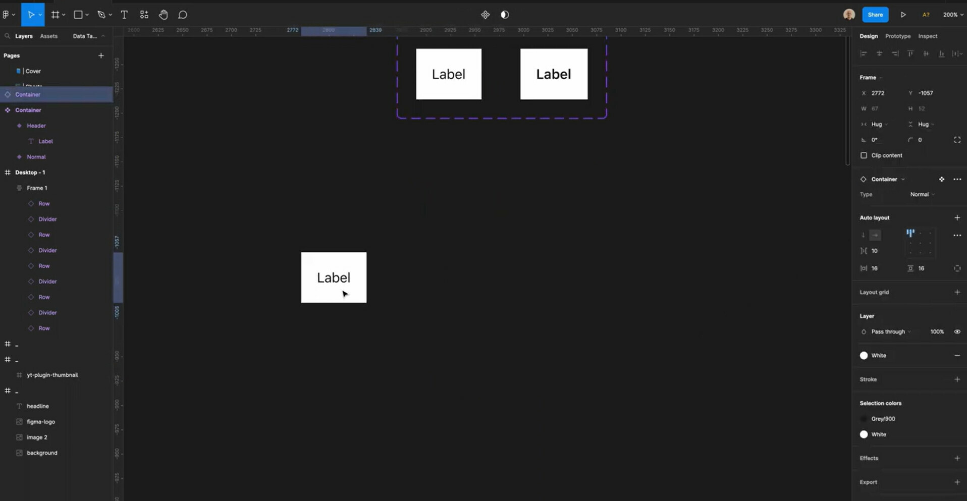
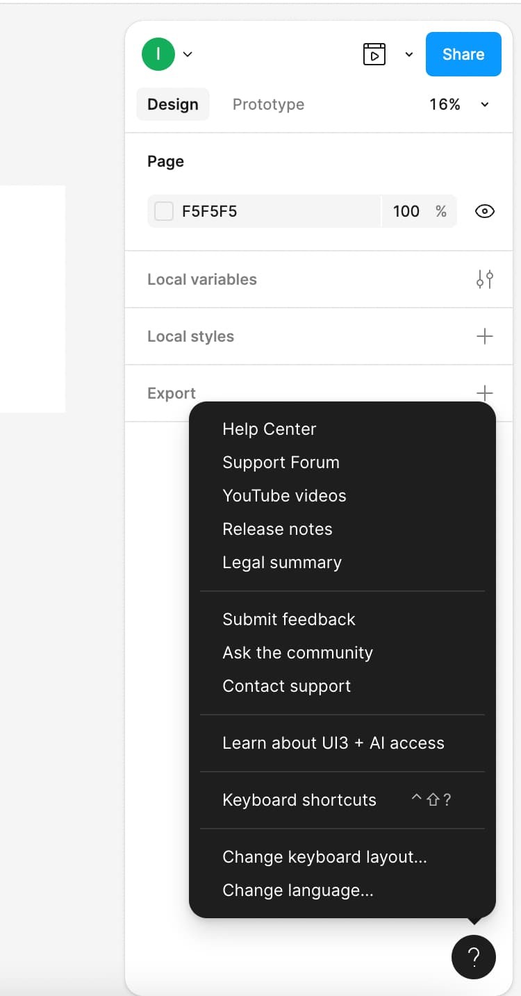
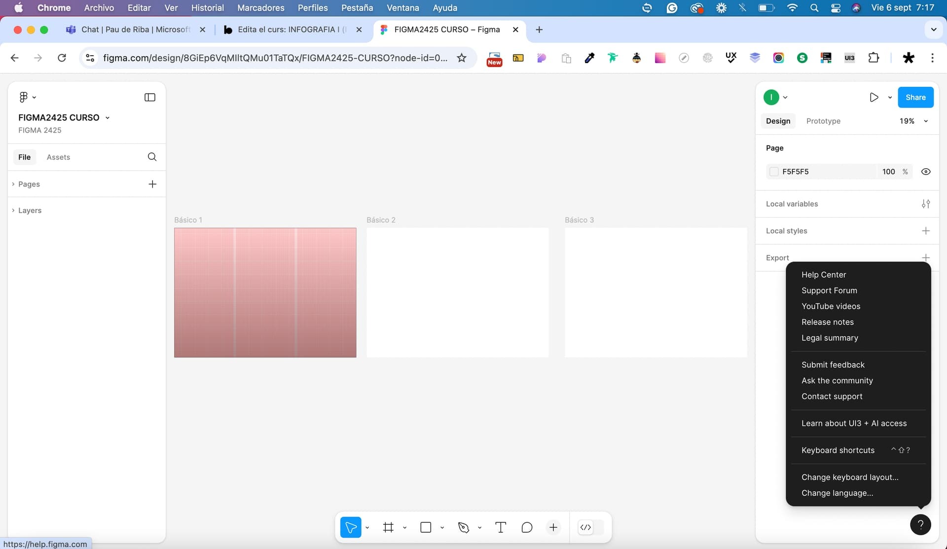
Hello, I would like to change the view. Currently, the editing toolbar is located centrally at the bottom of the screen. Previously, this toolbar was located at the top left. In the old view, the options such as “Create Component” etc. were also at the top center. How can I switch back to that view? I am still learning from older YouTube videos, which is why the new view is a bit confusing for me. Thank you!
What you call your “view” is called UI3, Figma’s redesigned UI
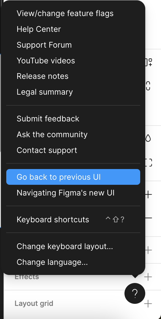
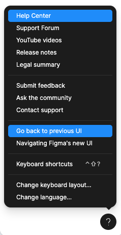
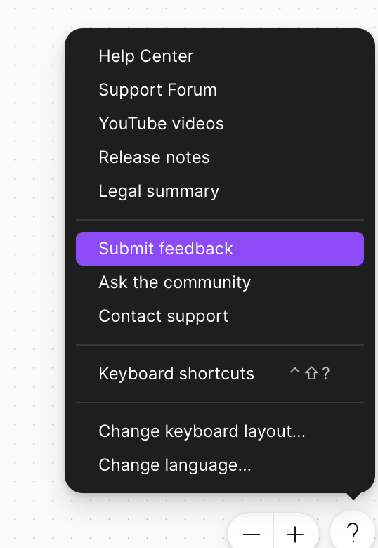
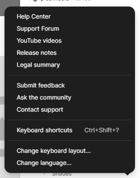
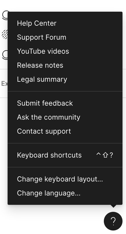
To switch back to the old UI, Click on the Round button with a “?” on the bottom right (It isn’t visible in your screenshot, but it’s below “Export”.)
Click that and then select “Go back to previous UI”.
Thank you so much! Very much appreciated
Thanks for helping out here, @Bauke_Schildt!
Let us know if we can help with anything else, @Jacob_Struck!
Hey @Grigory_Uglanov, sorry for the confusion!
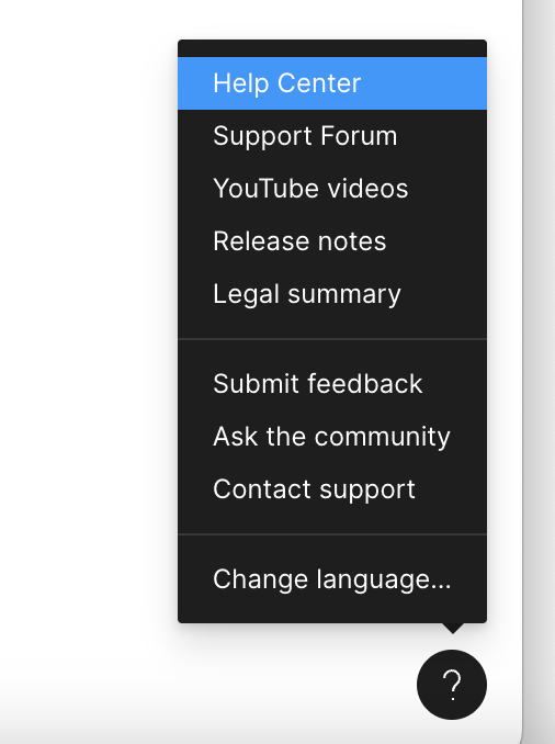
You can’t go back to previous UI within a FigJam file. You need to access the Help Menu “?” in a Figma file to see the option.
Hi, I do not have the option to go back to old UI. I’m on a new company, working on their account and I need to finish a design in some hours and I was not expecting to learn Figma from scratch here, because on my personal account, I still have the old UI. Anyway, things are not looking good, too many changes at once, a lot of things are now hidden.
I need to return to old UI as soon as possible.
In the following section, the same problem was addressed as in my case. Maybe you will find additional tips and assistance there!
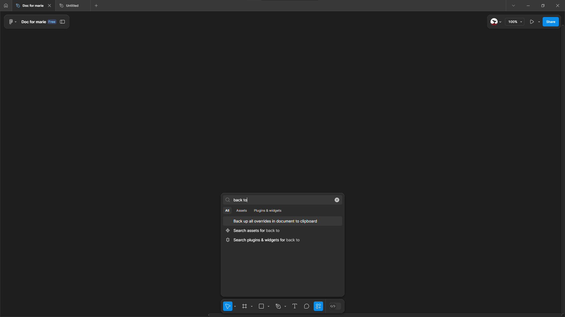
You could use "command + / " and type keywords “go back”, then a toggle of "Use new UI "will appear, just turn it off .
Hello, I have a question about this. Will the option to switch back always exist? Will Figma eventually do away with the old UI and will all users subsequently have to use the new UI?
Thank you so much for answering this! I hate the new Figma UI I wanted the old back!
Can you help me, I want to update Figma to a new version, how do I do this?
Hey @Olga_Kuznetsova, thanks for your interest in UI3!
We’re currently rolling out UI3 to all Figma users and will continue to do so incrementally. Our teams are working towards our goal of ensuring that 100% of our users have access to UI3 in the coming months.
We’re unable to provide a specific timeline as we want to ensure that we can maintain a high quality of service and experience for our users. By taking this approach, we are able to closely monitor the performance of UI3, gather feedback from users, and make any necessary adjustments before expanding access to a larger audience.
Hi, is there a way to ever prevent Figma to force me to use the new UI? Because the new UI is very bad, I’ve used it for some time and useful stuff is hidden, there is no contrast, floating windows are pain and take so much space instead of being on edge of display, it’s required to click much more to get basic things done. Feels like the team who redesigned the UI never actually used Figma and were hired from Adobe, who are famous for these “design changes”.
I tried the new UI and I don’t like it, everything I need is hidden away. I’d like to keep on using the old UI and if that’s not possible, I’d start considering migrating to another tool, there are other “Figma killers” out there, please don’t tempt me.
I created a new account for my friend, and it doesn’t have a “( ? )” button. My branding instructions for my small non-profit project are to use the old interface. It is very important to me to get it back. We’ll be moving to the new design later, but it takes time
I tried to find it, but it doesn’t work too
Oh no. Please don’t force this UX disaster upon 100% of your users. With sheer luck we avoided the Adobe acquisition because we did’t want awesome product to be downgraded. But now UI3 downgrade is being forced upon us.
At least make a poll and evaluate if it’s an improvement or a downgrade for the majority. And then LISTEN to the voices of your customers.