Hey people.
Beginner @ Figma, so apologies if I use the wrong lingo/terms.
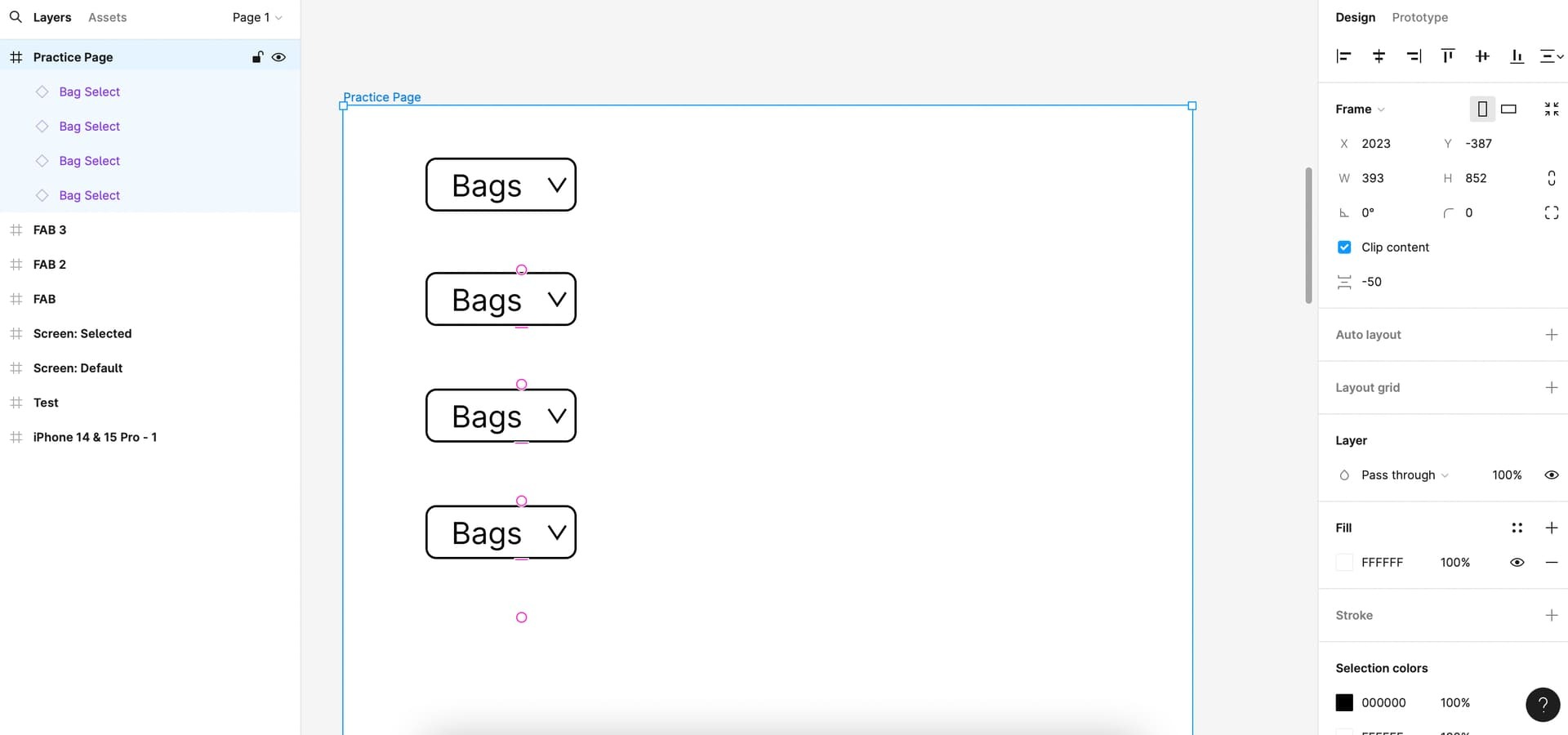
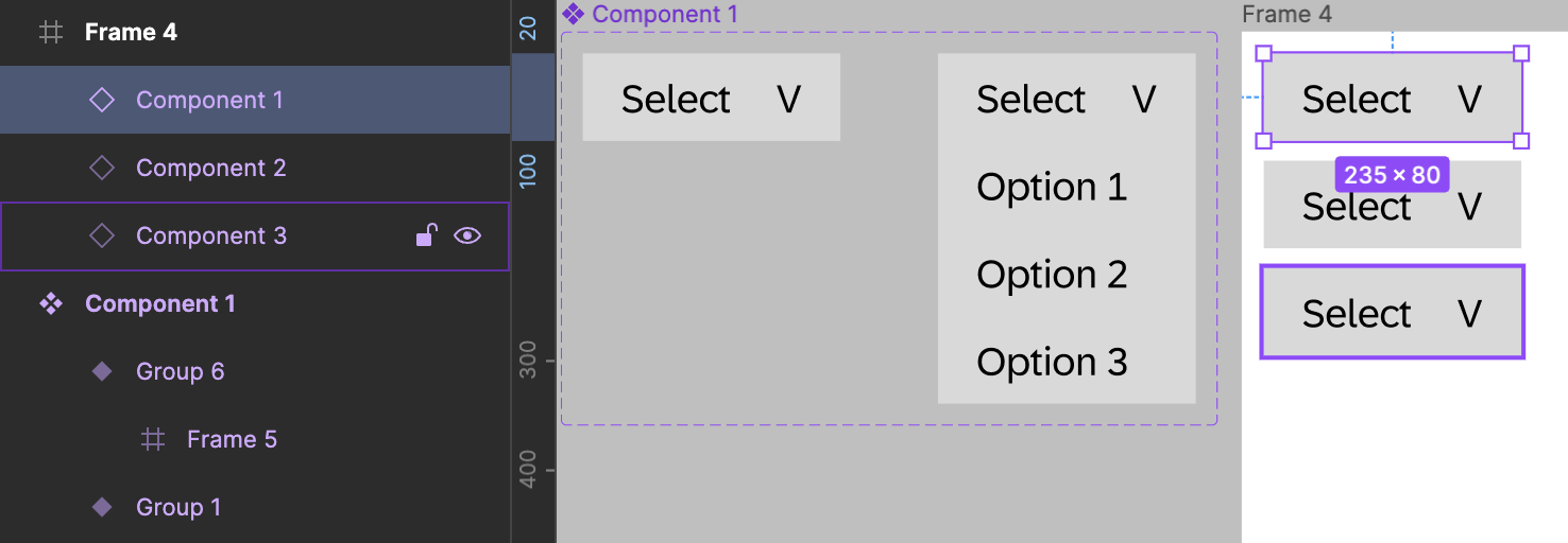
I am wire framing an app. Ive made a drop down menu (as a component with variables).
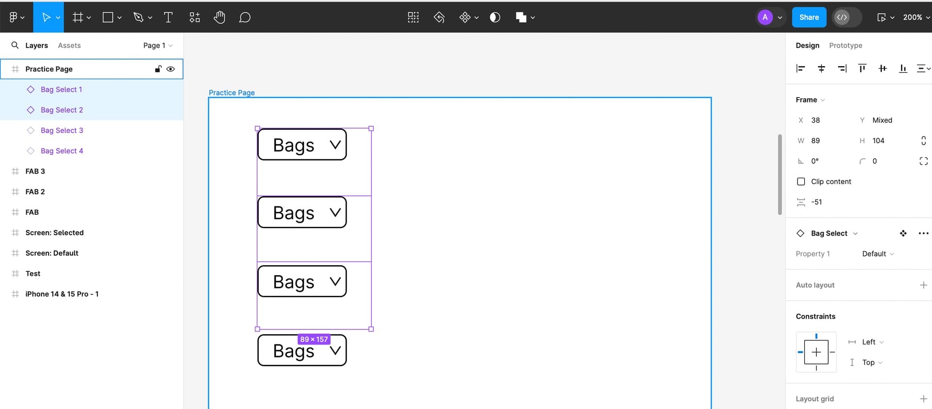
The app has rows and each row has a drop down menu; so the menus are essentially below each other.
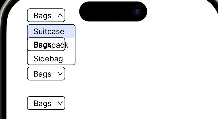
When I am Previewing the app, the dropdown menus overlap one another and the menu above drops down onto the menu below, with the words of each menu muddling up.
(Pictures below)
I have tried with/without Auto Layout, amending stacking, group/ungrouping, filling in colours etc. but can’t seem to find the solution. I have also searched the Community to see if someone has posted a similar problem but can’t seem to find an answer as yet.
Would be grateful if someone could explain, in simple/baby steps how to overcome this.
Much Appreciated in advance!
.


