Hey fellow designers,
I wanted to share my findings and ideas around building design systems and I will be really gratefull for your thoughts and the feedback
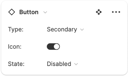
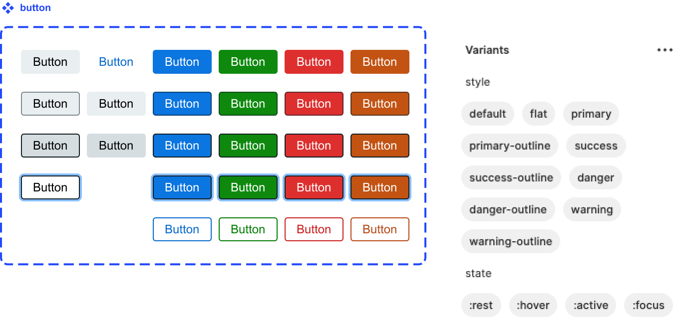
My team is about to migrate to Figma and I started the transition for our core UI kit. With auto layout and component variants everything looks amazing so far. But there is a puzzle I am yet to solve. Let’s say I need a button, something rather clean and simple to use. Like from official Component Variants playground

It turned out that with 5 different states and 6 possible variants I would have to create 30 copies for each button style. With 6 styles in mind I ended up with something very hard to maintain
Eventually I got an idea to delegate content definition to another component and keep the button nice and clean
So on the top level the button have only two properties to play with - style and state
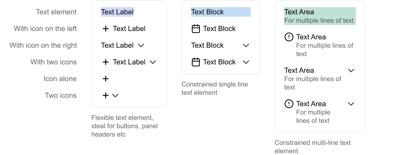
And to support all the possible content variations I have made special content component. This multi-variant component gives you a text label and optional icons on both sides
Inside that component there are two icons you can swap to anything you like or use in your team
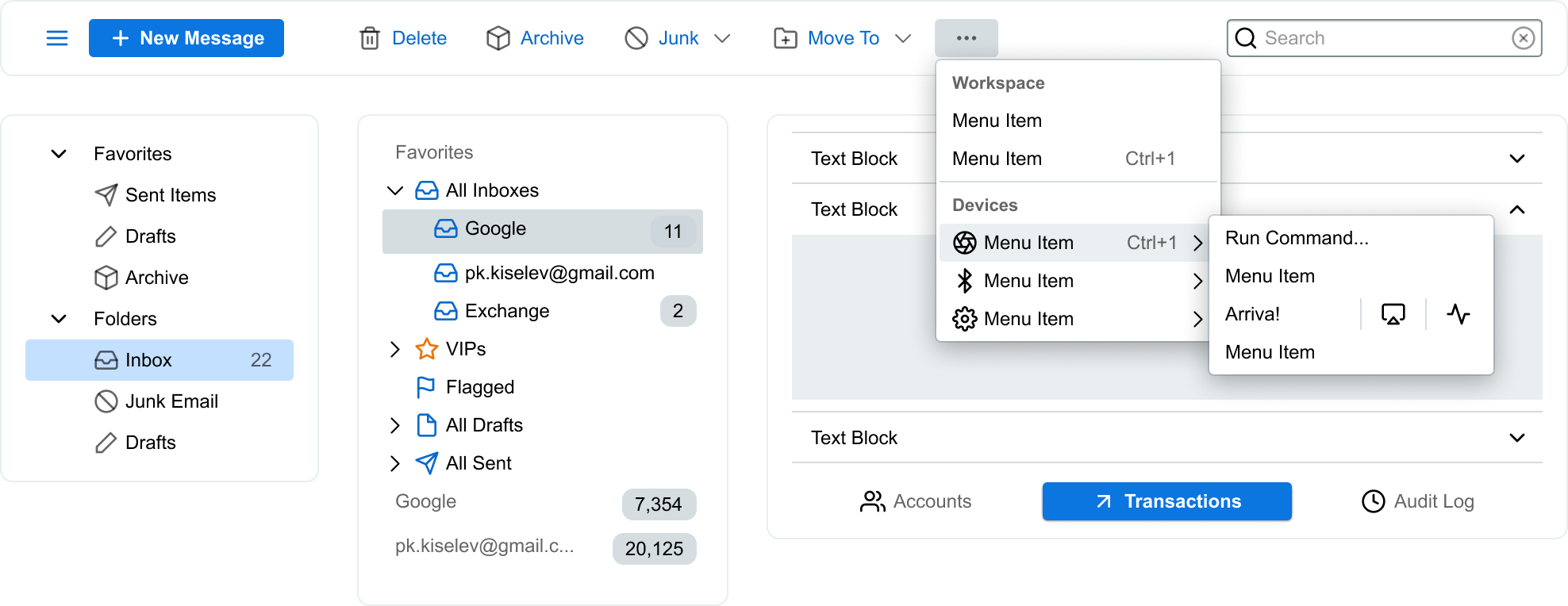
The main caveat is complexity, even in the simplies form when there is a button with text and nothing else you would need to drill down two times before you can edit the text. On the other hand I can see this element a perfect fit for variety of other UI elements. For example, form controls, menus, panel headers just to name a few. And it would work on larger scale giving the highest level of consistency possible
So here is the file - Content Component Playground
There is a button and several different content components to play with
Please feel free to share your thoughts and I will listen!


