Comments hidden by default (as it used to be)

Continuing the discussion from Comments | Hiding the Figma UI (`⌘`+``) and showing it again shouldn't also control comments` visibility:

It would be amazing having the old Figma appearance back. It’s annoying having to press Shift + C every single time I have to open Figma (I switch accounts constantly) and the comments are always there.

Figma could ask “Would you like having the comments hidden the next time you open it?” or something that would allow me to save my customizations.

Cheers and have a lovely and productive week. :+1:

1 Like

This topic was automatically closed 90 days after the last reply. New replies are no longer allowed.

During my design workflow, especially if on a single monitor, it’s quite common for me to hide and show the Figma UI in order to maximise screen space (with the shortcut +\).

Since the new comments feature rollout, hiding and and showing the UI also controls if the comments are shown or not.

I find this very annoying as it is a non-intentional consequence of a decoupled objective I am trying to achieve. That is, comments have nothing to do with this part of the workflow as they are not part of the Figma UI, but rather part of the collaboration workflow.

In other words, the new logic is:

  • If comments are hidden and the Figma UI is visible, +\causes both to disappear;
  • When +\ is used again, both comments and Figma UI appear;

The preferable decoupled logic would be:

  • If comments are hidden and the Figma UI is visible, +\causes just the Figma UI to disappear;
  • When +\ is used again, just Figma UI appears;

Eager to understand which workflows are benefiting from the update. For me this just means having to press shift+c at least an extra 25 times a day.

4 Likes

This is also extremely problematic for me as well.

Why are you forcing users to look at comments just because they want to see the UI? There is already a paradigm of the app remembering whether the left panel was hidden or shown when revealing all UI… why would comments work differently?

This is very frustrating and slows me down considerably.

Pressing shift C all day is such a pain.

Are you trying to get me to move all comments to a different system, because that appears to be the only fix for now.

2 Likes
  • Latest comments update made comments visible in view mode
  • These get in the way of viewing the design
  • Please hide comments as they were before - until users actually click the comment icon to make them show up when needed
3 Likes

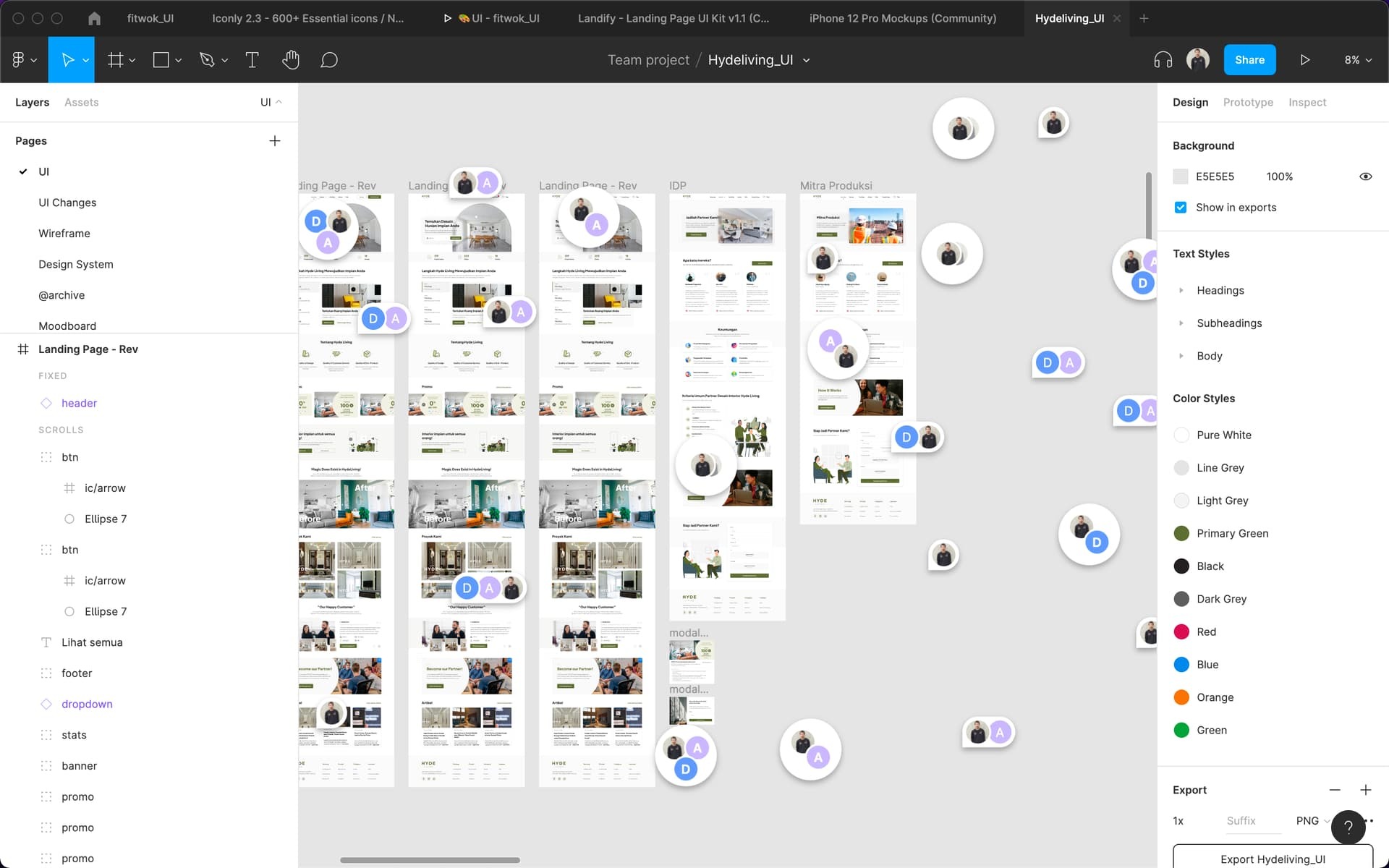
While I’m editing, I can see the comment bubbles floating around. That’s annoying when you’re trying to focus on editing. And god forbid if there is an icon getting covered b the comment bubble. It’s so disorienting to work with it.

7 Likes

You can press shift-C to hide them but I do agree that it’s annoying that they’re displayed each time you open a file. I then thought it might be useful so you’d know that there were comments, but then realized there could be a better method for that as an alert as opposed to always just showing all comments each time.

7 Likes

Thank you!

Can someone explain - I can’t actually see the comment bubbles unless I click on the menu item. I’m trying to make them visible to non-designers I’m linking the page to.

When I do shift-C, I see the toast saying comments are visible/hidden, but nothing else happens.

Edit:
Ah maybe I just don’t have this feature yet :frowning: Just saw a tweet from the figma account saying they’re still rolling this out over the next few weeks, as of Nov 17

This is the same issue I’m having. I can only see comments when I click on the comment bubble in the top menu bar, and then as soon as I click away (to the pointer, for example), the comments disappear. I want them to remain visible. Shift + C does nothing except tell me comments are hidden or visible, but nothing really happens. Have you found a fix?

  1. Describe the problem your experiencing and how your idea helps solve this

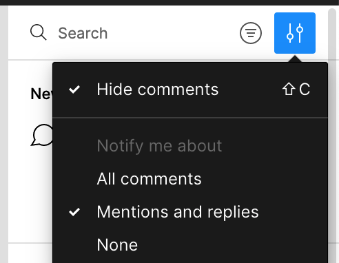
The new comments design is nice, but the comments are now always visible. The only way to turn them off is to go to comments mode, go to the comments setting in the comments panel, and set Hide Comments – unless you learn the obscure keyboard shortcut to hide them.

What makes this worse is this is not an application preference – it’s a file preference! I have to do this on every file?!

Please, I don’t want to look at comment bubbles while I’m drawing UI. It’s distracting.

  1. Add as much context as possible (screenshots, Figma files, mockups, etc.)
    Screen Shot 2022-01-06 at 2.10.08 PM

  2. Ask questions to bring the community into the conversation
    (e.g. Does anyone else experience this? Is anyone using a plugin or workaround to help solve this?, etc.

:expressionless:

3 Likes

Yep, this is annoying and feels like a bug. I can toggle comments on and off (shift+c or the View menu) but refresh the page and they’re right back there, front and center.

New comment redesign is great but it is so annoying seeing comments floating all over the places even tho we are not on the comment tab

Does anyone experience the same issue?

5 Likes

Does anyone else find that showing the comment bubbles by default annoying?
If yes, please upvote this post.

If Figma still wants to have this option, they could at least have setting allowing us to turn this feature on / off.

1 Like

It happened a few times where SHIFT-C to toggle comments visible/hidden does nothing. It shows the snack bar confirming the action, but comments don’t appear or disappear (mostly don’t appear I think). If I reload the page, they appear again.

I also had a case where in comment mode (mouse pointer = chat bubble), when I clicked somewhere on the canvas no comment was dropped. Again, back to normal after page reload.

Finally, is it normal that in Preview mode I don’t see the comments that were added on the canvas?

  1. Currently in the new update of the comments in Figma it shows all the time and is very disruptive to the design process.

  2. Comments should only show on the comments area, if not at least should be a way to hide them as we could before.

I don’t mind the comments being visible, what bothers me is that I click on resolve but the comments still show as unread and unresolved.

I agree! It is fine for the designers to learn the shift+C shortcut. But we have several development teams, and we can’t expect the developers to learn all the shortcuts in Figma. Some of our sketches have many comments which totally obscure the sketches now. Obviously we can resolve the comments to remove them, but that takes time. As a minimum you should make it possible to show/hide the comments through clicking the comments button in the top bar, instead of having the “secret” of pressing shift+C only to hide them.

1 Like
  1. Describe the problem your experiencing and how your idea helps solve this
    When a lot of people comment on my design, my design was covered up by them. The worse is it still shows when I don’t want to see them.

  2. Add as much context as possible (screenshots, Figma files, mockups, etc.)

  3. Ask questions to bring the community into the conversation
    (e.g. Does anyone else experience this? Is anyone using a plugin or workaround to help solve this?, etc. Nope