
Hi,
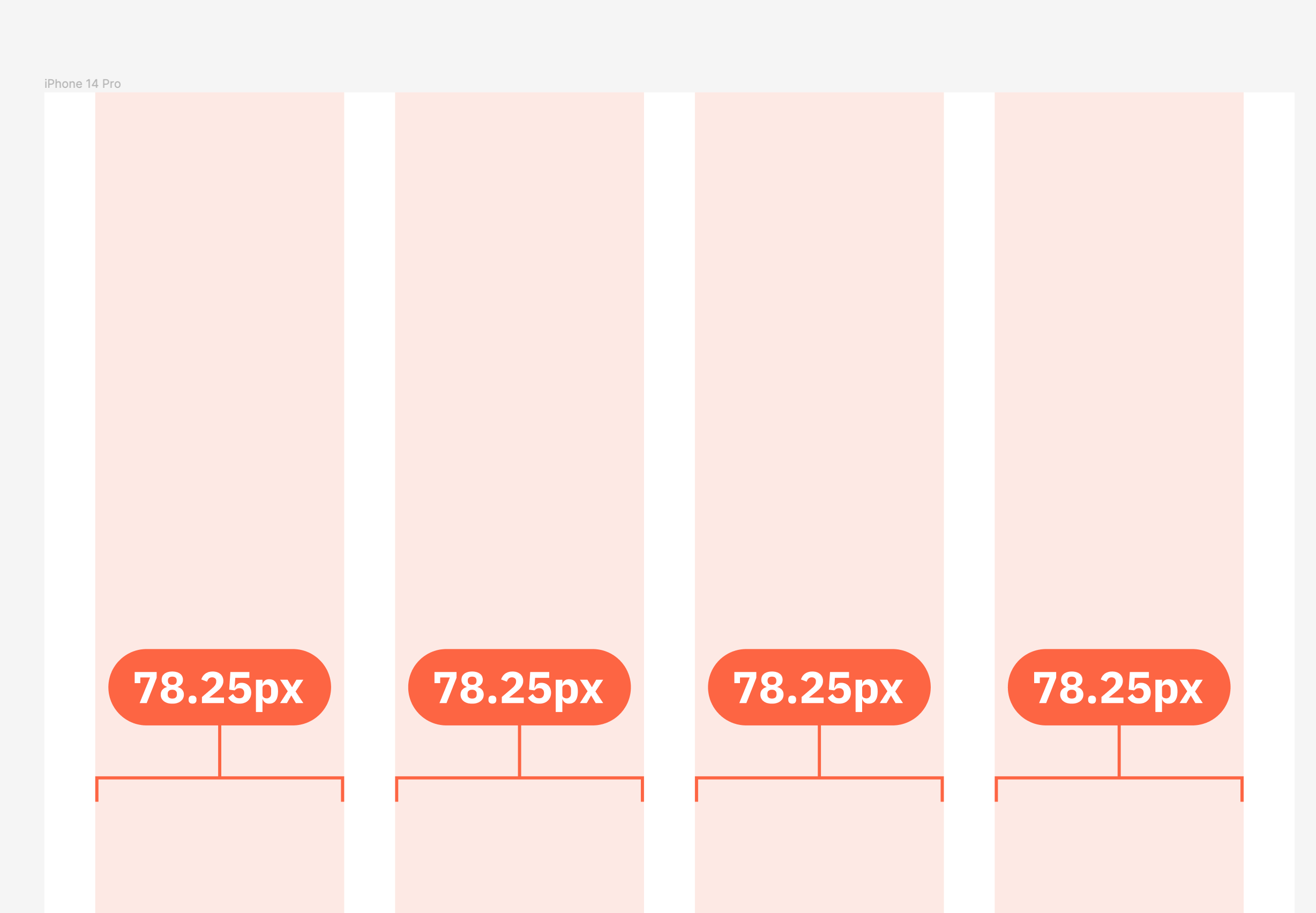
I’m facing this issue where column grids are not divided equally/accurately. I set up my layout grid with these:
- column count: 4
- type: stretch
- margin: 16px
- gutter:16px
Works fine on even-number’s width (78.25px for each column). But when I change the width to odd-number (iPhone 14 Pro - 393px for example), the 2nd column is 79px wide and the rest are 78px.
I’m not sure if this is a bug or intended to be that way. There’s another topic discussing about the calculation method used is different between layout grid and auto-layout. Please use the same Math rounding for grids & auto-layout - #3 by Radley
Please refer to attachment for reference.
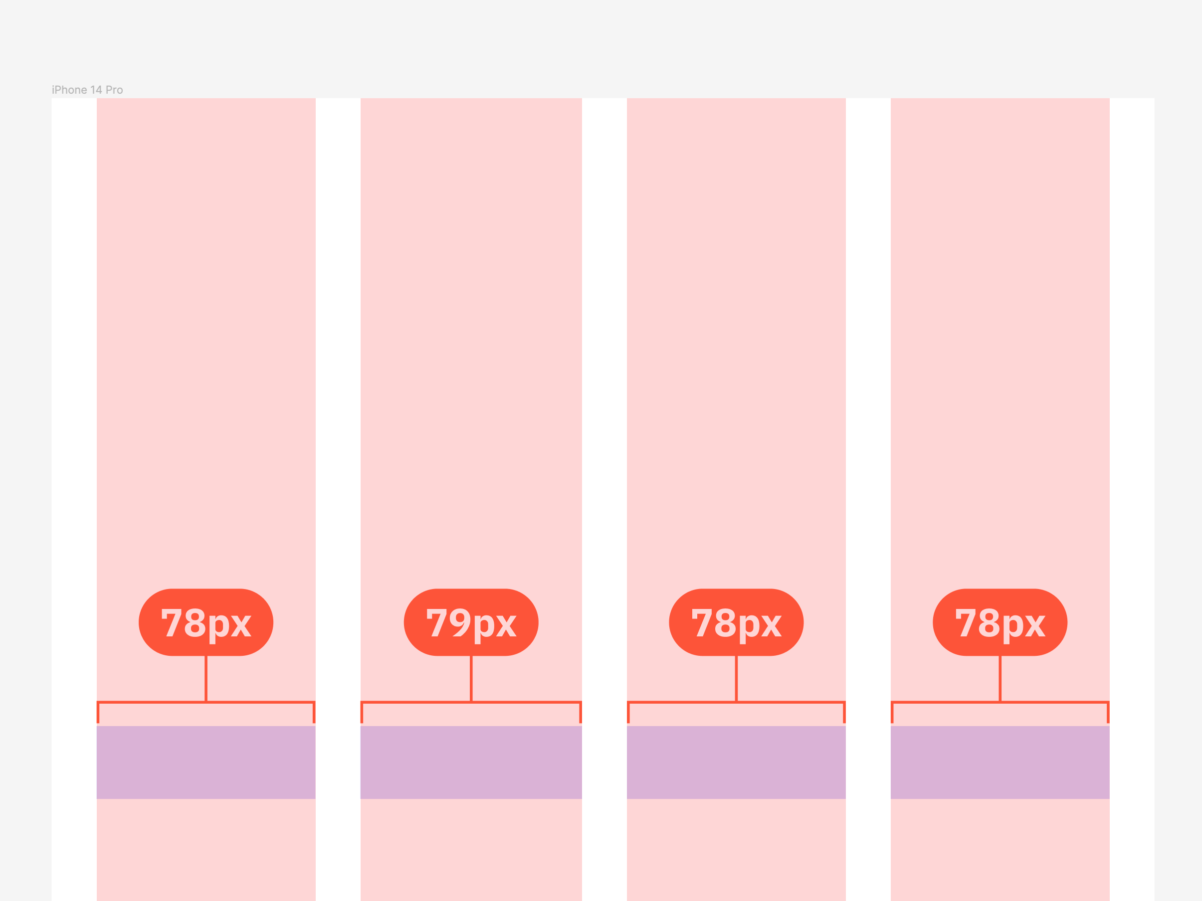
It’s better to divide the columns equally even though they are not in round number because accuracy is more important than that.