Am I the only one who’s left wanting by the new position sticky feature?


In my opinion, there are three main problems with the new sticky feature:


  1. It’s not compatible with auto layout


    • SolutionMake the sticky elements always appear on top of other elements (and later add a z-index feature so we can fine tune the behavior)


  2. The sticky element has to be an immediate child of the scrolling container


    • SolutionMake the sticky behavior relative to the closest scroll container instead, so the sticky element can be a grand child, great grand child etc.


  3. Only works for vertical scrolling and can only stick to the top of the container


    • SolutionAdd an offset property (top/right/bottom/left) - like the CSS implementation - super simple, but pretty flexible (only problem with the CSS implementation is the overflow: hidden limitation)


What I want to be able to make


None of which is possible with the new sticky feature unfortunately


HTML prototype


  • Note the sticky footer inside the container

  • Note that the elements stick relative to the window’s scroll position - it doesn’t care that the sticky element is far down the DOM tree

  • Check out the Codepen here


Figma prototype


  • This, only with auto layout


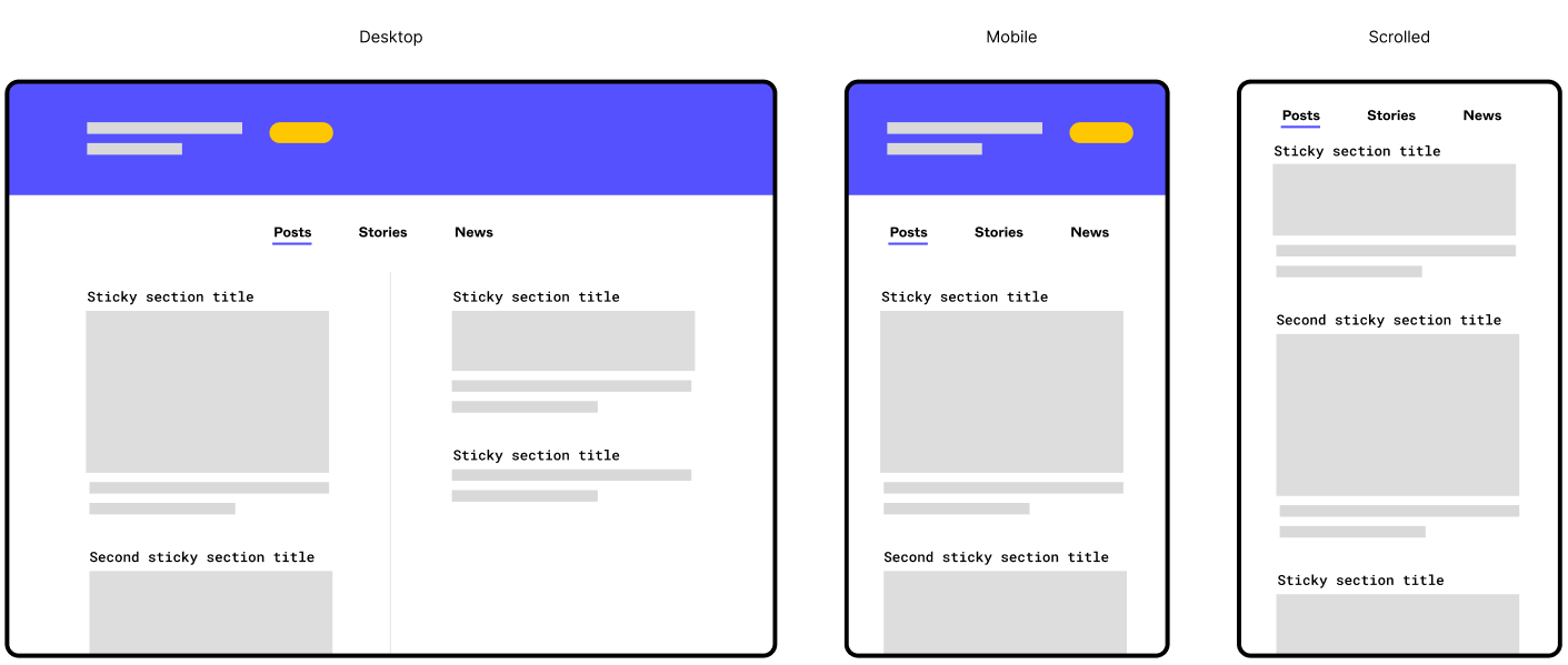
Sticky on larger screens (multiple columns etc + support for sticky in components)


  • I actually am working on a layout a bit like this (two columns with multiple sections in each). Being able to more accurately prototype it would be gold!

  • I would like to be able to create one component for each section. Within that component, I would then like to set the section heading to sticky


Edit: I initially just wanted to start a discussion and rant about how the new position sticky feature was implemented, but as the post was moved from “general discussions” → “share an idea” section, I felt the need to amend my post. I hid the rant below 😛


Just me ranting about how I'm disappointed by the way Figma implemented position sticky

Figma, why do you mock us so? (Position sticky discussion)


Yesterday Figma announced a lot of really nice quality of life improvements in their Little Big Things update. All good stuff, but the only thing that got me personally (very) exited was the position sticky feature.


Am I the only one who’s left utterly disappointed?


I thought Figma were committed to the auto layout feature, so why do they mock us so? Position sticky is in no way compatible with auto layout! (1)


The best I could do with position sticky:


  • Notice the oversized containers (colorized). They have to be that tall to make the element stick beneath the sticky tabs

  • The first element sticks nicely, but it will overlay any other sticky layer below it


They can probably fix this issue by just rendering sticky elements above the rest or something, but there is also another, bigger problem.


Problem 2


The biggest problem with the new sticky feature is a more fundamental implementation detail, which I suspect they won’t fix - thus, making me very pessimistic as to the usefulness of the feature (and it’s future). The problem:


You can only set position sticky if the immediate parent container is a scrolling container


This means that if you want to take advantage of position sticky, you have to have a totally flat layer structure - which again, is not compatible with auto layout! Or even components for that matter! (3)


The fact that the direct parent has to be a scrolling container, has always been the case for fixed elements, which has been an ok limitation (3) since fixed elements are detached from the layout flow.


Sticky elements on the other hand is a part of the layout flow, and is only detached from the flow just before it is scrolled out of the viewport. Them being a part of the layout also means that they has to be part of the auto layout, which is probably several layers deep due to how auto layout works.


Foot notes

(1) This is a bit of an over exaggeration. I know position sticky technically is compatible with auto layout, but due to auto layout’s strict z-index hierarchy everything will overlap the sticky element. “Just switch the canvas stacking”, you say? Then the next sticky element will be overlapped by the first element…


(2) When using auto layout you will end up with a deeper layer structure than you would without. This is because you have to the paddings and gaps on the auto layout containers, and in order to have different spacings, you need more and nested auto layout containers. This is perfectly reasonable and a boon to the structure and organization of files. It also makes the mental model of designing within Figma more like the mental model when writing the code.


(You can maybe get away with a flat auto layout structure on mobile mockups sometimes, but on desktop mockups it’s almost never the case).


(3) It’s been an ok limitation, at least after the position absolute feature was released and we could combine position fixed with auto layout.


Notes


I know that implementing position sticky is probably very tricky. But I think this is one of the cases where doing it right or not doing it at all would have served you better.


Figma has again and again spent the time to do it right, which makes me all the more disappointed this time around. It’s been so exiting to read the Figma blog on why seemingly easy to implement features are anything but.


I suspect there won’t be any such blog posts about position sticky 😦


Anyhow; I just wanted to put this rant out there. Please drop a comment if you agree/disagree. Would be nice to have a discussion about this.


Either way, have a good one! 😃


Are there current hacks to add content below the sticky element?


Getting the feeling we aren’t going to see a fix for this anytime soon.


One more way Figma not using real CSS makes our lives harder and makes their adding features slower. In the meantime Webflow, Framer, Plasmic, Webstudio, and others all have had this feature for a while.


Hey All,


Today we launched Sticky scrolling improvements!


Now, sticky scrolling can be set on any node or descendant of an overflowing frame. This means that objects can scroll and then“stick” for a period of time before scrolling again. Learn more about prototype scroll behavior in Figma.


The new implementation is a big improvement and now makes it a useful feature for us!


I do have a couple of suggestions to improve the functionality further:


  • Allow an ‘offset’ value from either the top or bottom of the viewport (or left / right if using a horizontal overflow) – this would eliminate the need from having to hack extra padding on the desired component


  • Definining z-index – you can kind of manage the order using auto layout canvas stacking, but there’s edge cases where you might want finer grained control (e.g. if a layer is in the middle of the stack, or if you want a sticky layer in an auto-layout to be in front of some layers but behind others)


  • This one’s part of a larger request, so possibly beyond the scope of just this feature – but the ability to swap a component variant if sticky is detected would go a long way to adding fidelity to a prototype. This could also apply to fixed layers, although I feel this would require an offset value to be useful


I agree with @Phill_Cresswell, that having a Z-Indez override would be ideal here.


I’m building everything with auto layout, and that means to get it on top, it’s actually a lower layer level, meaning when it sticks at the top the rest of the content scrolls over top.


I also very much agree with the swap on scroll idea too. Often a drop shadow appears only on scroll for a header, and there’s no clean way to implement this in Figma.


Here’s a demo of sticky headers in and out of auto layout.


Strongly agree with @Phill_Cresswell… Figma could enhance these aspects to further improve the utility of the sticky behavior. 🙂


Big plus 1 on allowing an offset value!! 👍


Big +1 here as well.

I really, really need an offset option. I can’t get it to work when used alongside a fixed header, the sticky content section always scrolls below the header. Any top padding/margin or spacer gets ignored, so the content sticks to the top of the screen (and is cut off because of the fixed header) – but I actually want it to stick to the position that is Header height + padding/margin.


Actually, when using the sticky feature, it is so unsatisfying that I just give up and I end up not using it.


I’d love to see Auto Unstick when next sticky sibling arrives in position ❤️ 😁


Would love to have horizontal sticky work. I currently need this for a project.


Similar functionality to auto layout in Figma but for sticky notes in FigJam. Ability to group stickies together and have them move with standardised spacing as stickies become larger (or smaller).


Would be really useful for things like roadmapping where there are loads of stickies on the board that are constantly changing to make things look cleaner and tidier.


Where is the offset position setting? ➕1


Hi @dvaliao - Do the new improvements include nested sticky elements?


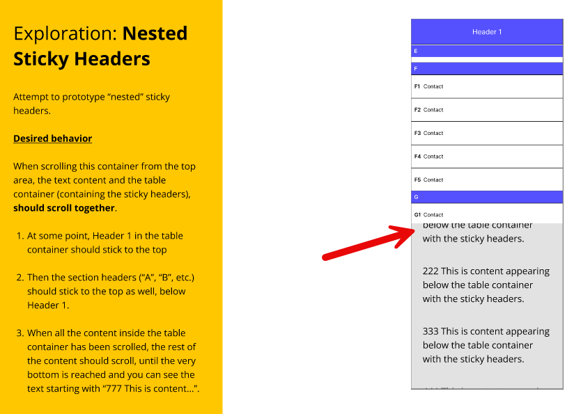
For example, let’s say you have a table with a main header at the top with all the column names, and inside the table you have sections headers for grouping certain rows in the table.


While scrolling vertically, I’d like the main header (with the column names) to stick to the top, but I’d also like the section headers to stick to the top as well (underneath the sticky main header, of course).


Hey @SLT-UX,


Right now, if a sticky object is nested within another layer in a frame, it stays within its direct parent’s bounds. It hasn’t been built to support any additional nested children within the child.


More info on how it currently works here:

Figma Learn - Help Center

Hey @dvaliao thanks for your reply. So I’m getting close and feel this should be possible perhaps? I created a Figma test file so you can see what I mean.


If you run the prototype you can try it out. The only problem at the moment is that the content below the table container isn’t behaving correctly. Maybe someone from the product team can figure out the trick?


Thanks for the test file, @SLT-UX!


We’ll pass this onto our prototyping team to take a closer look and advise.


This may have already been answered here but thought I’d add in case it hasn’t…


There’s a bit of a trick to making an object sticky and off-setting this from either the top and bottom as well as making it sticky up until a certain point…


Group the content you want to be sticky into an auto layout. Then group into a second auto layout. Now, set the outer auto layout to scroll with parent. The inner auto layout set to sticky and using the top and bottom padding set the offset. On the outer auto layout extend the bottom padding to where you would like it to stop. Essentially this is creating a sticky item inside of a scrollable frame.


This has worked incredibly well for me on a numerous project, particularly for prototypes when showing a client additional design details.


I’d also like to add that Figma needs to make this possible for horizontal sticky items, specially when creating carousels/sliders etc. inside of a component structure.


I may have answered this in my latest comment… It is a case of using multiple auto layouts, with different position settings and padding.


It would be great if you could locally specify the z-index/ordering of child items.


Example:


Remembering that messaging apps/view traditional scroll from the bottom where the latest content positions. You need to set first-on-top on the container to allow intermediate date-stamps to stick and sit over the scrolling messages. But this would mean the oldest date-stamp in the feed is always on top of the most recent stuck date-stamp.


The stuck date-stamps would need to have an override to allow last-on-top-when-stuck. Or you allow current stuck item to unstick when new sticky item meets the top position.


@DominicH Thanks for the tip - I experimented with the inner & outer AL containers and I think it’s getting me closer to what I’m looking for (see Try4 in the test file).


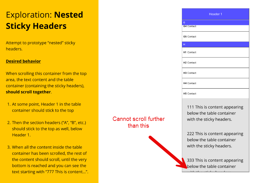
I tried various paddings top and bottom, and extending both the outer and inner AL container but I cannot get rid of the bottom text content sliding underneath the table container by about 100 px or so. Even though both are in the same AL container.


And if I set the outer AL container to sticky, I cannot scroll to see the entire bottom text content.


If I set the inner AL container to sticky, it doesn’t appear to make any difference.


Try playing around with the file as it sounds like you’ve dealt with this problem before. See the desired behavior on the left in the yellow panel. I tried to describe it a little better (hopefully).


@dvaliao Any update from the team?


Need support for horizontal sticky items, fo creating carousels/sliders etc.


Add top offset for sticky element


I also think an offset to viewport feature would solve a lot of frustration. I don’t like the hacking margins at all, creates a lot of overhead for a very simple feature definitely if you have a complex setup with multiple sticky elements in different columns.


Reply