The increased size of text, toggles, and lack of color (white text now gray) makes the component property panel rather hard to read and use. Suggest at the minimum - make the property group titles “white” for better legibility/contrast.
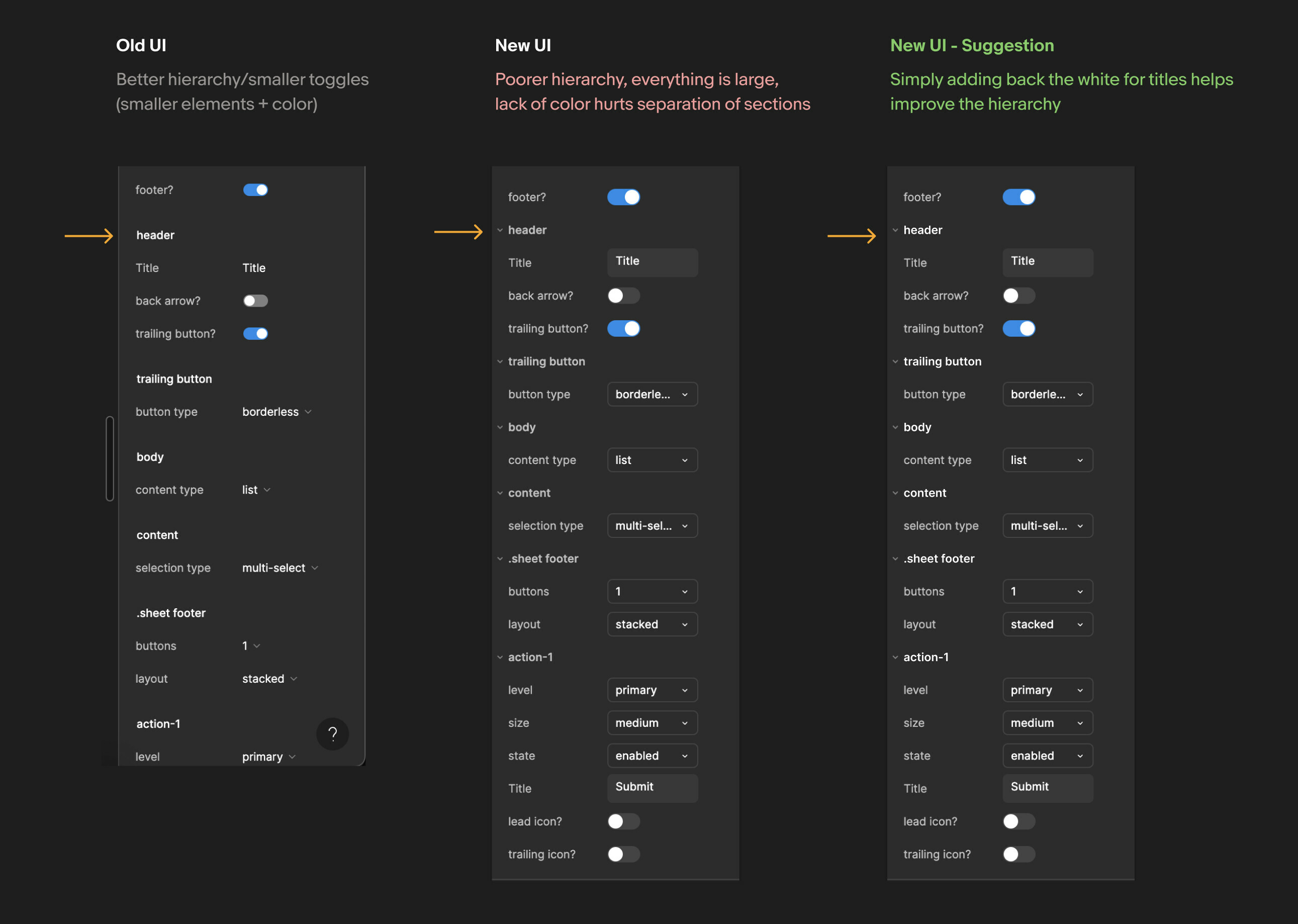

The increased size of text, toggles, and lack of color (white text now gray) makes the component property panel rather hard to read and use. Suggest at the minimum - make the property group titles “white” for better legibility/contrast.
Enter your E-mail address. We'll send you an e-mail with instructions to reset your password.