
- What I can’t stand the most is that the panels of the new UI can’t be attached to the edges. They leave some gaps, wasting the space to display the main design and operation area. And visually, these gaps are also distracting my attention.
- The toolbar at the bottom also interferes with the main operation space, especially if its color is the same as my design draft. By the way, is it just for the convenience of novices to move it from the top to the bottom? If someone who uses Figma more frequently, he will use shortcuts instead of mouse clicks to trigger these functions.
So I hope that adjustments can be made in time in the official version of UI3, otherwise these redesign will seem like a subjective conjecture of someone who doesn’t use Figma much.
UI3 Feedback
- July 3, 2024
- 387 replies
- 5784 views
- New Member
- 1 reply
122 people like this
- Raymond_Co

- Russell_Phillip

- Olha_Shcherbak

- Samantha12

- Isaac2

- Eden_Payne

- Amelia_Prasad

- Omid_Mozayani

- Gita_suci

- _gaemi

- VR1

- Christina_Tian

- Vjatseslav

- Connie5

- Rene_Capuzzo
- Igor_Barinov

- DNLBTLR

- Adamo

- Bhargav_patel

- Noonki
- Foquz

- Ken_Ottmann

- eila

- Rob_Gale

- Simon_Drummond

- RoRa

- leigh_van_maaren

- ekifol

- Eugene15

- Michele_Pella

- Anya_Shmelyova
- SlavaF
- ikat.iwork
- Inna_Vainberg

- Nolan_Kirkman

- KochADV

- Lee_Hayward

- maxim_milovanov

- Ralf_Hoefer

- Benjamin20

- Alwyn_Balingit

- Emelie

- Shubhank_Sahay
- Niko3

- Henry_Gardella

- Johnson_Ryan

- Judy_Kim2

- Bella_Olszewski
- Ilya_Pavlov

- Luca_Benazzi

- Kristaps_Stikuts

- jules.cameron
- Tabletki_Design

- Kartoffel

- lumenwrites

- Slava_Bronevitskiy

- Maria_Lyons1

- Janine

- Scott_Feaster

- Anna_Western1

- Jeff27

- Nesrin_Mk
- Bohdan3

- brent.hopkin
- DiogoFigueira

- Steve_Civelli

- Cosmin_Coman1

- Victoria16

- Lynsey_Loftus

- Boyan_Grigorov

- Einsteinhere
- Joe_Garlick

- Leyli
- Casey_Podlucky
- Q115
- Jon_Brennan1

- Rachel_McClung

- Gabriel_R

- Ken_Guzik

- Karina7

- OnlyRodas

- Robert16

- Darius_Vitkunas

- Peggy2

- Dawid7

- Raphael_Vercruyssen1

- Zoe_Gomez

- Phil_Bauch

- Katie_Bush1

- Jennifer_Treter

- Tatiana_Tsygankova

- Imambas

- Andrew-Hat

- Dmitry_Mezenin

- Mickael_PERRIER
- Juliette1

- Polina_Cheremisinova

- Metehan_Altuntekin

- Nirmal_Aiken_Labs
- Ulviyya_S

- Sasha_Trofimchuk
- alex132

- Dmytro_Galov

- Jose24

- BlackGold

- JanSloth

- Zoshua Colah

- Marce

- Arthur Vee

- Kyle Henwood

- Paige Womack

- JuliePolaski

- Polina Cheremisinova

- Kees Klein Hemmink

- Nenad Jovanov

- Thomas_B_

- Fenna

- PawelKO

- A.C.

- Ifatarg

- Matija

- gatmonkey

387 replies
- New Member
- 6 replies
- December 10, 2024
Now just imagine this one dude who decided that changing something that people got familiar with is a great idea… And changing it to something obviously worse… And this same dude was looking on this new UI and thinking “Yeah, nice job!”
I can only imagine this dude being some Top Manager that never touched one graphic design tool in his life.
Now imagine the other dude who trusted this first one dude to manage Figma redesign.
And finally, imagine these juns that were making UX for new UI.
This is a lot of people that don’t understand what are they doing.
Figma is done. No matter what these guys will do next it will be same quality.
I just don’t understand how that happened. Looks like original team got rich and abandoned Figma.
- New Participant
- 5 replies
- December 11, 2024
Figma please make sure KEEP UI2, or I will be devastated
- New Member
- 4 replies
- December 11, 2024
I’ll add up my voice here. Guys completely ruined their perfect product for some weird reason.
With the announced price increase it’s just a killer combo 🙂 I’m ready to pay more for the good product (UI2) but not for the bad one (UI3). Just feels bad.
- Active Member
- 20 replies
- December 17, 2024
Truly truly awful. If nothing else, the bottom bar and the jumble of crap now crammed under the “actions” button is a nightmare. There’s no way to browse assets anymore? I have to know a specific search term? And I can’t make my resources window persistent anymore? Who came up with this?
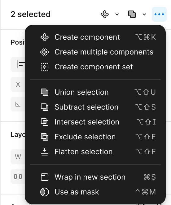
I’m constantly having to stop while thinking “Wait…didn’t I used to be able to click [thing that disappeared] to do [thing I’m trying to do]? We can’t do that anymore? Or did it move?” Like making a component set. Why the ever-loving ham is that buried somewhere on the right side? (I guess so it’s in the vicinity of where the tiny Create Component button has been banished to.)
Yeah Figma…it’s not good. Just start over.
- New Participant
- 7 replies
- December 20, 2024
Now that I’ve had a chance to spend more time with Ui3, I wanted to give an update on my thoughts since my initial impressions in July (see here https://forum.figma.com/t/ui3-feedback/77610/29)
First, the good:
- Huge props to Figma for actually listening to our feedback, addressing many of the issues we raised such as:
-
Floating panels = fixed, now docked
-
Missing auto layout width/height information = added back
-
clipping mask checkbox = reverted back
-
Keeping UI2 easily available. This is huge. Not just that it’s available but how easy it is to switch between the two UIs.
-
Horizontal scrolling on layer pallet. Great… but but no reason this couldn’t have just been put into Ui2?
Now, what still needs work:
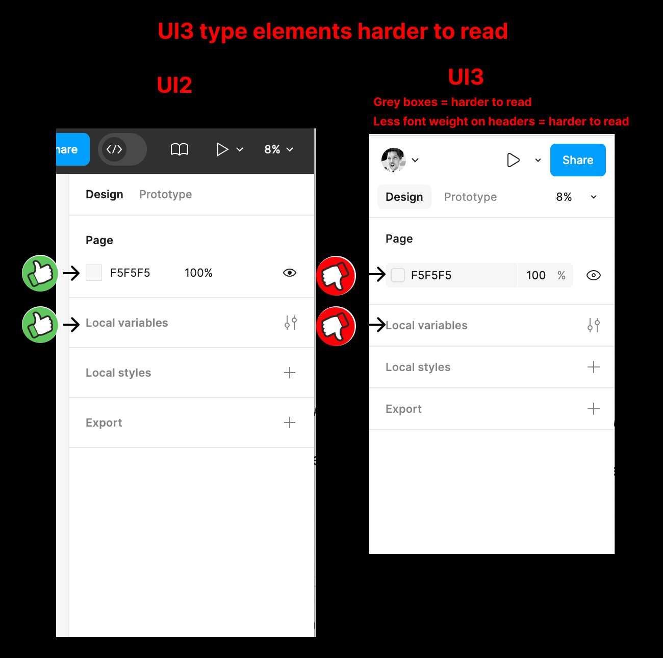
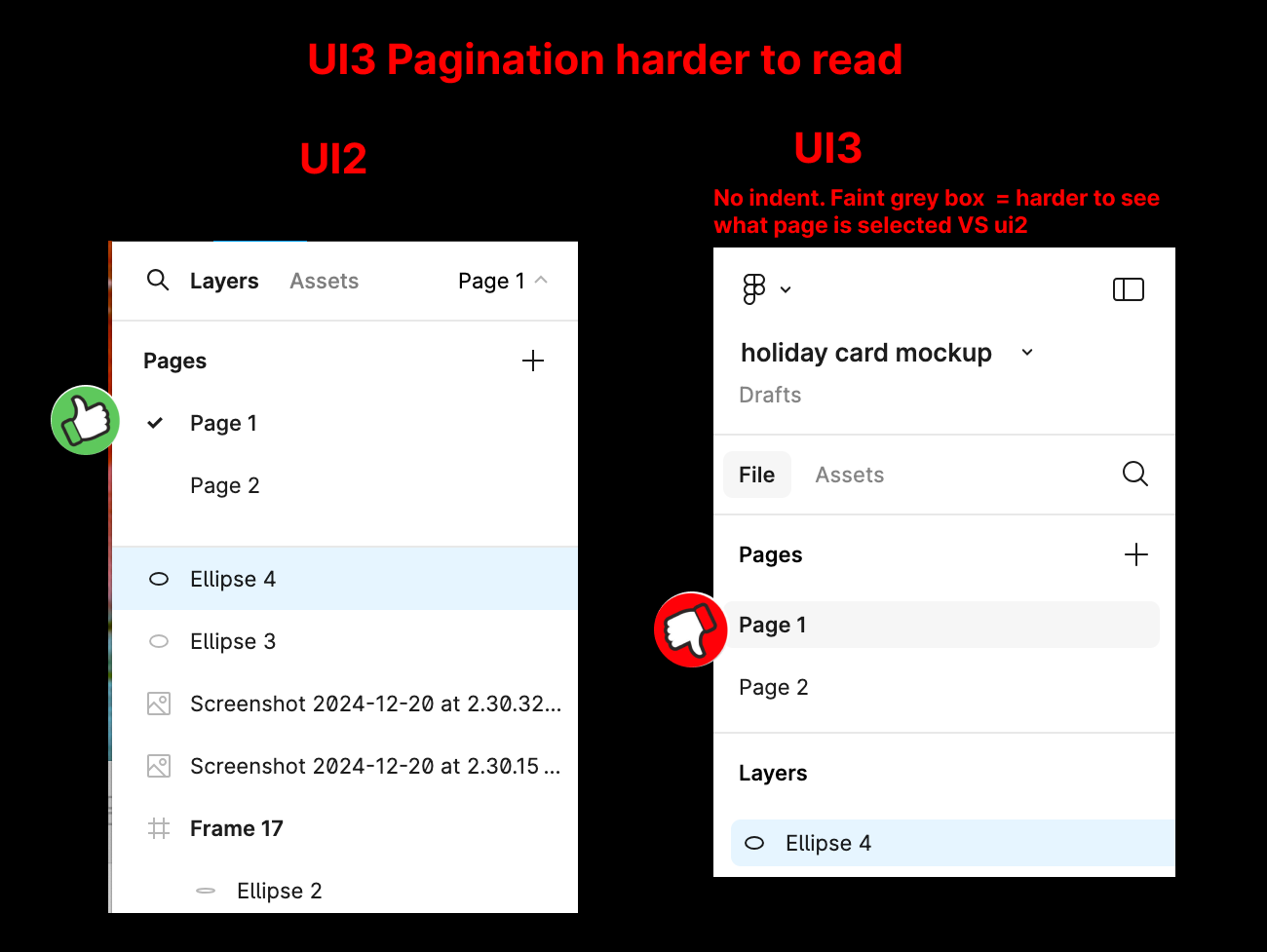
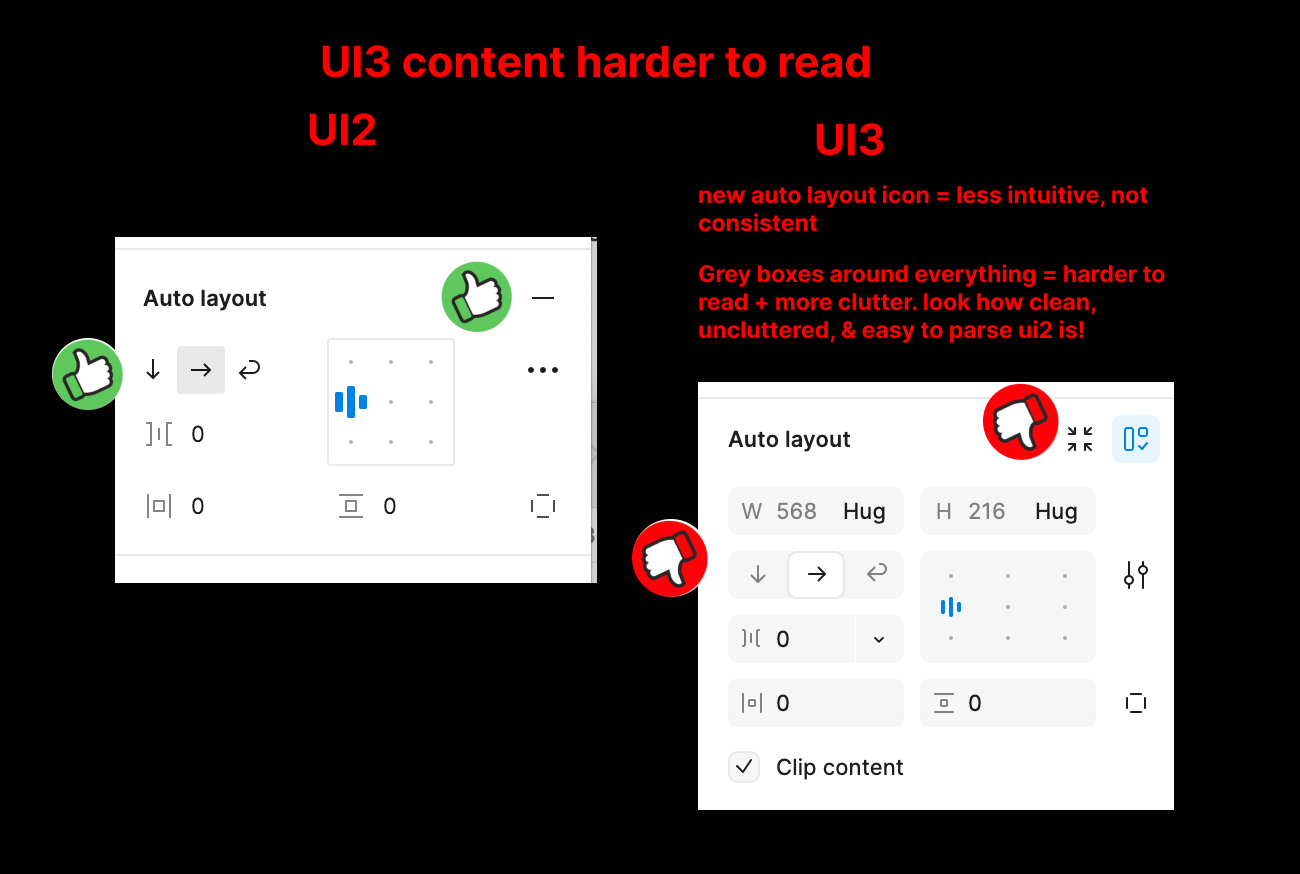
- Most importantly: Readability. Accessibility. Contrast. Specifically: spacing, sizing, and other touches that make the UI more cluttered and difficult to parse with long viewing sessions. This was my biggest issue for UI3 and remains the biggest reason I will stick with UI2 as long as possible. I have attached visuals of 3 examples below, but in summary:
-
Remove the faint grey boxes around fields. This makes information harder to read, not easier.
-
Pages: indented pages and your selected page check was much easier to parse than a faint grey highlight
-
other small touches, such as header front weights seem to have been reduced, and I still share gripes about losing the plus minus icon consistency over an auto layout button for example
The accessibility was and still is my biggest issue, and I have 20/20 eyesight… but I stare at this program all day. It matters. I don’t mind the re-ordering of elements, such as the tool bar moving to the bottom and width/height and color selection being rearranged, albeit I still prefer the UI2 version… but until readability, contrast, and clutter is resolved, I will be sticking with Ui2 as long as possible.
In terms of how to constructively address these accessibility/readability updates, as a rule of thumb, I would say rolling back any of the new styling to the original Ui2 execution is a good starting point.
As someone else stated, with Figma’s pricing updates, I’d rather pay more to continue to use Ui2 than Ui3… though I hope that isn’t what it comes to.
Thanks again to Figma team for continuing to listen to our feedback.
- 1 reply
- December 24, 2024
I hate everything about the UI. This whole thread has already stated why. Please revert. It’s awful. The previous version wasn’t broken.
- New Member
- 1 reply
- March 25, 2025
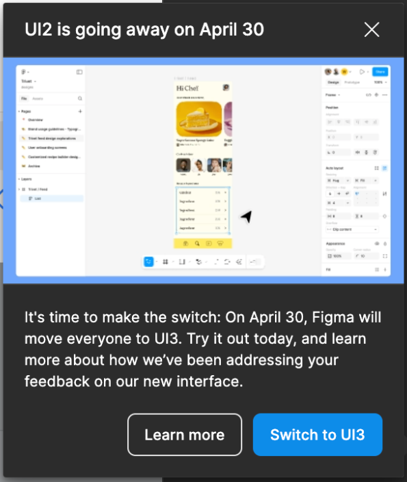
Great, so Figma chose to ignore 300+ messages about the disastrous UI3 and retire the UI2 on April 30 :slow-clap:
- New Participant
- 11 replies
- March 25, 2025

- New Member
- 3 replies
- March 25, 2025
Maybe I need to look at more tutorials and research more, but in UI2, inserting a component from the Actions within the Tools panel was easy, quick, and intuitive. The components were listed alphabetically, making it simple to find and insert the right one.
In UI3, however, you now have to type the component's name into the search field to find it. Additionally, the Assets panel seems to only show recent instances. And list view is not an option.
UI3 also has less contrast across its UI elements, which makes it harder to navigate.
- New Member
- 4 replies
- March 26, 2025
We’ve got one final month of good UI, everyone. Nothing lasts forever—let’s enjoy it while we can 😅😭
- Active Member
- 20 replies
- March 26, 2025
youhhou wrote:
We’ve got one final month of good UI, everyone. Nothing lasts forever—let’s enjoy it while we can 😅😭
I wonder how many people are still using UI2 compared to UI3 considering there’s no 15-page thread of people gushing over how amazing UI3 is. Quite the opposite. Multiple forum topics started where people are communicating their dislike of UI3—falling on deaf ears. Apparently Figma is just going to ride this freight train off the cliff.
- New Member
- 3 replies
- March 28, 2025
The new UI is pretty bad, please please please dont force us to use it.
- New Member
- 1 reply
- March 28, 2025
Please let us keep using UI2, the new UI is terrible.
- New Member
- 1 reply
- March 28, 2025
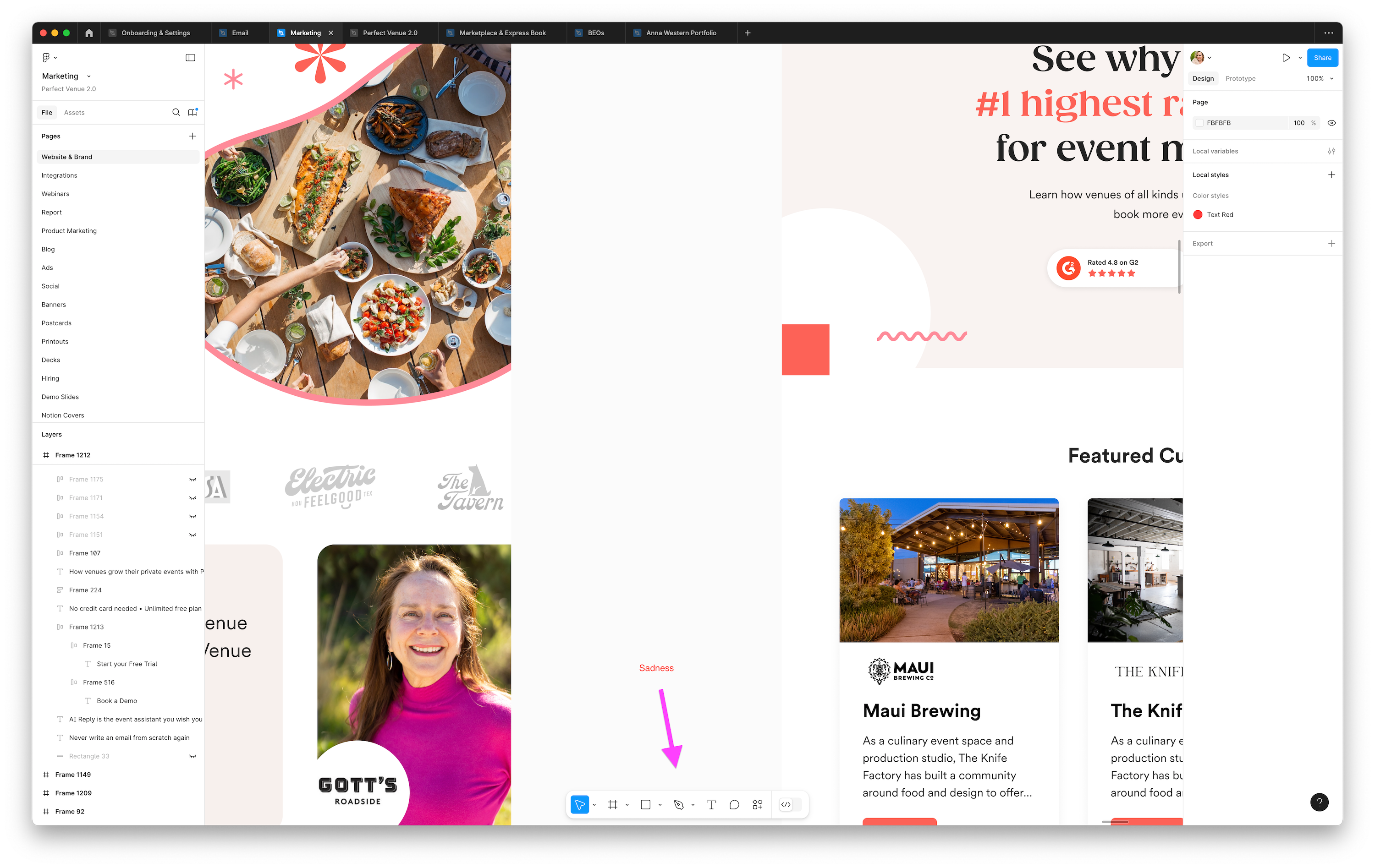
Switched today and of course these kinds of changes create a BIG decrease in efficiency. There is nothing more annoying than having to relearn the muscle memorized steps of using this software. It was FINE before. And I really appreciated having the ability to stick with the older UI. And finding out that I had to update today was not fun. So far I can figure things out, but the things that is sticking in my craw and made me have to submit feedback is the bar at the bottom. Why put something floating over the middle of the canvas/workspace??? Just why. Please offer a setting to move this back to the top or somewhere else. I’m tired and don’t want to spend more energy having to deal with this stuff. Especially on a Friday. Thanks love you guys.
- New Participant
- 6 replies
- March 28, 2025
Add an option to remove the gray background from property inputs and slightly increase the contrast between active and inactive states, including icons and text. Ideally, provide three levels: Default, Medium, and High. 🤓
- New Member
- 3 replies
- March 30, 2025
Anna_Western1 wrote:
Why put something floating over the middle of the canvas/workspace??? Just why. Please offer a setting to move this back to the top or somewhere else.
I totally agree. The position of the tool bar at the bottom of the canvas is annoying to say the least
- New Member
- 4 replies
- March 31, 2025
I’ve slowly become acustom to the new UI but a few things still trip me up:
- location of the “Boolean” attributes when working with vectors being in the right side pannel. I often forget where they are looking in the bottom tool bar or even right clicking to search the item menu. When I do remember they are off in the right panel, I often miss the dedicated icon button for these actions and still go to the 3 dot menu where they are hiden.
-
I keep getting the Figma “Main menu” drop down and the file dropdown menu mixed up. I feel like the menu proximity and similar visual style make it difficult for me to remember where actions like “place image” are.

- New Member
- 1 reply
- April 1, 2025
Can you just please add all your new features but into first classic Figma UI. This all design changes are sucks
- New Participant
- 9 replies
- April 2, 2025
I can't believe Figma is forcing this change on us. UI3 is, without a doubt, the most unfriendly design possible. It has made my workflow painfully slow and incredibly unproductive. What’s the harm in letting people CHOOSE which UI works best for them?
I always thought switching to UI3 was a HUGE mistake, but I never felt the need to comment on it because UI2 was still an option. Now that you're FORCING this change, I have to speak up.
This is NOT an upgrade. It’s a downgrade in usability, efficiency, and user experience. Figma was supposed to be about flexibility and user-centered design—so why ignore the feedback of those who actually use the platform every day?
Give us back the choice. Let people stick to UI2 if they want. This forced migration is a slap in the face to long-time users who built their workflow around UI2.
- New Member
- 1 reply
- April 3, 2025
Overall its good, and there are many improvements for sure. But the new UI has much much smaller controls.
I heavily use ‘Create Multiple Components,’ something that was in the top toolbar as a large button dropdown. But now, I have to tap a tiny arrow button beside the tiny Create Single Component button to do the same action. If there was a keyboard shortcut for this I would be fine with hiding it, but there is only a shortcut for Creating a Single Component.
I realize this is also a suggested action under the Actions button, but I’m unsure about consistently using an AI suggested dropdown that could change actions.
- New Participant
- 7 replies
- April 6, 2025
Like many here, I am very disappointed UI2 is going away with so much more work still needed to make UI3 as useable as UI2.
Figma actually reached out to me to get feedback on what specifically they thought needed work still to improve UI3. My general feedback was and still is: anything that gets us closer to UI2 is an improvement… but they asked for specifics, and I gave examples (some of which I’ve posted in this thread). On the topic of grey boxes for example, the person I spoke with said they went back and forth internally but went with the grey boxes to help clarify what fields can be manipulated and because things were floating too much in space without delineation. I responded that I had zero issues with that in UI2… and in fact I thought UI2’s hover states was best-in-class UI for clarity of interaction… but this person also added “I believe we are working on a higher contrast theme for accessibility purposes...” That’s GREAT and should probably be the standard, but like others have said, the reduction of UI size is rough (and I gave them specifically examples, again). I’d much rather scroll down the right-hand menu bar a little further than have everything be a little smaller or hidden in menus.
I bring this up simply to say: Figma is listening. If you’re not happy with UI3, absolutely speak up. Post what you don’t like here and be SPECIFIC. They have already made a TON of changes just based on feedback thus-far and I believe they will continue to do so as long as they know that’s how their user base actually feels en mass. Just like the grey boxes around everything, they think this is a net-improvement and there is no way they’ll think otherwise unless people bring it up.
- New Member
- 1 reply
- April 7, 2025
So I've really been trying to give UI3 a chance. I figured hey we’re all UX designers let me try to get past this learning curve. BUT my issue is the NEW LIBRARY layout. It drastically slows down my workflow. I miss having a bunch of frequently used components open from their folder. Example: Buttons & Dividers. I’m commonly grabbing those. Now instead of just having all my components listed to the left in open accordion style I have to manually click into each folder and grab them then naviaged back.
Why add extra clicks into a library??? Please bring back the drop down drawer library ability vs adding all these extra clicks.
Until this issue is resolved I have hence converted my Figma back to the previous UI.
- New Member
- 4 replies
- April 10, 2025
Jeff27 wrote:
I bring this up simply to say: Figma is listening. If you’re not happy with UI3, absolutely speak up. Post what you don’t like here and be SPECIFIC.
-
Toolbar at the bottom
-
Control are too small and pale
This issues are SPECIFIC and significantly impact UX. It has been repeatedly mentioned on this forum since UI3 was announced, yet no changes have been made so far.
However, the main problem is that the team working on UI3 lacks the necessary expertise to avoid such obvious mistakes
- New Member
- 1 reply
- April 10, 2025
Someone who used Figma for several years, shouldn’t need a tutorial to find the tools and functions they’ve used for years, that’s like a usability 101 LOL...
- New Member
- 1 reply
- April 10, 2025
The new floating navigation bar at the bottom is a terrible UX decision. It’s not about being used to the old layout — it’s about the bar now occupying active workspace and drawing attention away from the actual design. It constantly gets in the way, especially when working on multiple frames or zoomed-in views. Please consider moving it back to the top left or letting users choose its position.
Reply
Related topics
Font changes by double clicking and copy-pasteicon
ArchiveUpdate all text boxes with new version of font?icon
Ask the CommunitySome elements randomly have incorrect layoutsicon
Ask the CommunityBug 🪲 / Text in the componenticon
Ask the CommunityIssue with instance within instance of different projectsicon
Archive
Enter your E-mail address. We'll send you an e-mail with instructions to reset your password.
Scanning file for viruses.
Sorry, we're still checking this file's contents to make sure it's safe to download. Please try again in a few minutes.
OKThis file cannot be downloaded
Sorry, our virus scanner detected that this file isn't safe to download.
OKCookie policy
We use cookies to enhance and personalize your experience. If you accept you agree to our full cookie policy. Learn more about our cookies.
×
Cookie settings
We use 3 different kinds of cookies. You can choose which cookies you want to accept. We need basic cookies to make this site work, therefore these are the minimum you can select. Learn more about our cookies.