Hi Figma,
As the title suggests, the main use case for UI 3 as a product designer like myself is utilizing AI features, background removal, and layer renaming. However, beyond these, the UI itself presents cognitive challenges.
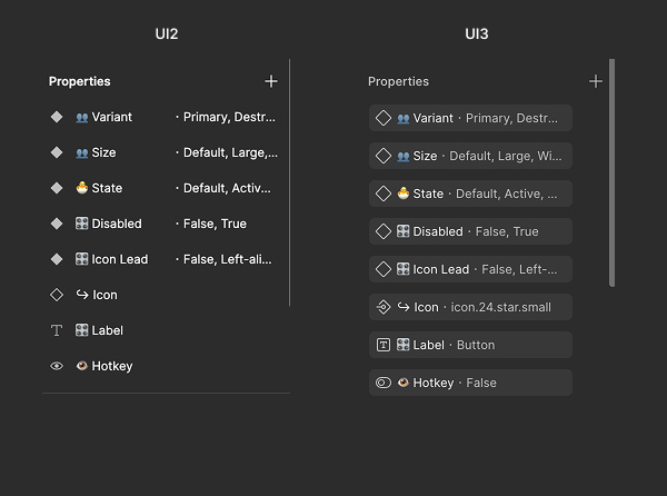
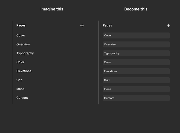
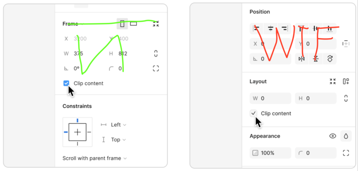
Here’s a small comparison between UI 2 and UI 3:
-
UI 3 has more complex icons. (Why use a border in the typography icon, especially in such a small space?)
-
Wasted space and visual distraction. (I don’t understand—why does everything need to be wrapped in a background? This adds unnecessary layers of complexity and distraction.)


