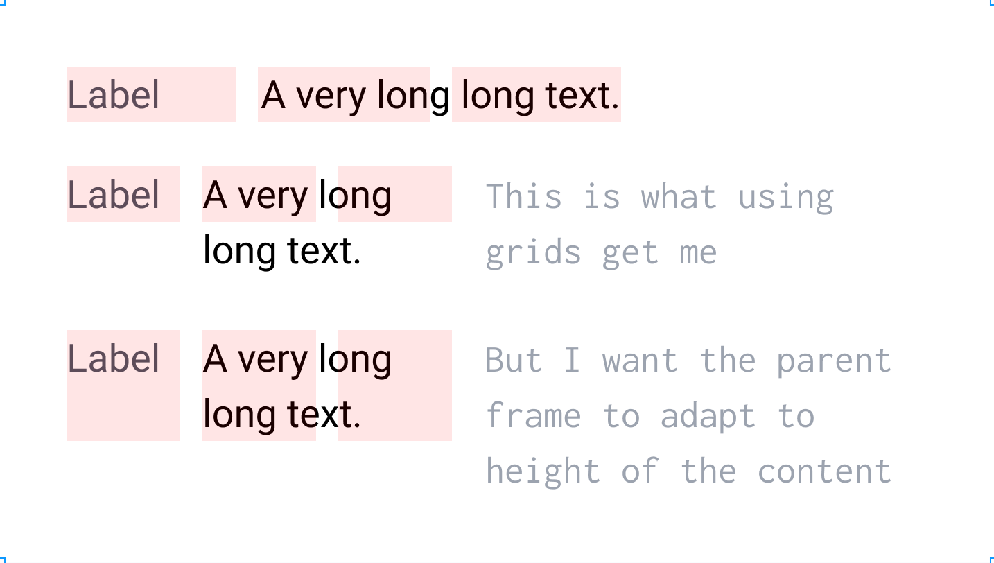
I need a 3 column layout where one piece of content takes 1/3rd of the width and the second 2/3rds. I can do this with a regular frame using 3 col grid, however when the content in the 2/3 becomes too big for the width, the height of the frame does not adapt to the content. If I use the autolayout frame I can’t get the 1/3, 2/3 layout. It’s a known problem of Figma and I’m reaching out to the community if anyone knows of the work around.
Unfortunately, I was not able to get a good workaround here from the team, apologies for this! I hope the community will have a better solution for you.
I’ve been having exactly the same problem with this. I’m looking to move to Figma from Sketch and have a bunch of form input fields in my sketch designs (and text counterparts for when the form data is not being edited) 1/3-2/3; 1/2-1/2 and 2/3-1/3. This is something I can do so easily in Sketch, but whilst Figma is so good a some things, it seems anything other than a simple 50/50 auto resizing grid is beyond its means. Maybe I’m missing something but I’ve been trying to achieve this for over a day now.
You can use Auto layout here and keep 1/3 + 2/3 layout with using max-width for the containers. Each Auto layout container is set to Fill (width) and Hug (height), has a max width corresponding to the columns and are nested inside an Auto layout parent container with its height set to Hug as well.
Feel free to check out my example file here and duplicate it to your Drafts to inspect it:
Disclaimer:
However, when resizing the parent frame width the column ratio breaks at some point. A fully responsive layout would require percentage based width values, which is currently not possible.