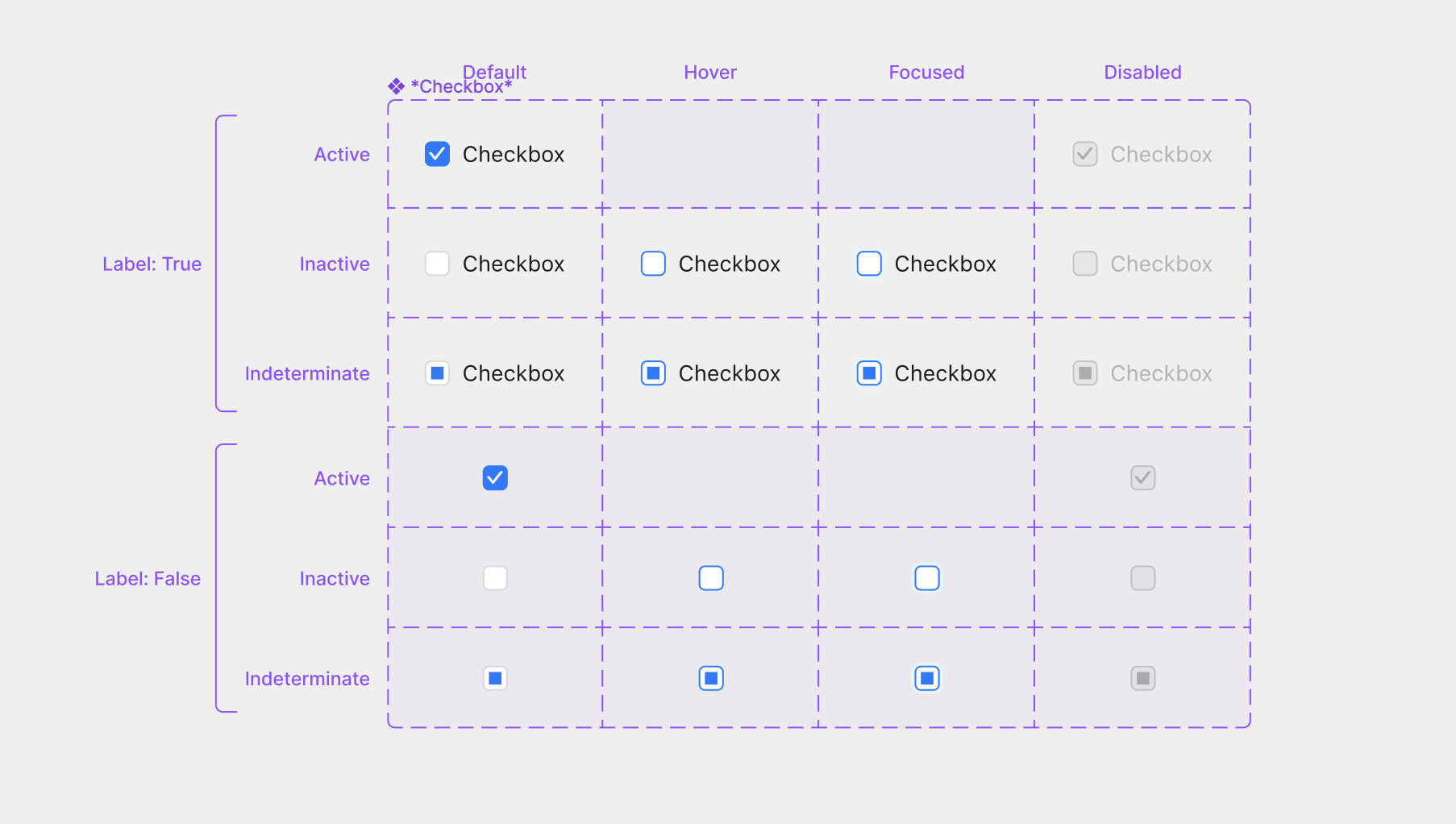
I’ve seen components laid out in very different ways on other Figma files but haven’t figured out how to mimic that behaviour.


For instance, in the Ant Design UI library, they are able to show all variants of a components with their respective property labels like this:


But when I try to create all of these components myself, I only have the main dashed purple border, no labels or grid-based organization.


I know the extra purple UI in the first screenshot is a native Figma feature since those elements are not in the layers pane. How can I get my components to show up like the screenshot?


Thanks!

These are the most common objects on the canvas (text and frames with a stroke). Therefore, just create them.


Manually create these labels for every single component in a massive design system = hours of time


Use the figma native feature = 0 hours


I think it is obvious why I prefer to find out how to get figma to do this versus creating it myself 🙂


There is no such native feature. Please open this file again and take a close look at the layers panel.


Maybe this plugin fits your needs:

https://www.figma.com/community/plugin/1047796251364453654


Yes this is exactly what I was looking for, thank you!


This topic was automatically closed 30 days after the last reply. New replies are no longer allowed.