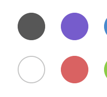
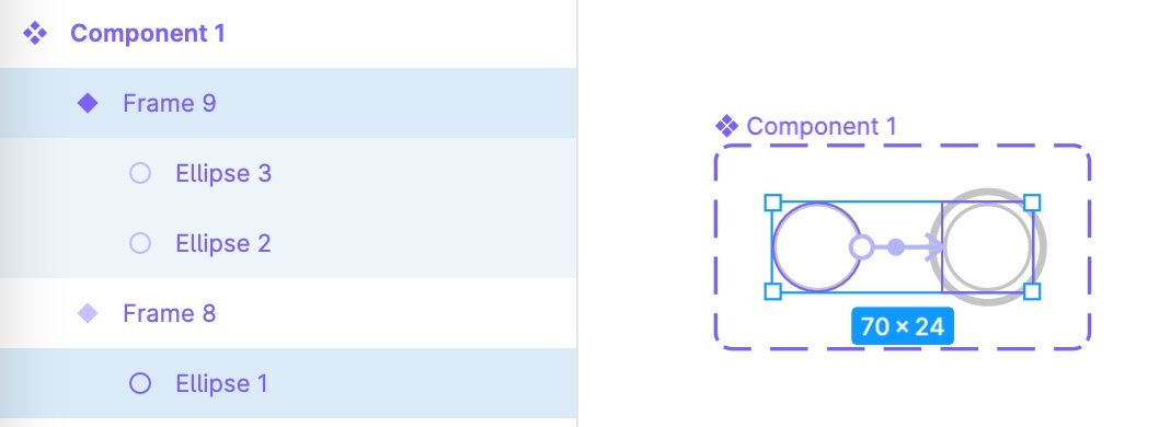
I have these two components in different size (image A), and I’m trying to trigger a state change when hovering over a default component, which is the left one in the image.


pImage A]


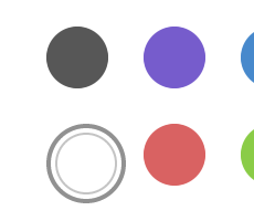
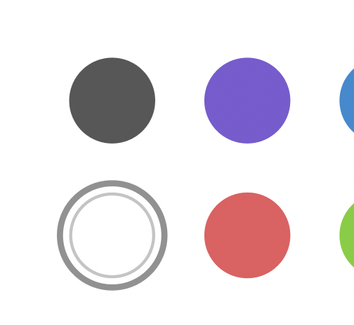
The hovering interaction seems to be working just fine, but the issue is that, the second component shifts to the bottom right when the state is changed. (Image B to Image C)


pImage B]

Image B


pImage C]

Image C


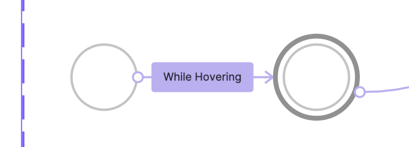
What I would like do here is maintain the component position on hover as you can see in the image below. (Image D)


pImage D]

image D


I am not sure if I’m doing this in the right way, but any tips would be very much appreciated.


Thank you.

Currently you cannot achieve that with Interactive Components. You can either use Overlays for that or make both components equally sized.


I see, thank you Gleb!


How are you creating that overlay state in the interactive components? maybe maintaining the same frame size and adding additional shapes or a shadow/stroke could work


Just encountered the same issue and found a workaround that might help designers in the future with this question. Follow the following steps:


  1. Place the larger shape on top of the smaller shape. Make sure both shapes have the same center.

  2. Select both shapes and create a component.

  3. Make a variant of the default variant (and call it “Hover”).

  4. Delete the larger shape of the default variant.

  5. Add the hover functionality so the component changes from default to the Hover variant.


The “smart animate” transition won’t look perfect, as it does not enlarge the small shape but rather makes the bigger shape visible on top of the smaller one, but the positioning is fixed 👍.