Question

help me to learn this.

  • October 17, 2024
  • 1 reply
  • 11 views

DOOKDIK

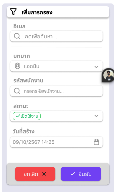
I just designed it for the first time. What do you guys think about this pop-up? And should I improve it? Please help me.

1 reply

rwb_marns
  • 17 replies
  • October 17, 2024

Hi DOOKDIK,

  1. Avoid bold fonts for labels
  2. Field labels’ font size should be smaller than your value font size
    e.g. label: 12px; value: 14px;
  3. Set your Fields to 40px height
  4. Reduce your border-radius to at least maximum of 10px
  5. Avoid using drop-shadows
  6. If you want to have your Fields with icons, then it should be consistent to all Fields
  7. Set uniform padding to both ends (left and right)
  8. Remove footer background
  9. Set padding the same with #7
  10. Set CTA’s spacing same with #7
  11. CTA’s border-radius should be the same with your Fields
  12. Detach your popover from your Filter component

Try to implement this and let see what will be the outcome. But before that, save the your current design and compare it with the new one.


Reply


Cookie policy

We use cookies to enhance and personalize your experience. If you accept you agree to our full cookie policy. Learn more about our cookies.

 
Cookie settings