Solved

Nested components that has different widths, swap between editable text button and icons


Jonathan53

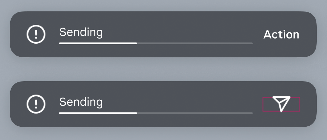
Hi there, I have an issue swapping between with two different type of nested components into a main component that is consist of a icon label that needs to swap between actionable text icon and a standard icon (it either stays in the text width or the icon width. What is the best way to handle it so that it is more flexible between the two component styles so that the padding on both sides will stay constant (hugging both icon and text width)?

The only way i can think of so far is separate the two instances (icon and text), which has more instance involved, not ideal.

Please advise.

Best answer by Jonathan53

Just found the answer to my own question, set both components with ‘auto layout’ will do the trick.

View original
This topic has been closed for comments

3 replies

Jonathan53
  • Author
  • 2 replies
  • May 20, 2024

I mean two ‘variants’ involved (text and icon), not instances


Jonathan53
  • Author
  • 2 replies
  • Answer
  • May 20, 2024

Just found the answer to my own question, set both components with ‘auto layout’ will do the trick.


Celine_D
Figmate
  • Community Support
  • 3381 replies
  • May 21, 2024

Hey @Jonathan53 ,
Glad to hear you have found a fix! I’ve gone ahead and closed the thread here. 🙂


Cookie policy

We use cookies to enhance and personalize your experience. If you accept you agree to our full cookie policy. Learn more about our cookies.

 
Cookie settings