Hi guys,
First time poster here. Sorry if this has already been discussed / answered. I think it might be related to this bug.
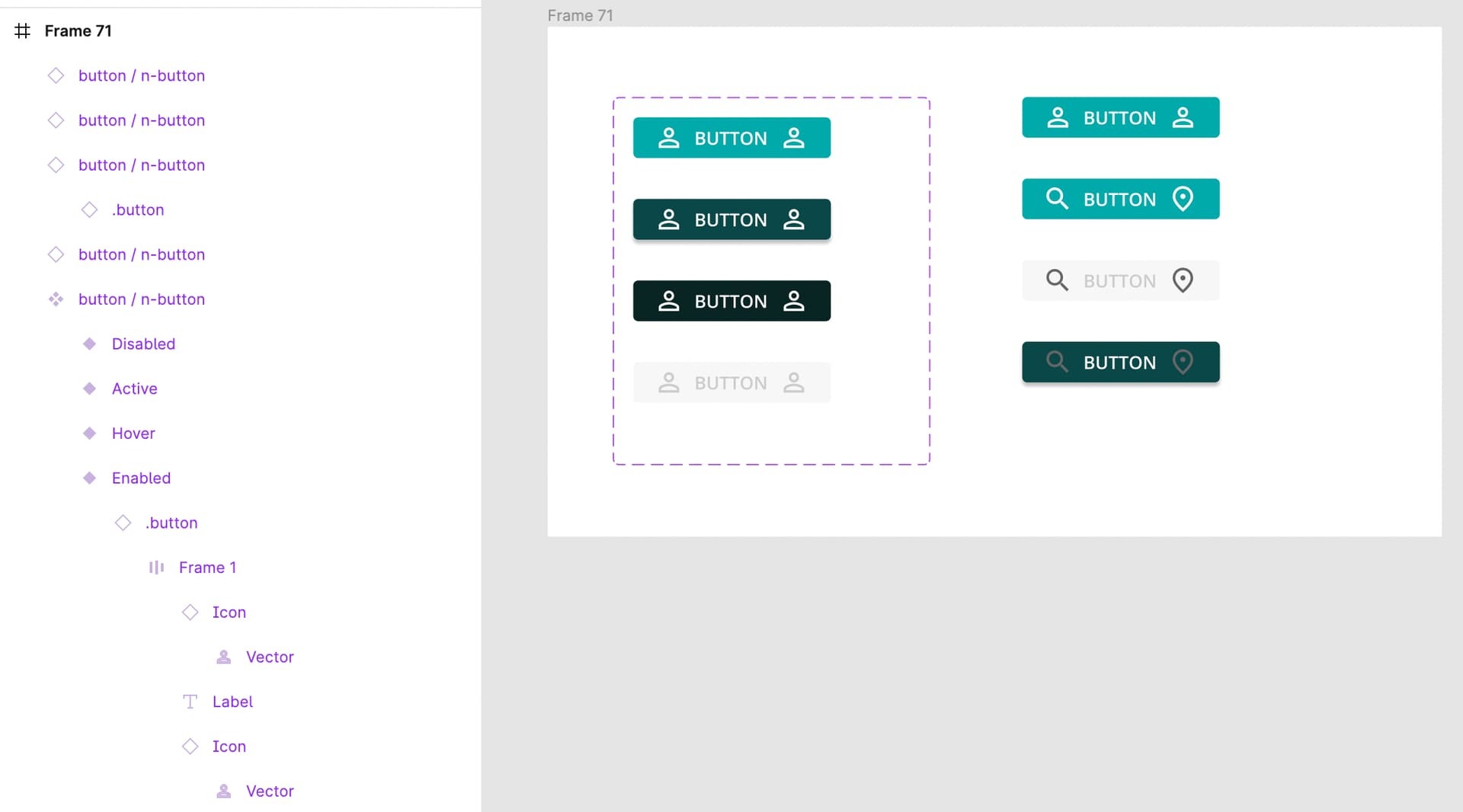
I’ve got a button component with 5 variants and 3 states each. The button consists of a text field and an icon. The icon is a component with variants as well (so I can easily swap icons from an expandable set).
In the last two variants of the button, both the text color and the icon color need to change between the different states. This seems to work in one direction but not in the other - once updated the icon color doesn’t return to normal. The text box, however, works perfectly fine. Also: I’ve noticed that if I don’t update the icon’s variant it would respond correctly to the interactions.
I suspect I haven’t wired the interactions correctly. Here’s the file.


