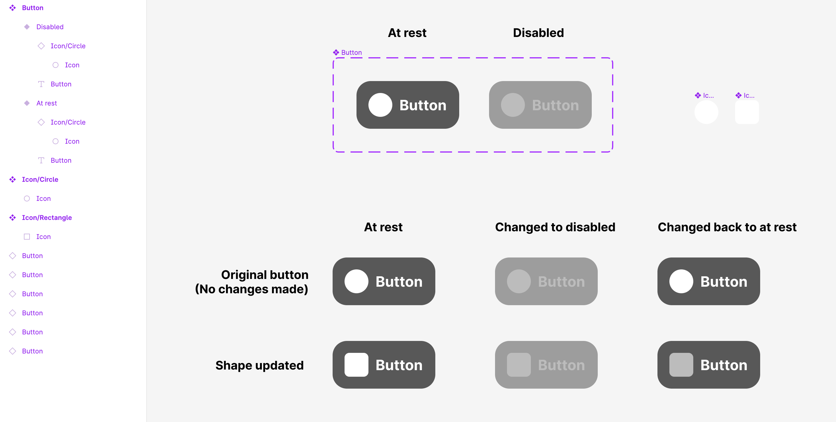
[Variants] How to keep the icon color override while changing the variant state?

Unfortunately, this is still a thing that occured to my team today.

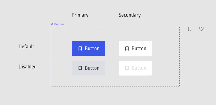
We tested a very simple button component like this:

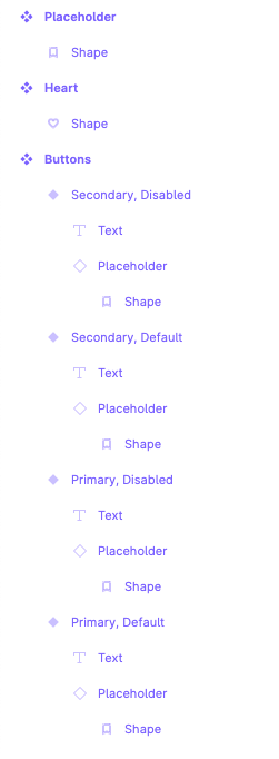
❖ Button (= Auto Layout Frame)
— ◇ Icon (= Nested Component Instance)
— Label (= Text)

We defined an instance swap property for the nested icon component inside the Button.
The Button has Variants for two different states (normal, hover). The normal state button contains text and icon Color A and the hover in Color B. We utilize the while hovering interaction to change the normal state to the hover state via smart animate.

Also, we have two different icon components which we can swap to.
Each icon component has exactly the same layer structure and naming – and we don’t use any hack like the union trick.

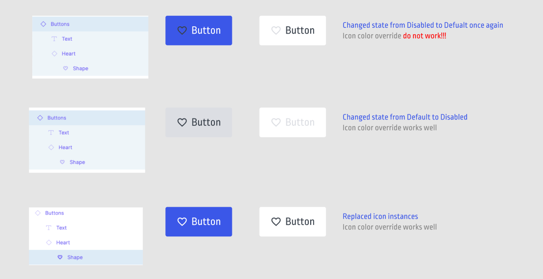
After inserting the Button component as an instance in the test design, we override the default icon by swapping its instance to another icon and change the text.

When testing the button and its interaction behavior in a prototype the following happens:

  1. hovering the button = change to hover state, icon color has changed from A to B as expected.
  2. not hovering any more / placing mouse cursor outside the button = changes back to normal state as expected, but the icon color stays color B and does not revert back to color A – this is an unexpected behavior and a bug we cannot resolve at all.

This only occurs if the Button doesn’t use the default Icon, so it just happens when using the icon instance swap.

Any thoughts on this?

Not sure if this also solves your problem, but the issue I found in my case was: The Default state needs to override the nested icon. If the Color Style applied to the icon on a component’s default state is the same that the icon component has in the library, Figma doesn’t “identify” any change, so when coming back from another state that does override the color results in no change.

How I solved this:

  1. The icon component has ColorStyleA applied to it by default
  2. The component in which the icon is applied overrides ColorStyleA with ColorStyleB in its default state. ColorStyleB is identical to ColorStyleA.
  3. The hovered component applies ColorStyleC to the icon.

This way, when removing the mouse from the component, Figma understands that ColorStyleB needs to be applied to it.

4 Likes

That is indeed what I came across too… changed all default Icon colors and now it works.
Pretty never wrecking if you’re not aware of this issue.

Thanks for this insight, this was a super annoying issue to fix.

1 Like

I have this same issue. Figma please fix this!

1 Like

If you force color override on your icons it would work, here is my take on it

1 Like

I also have this issue. Is there a way to contact Figma support on this so they’re more aware?

Thank you @Alexandre_Navarro_Caldeira ! This has been such a frustration for so long. I haven’t been able to have my swapped icons obey my hover states, and your solution totally worked for me. I just went back and set all my root icons in my library to another so it reminds me to override my icon color on me default states when creating new components with icons.

1 Like

Happy to know it helped :slight_smile:

Uh. I don’t see this working. If I have let’s say 3 states for a component (default, hover, active), and the icons for each state are a diff colour, every time I change the icon in an instance it inherits the icon colour from the icon component itself.

So this happens:

  • Default button has grey icons. All icons in icon component set are grey, so swapping this out is fine in the instance
  • Hover state button has a BLUE icon. When changing this icon out in the instance the new icon pulls the GREY in from the icon component set.

Idiotic. Icons should always inherit the colours from the button state.

1 Like

Also, what if I have multiple button variants? Primary = grey, secondary = outlined, teriary = black no background etc. Your “fix” would mean you’d need 3 sets of icon components in 3 colours. No, bad.

Figma needs to fix this. Icons should be treated like text. It’s a special object, not just another component.

And while they’re at it, they should create specific component types for buttons, fields etc that COME WITH states (hover, focus, active etc), AND allow variants (primary, secondary, etc) as standard without us having to reinvent the wheel every time we create a new library :roll_eyes:

Come on, @Figma_Support ! Web components are a fairly standard lot. You can give us a set of pre-built editable components that covers like 99% of all design use cases and then let the l33ts go off and invent new components if they want (I’ve been doing this 17 years and have maybe needed a custom component like twice). This is a no-brainer, even that lot from adobe should see the sense in it.

3 Likes

This issue is giving me a proper headache with a design system I’m creating - It’s crazy that this isn’t fixed! It just ruins the mechanics of a system when when components look all broken when presenting prototypes :disappointed:

Please fix ASAP Figma!

4 Likes

This stuff is killing me.
@figma_support anything that uses the nested component (with instance swap in that component) is not working for icons.

Basically the structure might look like:
-Button
-----Icon with swap instance

If I leave the original icon - the hover works. If I swap the icon - sometimes it works, but most often it takes either original icon color, or behaves strangely… like not using overall any color changes

3 Likes

this answer should be pumped up! because that’s exactly what was going wrong with my single black icon, all I had to do is rename the inner vector layer to “icon” like all its sisters, and it worked

1 Like

terrible . Why is this not fixed?

I found this solution and it worked for my case: How to solve the icons colors problem In Figma | by Edward Chechique | Prototypr
basically you need to make sure that the layer names inside the icons are the same and then apply the colour as a style in the component. Then when you swap the icon in an instance of the component the colour style applied will remain and the shape of the icon will be able to be swapped.

3 Likes

What @Beatrice_Rachello says is correct. As long as the top-level name inside the component is the same, it should work. I now systematically group content in a component and always use the same name.

Solved, Here is my solution for this:

First, you need to Flatten each layer in a variant, for this, as you know Figma doesn’t have to Flatten each layer option, so I suggest you download the Automator plugin.

After that, Select all layers (you can do this by pressing Enter while selecting the parent layer) Run Automator > Object > Flatten selection, then click Flatten each layer.

Done!

It does look to be all about forcing an override in addition to flattening and consistent naming.

If the original base icon component has a default colour of WHITE, make sure this colour is overridden in the next component where it is to be used as a variant.

It then stands a better chance of defaulting back to the variant than defaulting to WHITE. (if you still need white, specify a different white)

When applying the variant, it’s worth applying/unapplying/applying to “clear the cache”.

I’m with the sentiment of the thread though, this is maddening.

Simply Naming things correctly doesn’t work in all cases. This is extremely frustrating

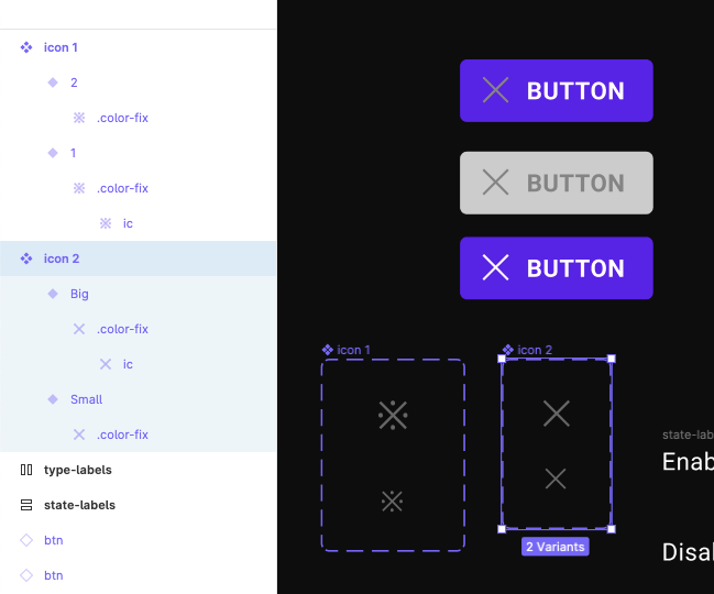
both of these use the same "Active Variant that should make all parts red

Note: they have the same Layer naming, but one is a Vector (01) and one is a Union (02) that has been named Vector

2 Likes