
Hi,
I’m building a big library and have a popular problem with icon color override which is not supported.
I’m have read a lot of topics and following them, unfortunately, it doesn’t work all the time in my case.
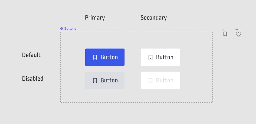
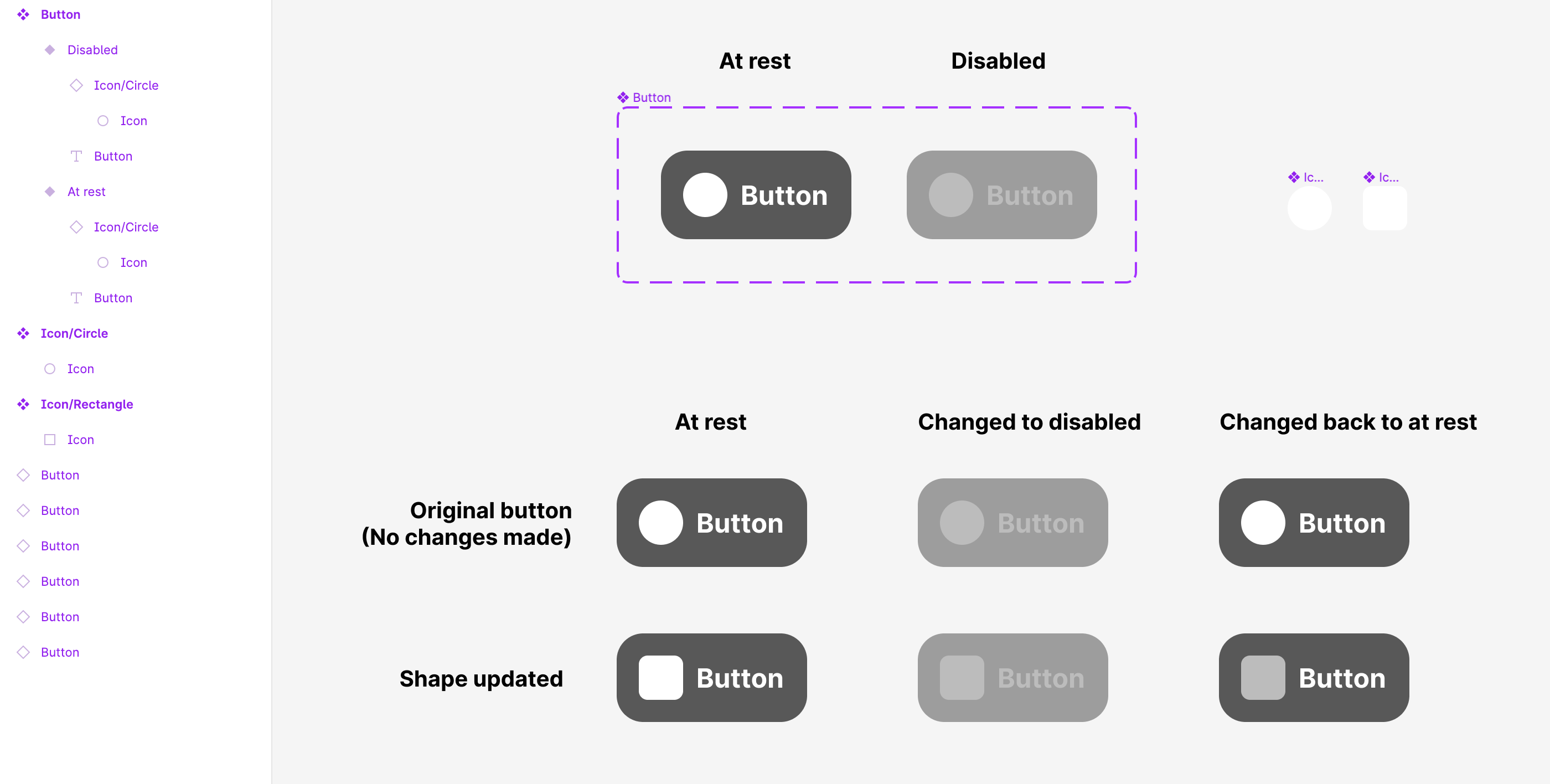
I created a button variant: a button with icons. Then I’m creating an instance and I’m replacing the icon symbol. The color keeps override. Hurra! I’m changing the state to disabled. The color keeps disabled override, hurra!
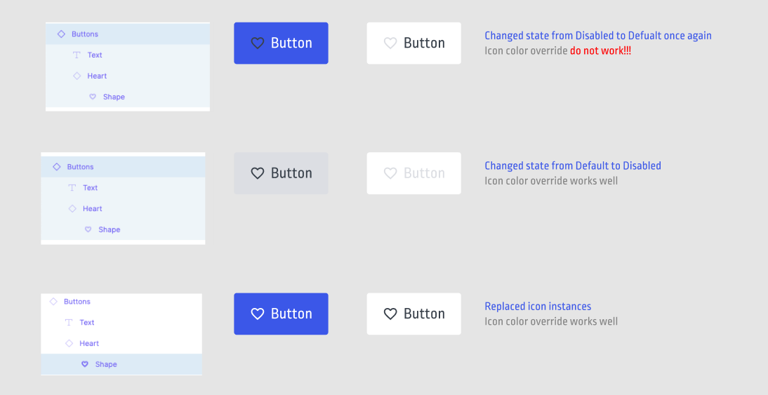
But when I’m changing the variant state ONCE AGAIN it keeps the second override.
Video:
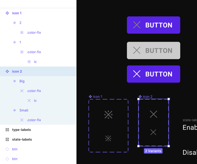
My build:
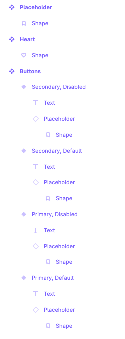
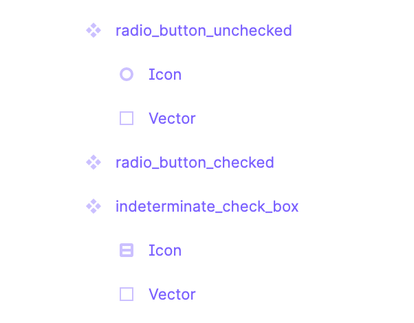
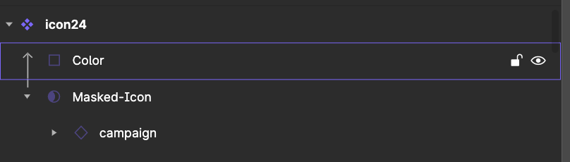
Structure (All icons are shapes, all names are the same)
😭 Problem:
I will be happy for any advice. Thanks

