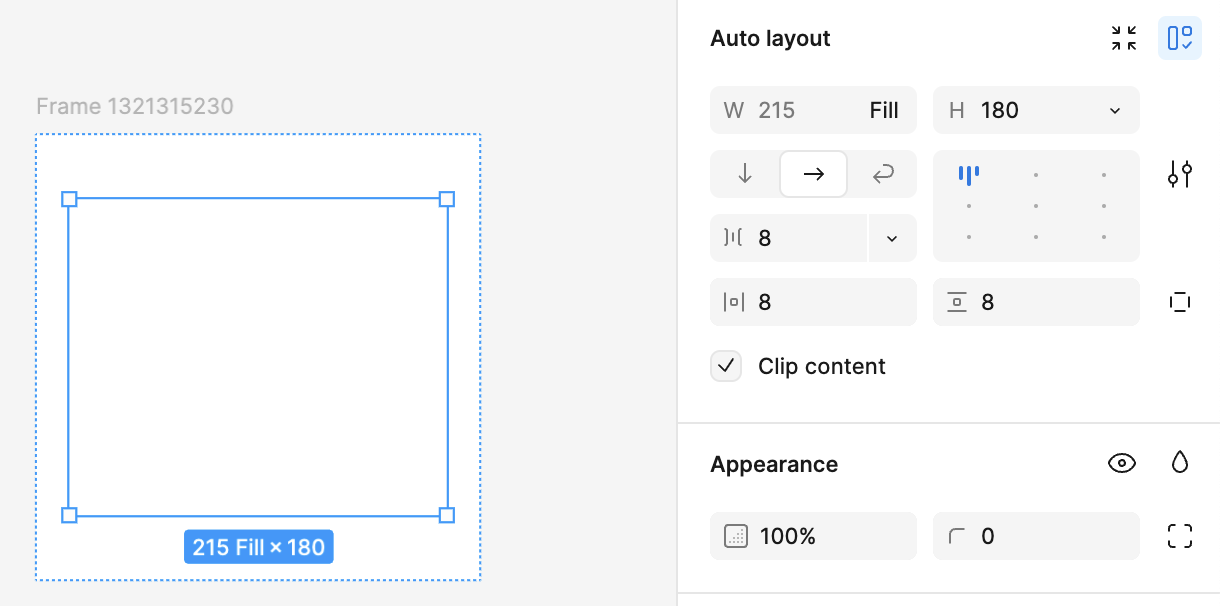
The idea of combining Layout and Auto Layout settings is cool, but the idea of merging two categories of input fields into one is not. It makes the workflow worse, because both settings are important and often you need to see them at the same time. But now Fill/Hug is always visible, and height/width disappears if there is auto layout.
Now to find out the size of an object you have to either 1. look at the bottom edge of your frame (not always possible, you have to scroll down if it’s long), or 2. move the cursor over the size input field (which is a time-consuming movement), or 3. make the right panel very wide (which eats up the working area).
There’s no benefit to combining important settings. In any case, even in the new interface there are so many of these settings that they go into the scroll anyway.
If I select an auto layout element, I can’t see the height and width directly, as I now have to hover over fill/hug to see the height or width of an element. Makes it more complicated to quickly see the values. Please separate the height / width and auto layout setting again in UI3
Please think about having a separate input in the new Beta UI so you can always see the Width and Height. It is super annoying that you have to hover over the input to see height and width.
The issue Danny addressed is not limited to height/width. In many area’s it requires a hover or an extra click to unveil information that I need to know on a regular basis. To sum up a few
Corners - If the corners are not all equal it shows… but it doesn’t show the values, so extra click to see or edit
Positioning - For ignore autolayout the nice align-tool is hidden
Clipping - If i want to toggle the clipping to “snow content” i have to select from a dropdown, but switching between to values now requires two clicks, while back in the days it was just one
state - In the context-menu while in prototypemode you have to open some fold-out part of the menu to see two extra fields… that could have been shown all the time anyways.
It would be lovely if these extra clicks would be removed; I rather have a bit more ugly UI than one that requires clicks and hovers to know the system-status or toggle some values I often edit
Fully agreed, also for me, auto layout allign square picker is not square any more its stretched horizontaly like rectangle and it’s much harder now to pick Allign bottom left, middle and top because they’re too close to each other.
Was about to make a new thread regarding this until I found this. This is one of the biggest things I miss in UI3. I really need to see Fixed/Hug/Fill without hovering on W/H values.
They have already fixed it! Yes, they didn’t split the inputs, but they made the change so that now dimensions are not lost even if auto layout is enabled and even if the right panel is in the narrowest position.
But you need to hover on it, I can’t find the pattern when it shows it vs when you need to hover on it. I just want it to be visible without me needing to interact with it.
Well, the absence of the inscription can be read as “fixed”. Because all elements are initially in the fixed status, so this is the “default” status, which is not marked. Honestly, I don’t see a problem with this.
The main problem has been solved, now you don’t need to make extra mouse movements to see the sizes (which I am very happy about)