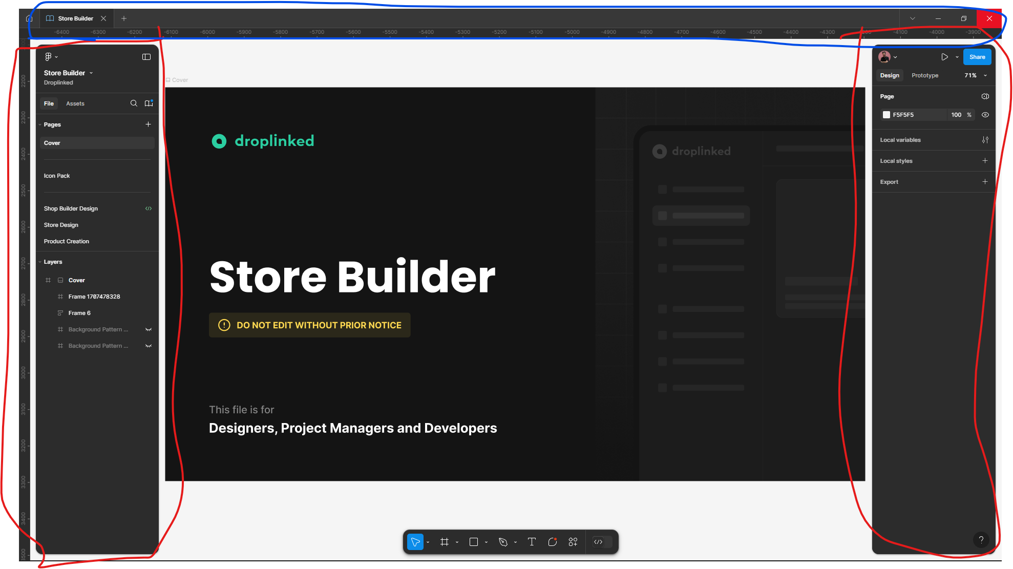
UI3 is really bad and like combining MS Fluent UI and Apple's Human Interface Design and it's a copy of Spline


No need to mention that it’s 90% like Spline.

Many small things are in another place and reordered and it’s hard to remember the place for people like me who used Figma for 4-5 years.
Screenshot 2024-09-18 210821
And everything is small I had to increase the scale because it was hard to see the texts and icons on my FHD 27 display.

1 Like


Two scrollbars next to each other? Why do we need a scrollbar at all for the board and canvas? Everyone know that the can zoom in and zoom out to see everything.

image
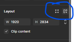
Why the Absolute option is now renamed to ignore auto layout :confused:

Resize to fit is in the auto layout section. Why?
The auto layout icon is not good and removing the auto layout is bad because the color is blue.
We can’t hide the voice chat section.
The border-radius is moved to appearance. Not good!

image
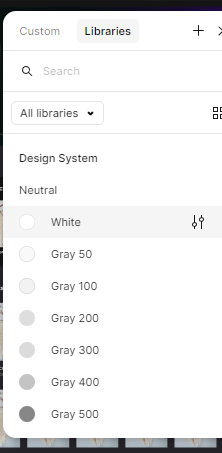
Custom should be after libraries because library is more important when I’m selecting a style.

image
The muted icon is not visible.