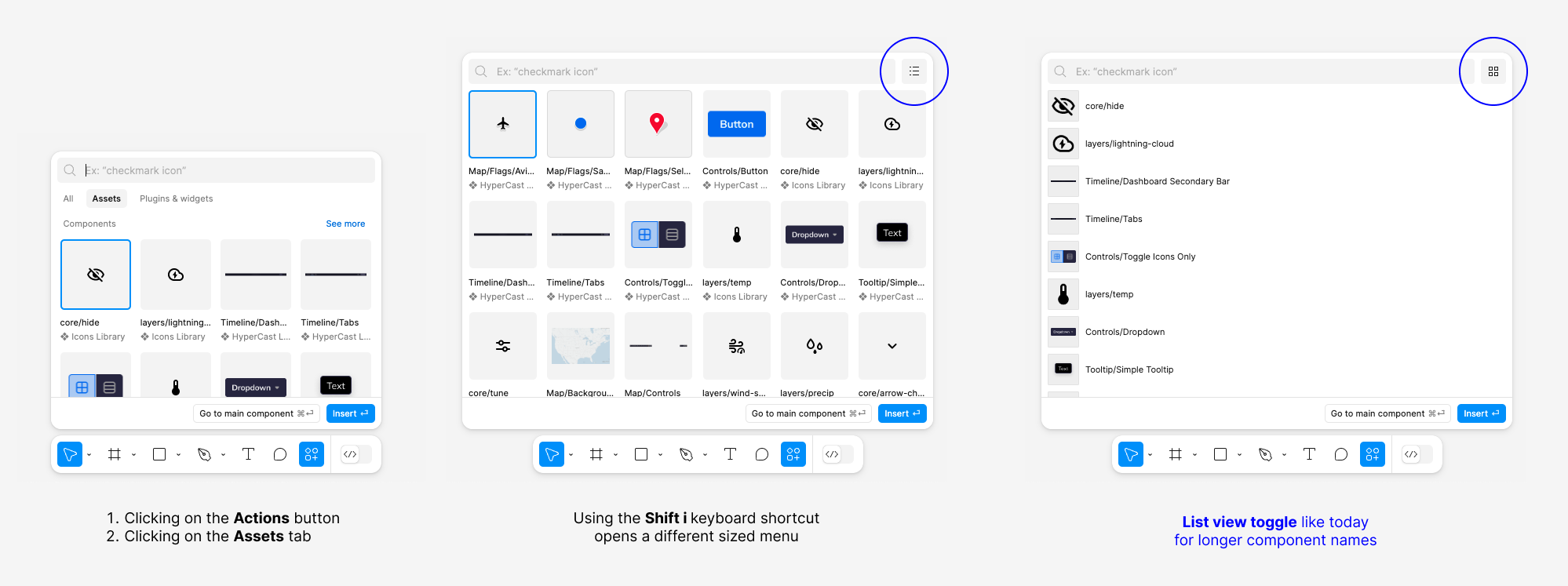
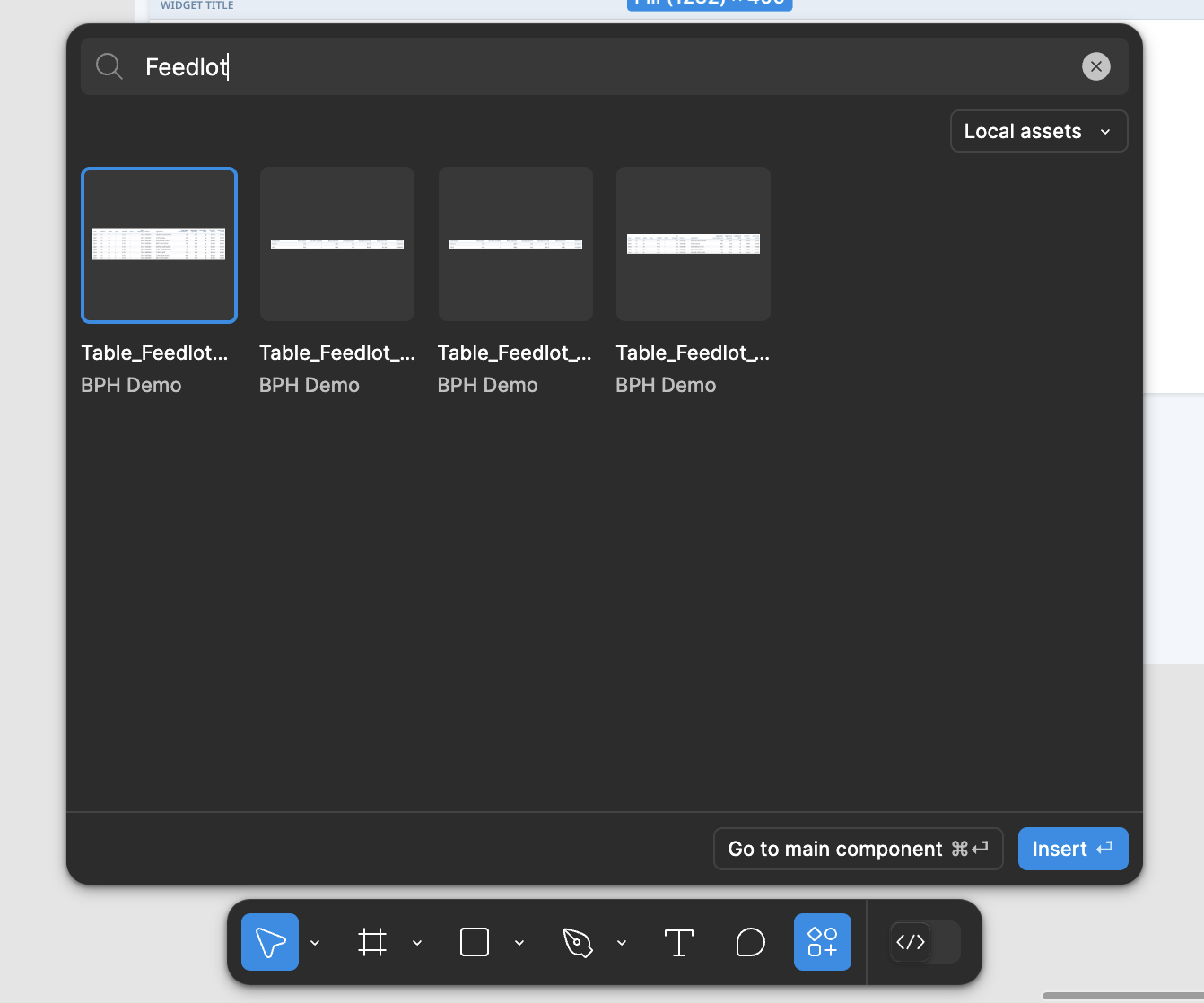
- I’m missing the list view we have in UI2 - I usually go by the component name which is now almost unreadable when you have all your components ordered by folders and sub-folders. We have many components that look very similar in a small thumbnails, and the grid view makes it harder to know what to insert.
- Insert menu - 2 different sizes - There’s a difference between clicking the Actions menu vs using the keyboard shortcut for inserting components, each opens in a different size, and both makes it even harder with the unreadable component names
- The component menu doesn’t close after dragging/inserting a component to your canvas. You have to click 2-3 times outside the menu for it close and even then it has some delay, it makes for a really frustrating rage click. I’m finding myself just click Esc or clicking too many times just so I can get back to work.
UI3 - Insert menu & component list view toggle
Reply
Enter your E-mail address. We'll send you an e-mail with instructions to reset your password.


