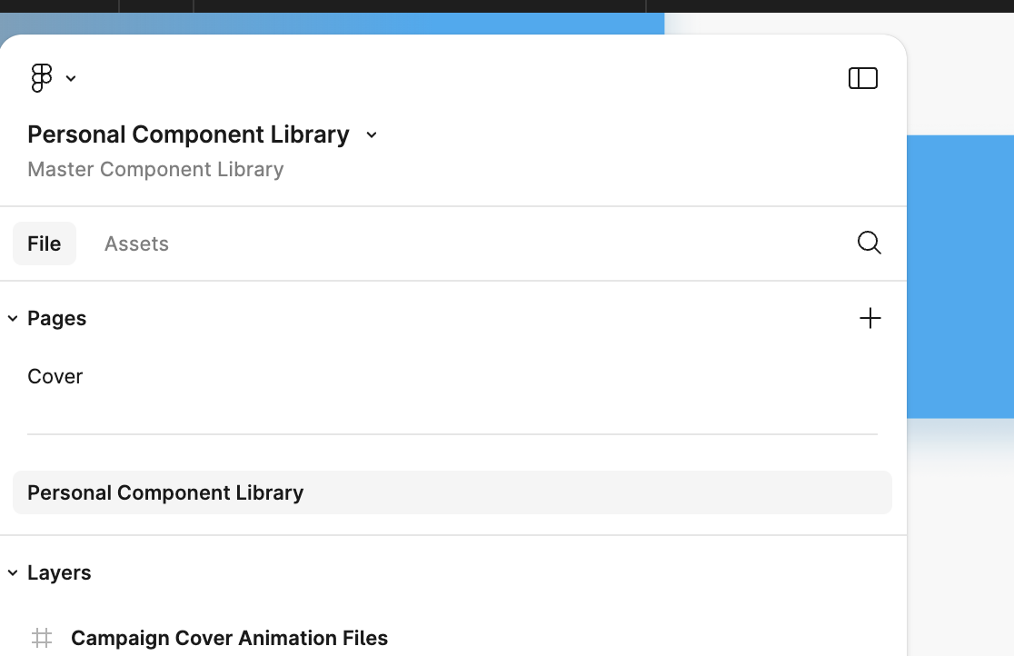
- What I can’t stand the most is that the panels of the new UI can’t be attached to the edges. They leave some gaps, wasting the space to display the main design and operation area. And visually, these gaps are also distracting my attention.
- The toolbar at the bottom also interferes with the main operation space, especially if its color is the same as my design draft. By the way, is it just for the convenience of novices to move it from the top to the bottom? If someone who uses Figma more frequently, he will use shortcuts instead of mouse clicks to trigger these functions.
So I hope that adjustments can be made in time in the official version of UI3, otherwise these redesign will seem like a subjective conjecture of someone who doesn’t use Figma much.
UI3 Feedback
- July 3, 2024
- 426 replies
- 7169 views
- New Member
- 1 reply
426 replies
- 8 replies
- July 3, 2024
Hey Figma,
- I’m all up for a nice new UI and optimise tools to make them better. I might be a bit old-school, coming from Creative Cloud and then switching to Figma long ago, but what I miss about this new update is that it feels like a tool. Before you had it, the sidebars were attached to the sides, but now you have a little spacing around them. For me, that’s a bit disturbing and actually ruins the interface. A quick suggestion: Could you make it so that people can choose? Either they stick to the sides and the work area within it or as it is with your new UI? What I cave in is that Figma feels and looks like a tool, and for that, I at least want the sidebars to be completely on the sides.
- Floating bottom tools: Would it be possible to choose the location? Either top or bottom? Maybe what I really seek is more customizability to change the interface to match how I work. E.g. I would also love it, if I could separate Pages from Layers and have two columns rather than one unified one, and so on. Customisability is maybe what I seek here as you have everything locked in place and allow zero customizability to the layout of things, which, if possible, could drastically optimise my workflow.
- Please return the width + height to separate them from “Fixed, Hugged, and Filled”, as I constantly seek this information as I design UI myself. I know that you have added it below, and this might take some getting used to, but my eyes constantly try to locate that info from the right sidebar.
- Russell_Phillip
- Lucas_R
- CJ1
- VR1
- Vjatseslav
- Bart_Nowak
- Nick_Roviezzo
- Paco_Zane
- Igor_Barinov
- Tanner_Monson1
- DAT
- BrandNew
- Ken_Ottmann
- RoRa
- Linn2
- ekifol
- Adi_Meir
- Ella_Forte1
- Anya_Shmelyova
- xingfeng
- Benjamin20
- Konrad_Burman
- Dana_Atwood
- Niko3
- maltek
- Judy_Kim2
- jules.cameron
- Jacqueline1
- Jeff27
- Cosmin_Coman1
- Ornelas_Alex
- Lynsey_Loftus
- Tori_Kopecky1
- Madeleine_Brooks
- Michael_Martino2
- Einsteinhere
- Gabriel_R
- Antti_Huhtasalo
- Phil_Bauch
- nasgary
- Jennifer_Treter
- Mads_Hensel_dk
- Andrew-Hat
- DrossDesign
- Tomas_Slavata
- astraworks
- kukapishixdd
- Polina_Cheremisinova
- Metehan_Altuntekin
- Sasha_Trofimchuk
- Tetiana_Kolomiiets
- DMa
- Marce
- Sizwe Moabi
- Fenna
- Anna Shannon
- Jon Towers
- 1 reply
- July 4, 2024
Once upon a time, Microsoft also made a big mistake when they changed the classic look of the Start menu! Please don’t repeat their mistake!
“Don’t try to change something until it’s still working.” - © BIC company
- 4 replies
- July 4, 2024
This isnt very constructive at all. You’ve not even said what you don’t like about it
- 2 replies
- July 4, 2024
Agree, it would be more helpful to say what you dont like.
In my case, I think they hided lots of important features and compressed everything, wich isnt very friendly tbh.
- New Member
- 10 replies
- July 5, 2024
Regarding the new UI3, the added features on the product side are good, but do we really need to drastically change the UI/UX? In our work, efficiency is crucial. I tried using UI3’s UI/UX, but ultimately reverted to the previous UI version because I couldn’t find the tools I needed. The changes in UI3 are significant, and at least for me, adapting to it is very troublesome. My needs are urgent, and I don’t have time to get used to the new UI.
🤬
- Pavel_Kolchanov
- Denis_Orlov
- CJ1
- Jean_Neves
- Bart_Nowak
- Paco_Zane
- Igor_Barinov
- Adamo
- Jai1
- Yann_Bernhard1
- leigh_van_maaren
- Anya_Shmelyova
- Gaelle1
- Eldin_Herenda
- Niko3
- Joey_Hannes
- jules.cameron
- a2609661273
- Ornelas_Alex
- Lynsey_Loftus
- Living.Security.Andy
- Mislav_Hilc
- nasgary
- Jennifer_Treter
- Barbara_Szafranska
- DrossDesign
- astraworks
- Polina_Cheremisinova
- Metehan_Altuntekin
- Nirmal_Aiken_Labs
- Sasha_Trofimchuk
- alex132
- Tetiana_Kolomiiets
- DMa
- Marce
- Sergemavro
- Paul Sanders
- JuliePolaski
- A.C.
- Jon Towers
- JoelleTDK
- louyike
- Active Member
- 34 replies
- July 5, 2024
Hi @Huan_Z, watch some of the videos on the launch/announcement the other day. It may shed light in where some of the elements have moved to. 👍
- 1 reply
- July 6, 2024
I didn’t like moving prototypes from illustrator to Figma in 2012 either but at some point workflows need to be re-organized to adapt to changing demands. I expect there will be community file walk throughs and examples to help adapt to the changes. Efficiency is at the core of what Figma and most tech companies emphasize so stick with it and I think you’ll reap the rewards. Good luck!
- 1 reply
- July 7, 2024
As much as I am in for more modern and efficient UI and that too for a designer’s tool, somehow I feel that the UI3 has made life a little tougher. I know that there is a getting used to and I might relearn what is almost 8 years of muscle memory, But some changes do suck! For instance, I have been searching for the height property for a component object and eventually somehow figured out that on hover of the auto-layout property, this was hidden… but why!
I am trying to set a text property for one of my variants in Figma which I have built hundreds of components in the past - and now, its just not happening and I do not know where and how to find this feature.
OK! so yes… I am a little disappointed for sure.
- New Member
- 10 replies
- July 8, 2024
I know that Figma provides some videos to inform users about the specific changes. However, in reality, very few people actively watch them. Most users only look for these resources when they encounter problems and need solutions. What we need to understand is that good interaction design should allow users to transition from awareness to familiarity with minimal changes to their usage habits, even if there are many changes.
- New Member
- 10 replies
- July 8, 2024
Sometimes the relationship between users and a product can be understood as a kind of interpersonal relationship. The more disappointments accumulate between them, the more it lays the foundation for their eventual separation.
- Active Member
- 61 replies
- July 8, 2024
I’ve been using UI3 for 3 days now and I am slowly getting used to the fact that my tools have moved to the bottom. I’ll get used to it, but for now I have tasks to do and assets to deliver and the change for accessing the basic tools is too big.
Overall: I think removing the top toolbar was not the best choice. I get wanting to align with FigJam and Figma Slides but those are much simpler tools. Getting rid of the toolbar has created a lot of problems because you’ve had to move the contextual tools within the constraints of the UI panels.
Toolbar
- Moving the toolbar to the bottom may have freed up a few pixels (The toolbar was 48px high), but half of that that gain is negated by the spacing around the “floating” panels (2x 12px).
- The top bar also had the F menu and the File menu in it, which have moved to the top of the Left panel, which means they are now further away from the OS Figma menu (in the Desktop App, which all of my team uses) which gives it a cognitive disconnect.
- Having the Toolbar at the bottom on a Mac means that every time I overshoot, my (Hidden) Mac Dock pops up
- Vector editing
Vector editing has become a little harder: Before, when going into node editing mode, the tools were grouped (Select, Pen, Bend, Fill). Now the Direct select (Move) tool is 3 tools away from the other tools and you need to switch between those two for some types of editing. - Toasts now show up above the toolbar, but they’re the same color as the toolbar, and when using the pen tool, there are sometimes 3 layers of white boxes taking up a lot of screen space
- Switching to Dev-mode triggers an animation on the toolbar that will look cool for about 3 times. Especially since Shift-D triggers it too.
“Floating” panels
-
The gap between the panels and the viewport give me a ton of visual noise just outside my field of vision. I’m usually looking at the middle of the screen, but when I move around the canvas I can see things moving in the gap, which is really distracting. Not good for people with ADHD…
Couple that with the fact that while the panels LOOK floating, they can’t actually be moved, just resized, makes it a purely aesthetic choice, making me wish i could at least turn off “floating” to have the old style full-height, flush panels back. Figma is a tool, and I want functionality, not meaningless aesthetics. -
The File dropdown menu and the F menu are now taking up valuable vertical space in the File/Assets panel on the left.
-
Left panel
-
File
Nothing much has changed, but I wonder why I still have to horizontally resize the panel to be able to see all the nested layers instead of having horizontal scroll -
Assets
I’m glad you’ve kept the option of a list for the libraries, because I like keeping the panels as thin as possible to have as much use of the canvas as possible and that means I could only see 4 Libraries in Grid view…
-
-
Right Panel
Design-
Context sensitive tools
The context sensitive tools have moved here from the top toolbar, but the right panel doesn’t have as much horizontal space available, so sometimes those tools are now hidden behind the “…” icon. A little frustrating, especially because this is 100% caused by the fact that you got rid of the top bar. -
Instance/variant properties
Nice improvement on the affordance of the text field being visually different from the other variants.
Moving the properties up means that with complex components with a bunch of properties the Position/Layout panels end up almost on the bottom of the screen… -
Position
- Not sure if we really needed the rotate 90º and flip horizontal/vertical tools there, but sure.
- Rotation being grouped with Position is an odd choice.
- Separating Position from Width and Height is strange to me. Position and the size of what I selected are linked to me, and in a tool like FigJam it’s not that big of a deal, but for UI design it’s pretty important to place objects in exact positions.
-
Layout
-
With Layout now being separate from position the distance between the Position and Size is really big.
- I really don’t like the choice of hiding the Width or Height under a hoverstate when layer is set to Fill or Hug. I do not want to move my mouse from the layer I selected over the sidebar, and we’ve lost the “Fixed” indication, which is super helpful when you’re trying to figure out why your nested autolayouts are not behaving like you thought they would.
- Rotation should be linked to the object I selected
- Show/Clip Content should NOT be a dropdown, the checkbox is semantically better, especially since the default is “Show content” while the old checkbox was “ Clip content” (Higher cognitive load for people switching to the new UI)
-
Fill and Stroke - no comments
-
Effects
No idea why this moved up, above selection colors? Effects colors don’t show up in the Selection colors. Unless that’s a future feature? -
Selection colors
Selection colors are linked to fill and stroke colors. Having Selection colors below Effects implies that Effects colors will show up in the Selection colors. Effects colors do not show up in the Selection colors. -
Layout Grid has moved all the way to the bottom, away from “Layout”, which is an odd choice.
Prototyping
The Prototyping Interaction pane has improved a lot, but I still feel that it should be possible to see the full set of interactions, especially Set Variable, in one go, and not have to click each one to figure out what they do. -
- Filipp_EGOROV
- Isaac2
- Lucas_R
- CJ1
- davidlopan
- Nicola_Del_Ben
- Bart_Nowak
- Igor_Barinov
- Adamo
- Jai1
- Ken_Ottmann
- rudbear
- DannyEspinoza
- ekifol
- Matt_Rea1
- Ella_Forte1
- Erik28
- Oleg_Serediuc
- Naina
- Neil_Gonzalez
- SlavaF
- FullTrucker
- OG_Can
- Lee_Hayward
- Alwyn_Balingit
- Emelie
- Konrad_Burman
- Neva_Corbo-Hudak1
- Luca_Benazzi
- Tom_Van_humbeek3
- Petr_Seifert
- Tobias_Berger
- Cosmin_Coman1
- Ornelas_Alex
- fckTheSys
- Jeff_Nitzberg1
- Lynsey_Loftus
- Michael_Martino2
- Iggy_Hammick
- Rui_P_Cabrinha
- juliana3
- Olaf_Kuusik
- Gabriel_R
- Jordy
- mjsxi
- M_Vlad
- Robert16
- Huan_Z
- Uyen_Hoang1
- Weirdo
- Jennifer_Treter
- Andrew-Hat
- DrossDesign
- Polina_Cheremisinova
- Metehan_Altuntekin
- Alex_Vlad_Coza
- Danny_Giebe
- Sam_C
- Ulviyya_S
- Sasha_Trofimchuk
- Alexandru_Cotoranu
- Timofey_Tulin
- DMa
- JuliePolaski
- bhop
- Jon Towers
- JoelleTDK
- eJonsson
- Vadim Kartashev
- 2 replies
- July 8, 2024
I think as a first impression, I’m liking the more nuanced changes to UI3 so far, but my only complaint is that it’s floating now, rather than docked to the edges of the viewport.
It feels really distracting with Dark Mode on because most of our files have a light background and we prefer to work that way. This creates a “framing” effect where the floating UI creates an odd feeling when panning around the document, since I can see various design elements flying in and out of the gap area — which is why it’s distracting.
It also makes it feel like the floating UI is mistakenly part of the document, as odd as that sounds.
Please consider adding an option to dock the panels and remove the gap 😃
- Active Member
- 61 replies
- July 9, 2024
Yeah, my ADHD brain does NOT like that gap.
- Community Support
- 4864 replies
- July 9, 2024
Hey All, thanks for the feedback!
We’ll ensure our UI3 team has eyes on this topic for improvements.
We completely understand how hard it can be to adjust to the new changes. Be sure to take a look at our Help Center article to learn more about Navigating Figma’s New UI.
- 1 reply
- July 10, 2024
Overall UI3 makes Figma a less efficient tool. When I heard of this new UI release iI was excited for a new and improved Figma experience but unfortunately everything is less organised more visually complex and needs more clicks to achieve which is very disappointing to see, especially coming from a tool made for UI/UX/product design. @Bauke_Schildt really pointed out everything perfectly.
My only hope is that they keep the option of using the old UI2 even after UI3 gets released in full.
- Active Member
- 34 replies
- July 10, 2024
Hi @Morten_Stig_Christensen, I like your suggestions. I very much like the look of the new UI (not tried it out just yet). I was concerned a little about more screen space being used up because of the new padding around the sidebars etc for those on smaller displays. It would be great as you have mentioned to have something like Adobes layout selector. You can have the “UI3” and “UI Classic” for example, so you still get the new features just old UI.
- 1 reply
- July 11, 2024
Exactly the same feeling, like you said about Microsoft. And all of useful tutorials become unusable with these changes. Constraints, components, everything. And too many changes to get used to. As if they wanted to make our lives a bit harder
- 1 reply
- July 11, 2024
and while we’re at it, can we please get a movable UI.
Things like, switching the left & right vertical tools & moving the top tools around or down… pinning them together, to eachother… ect.
- 1 reply
- July 11, 2024
After working with the new UI for a few days, switching back and forth, I’m going back to the old UI. For the new UI, I actually prefer the look of it: it’s more compact with a cleaner presentation. I readily adapted to the placement, but “floating” palettes that don’t truly float/aren’t moveable are frustrating. When I hide the sidebars I need them hidden, not taking screen space (I take a lot of screencaps - don’t judge me 😉 ). The last straw is the gap around the palettes - it’s visually disturbing.
- 2 replies
- July 11, 2024
This seems like the primary UI3 feedback thread, so I’ll add comments here. I agree with much of the feedback from @Bauke_Schildt and what doesn’t resonate with me (e.g. rotation grouped with position seems fine to me) is minor.
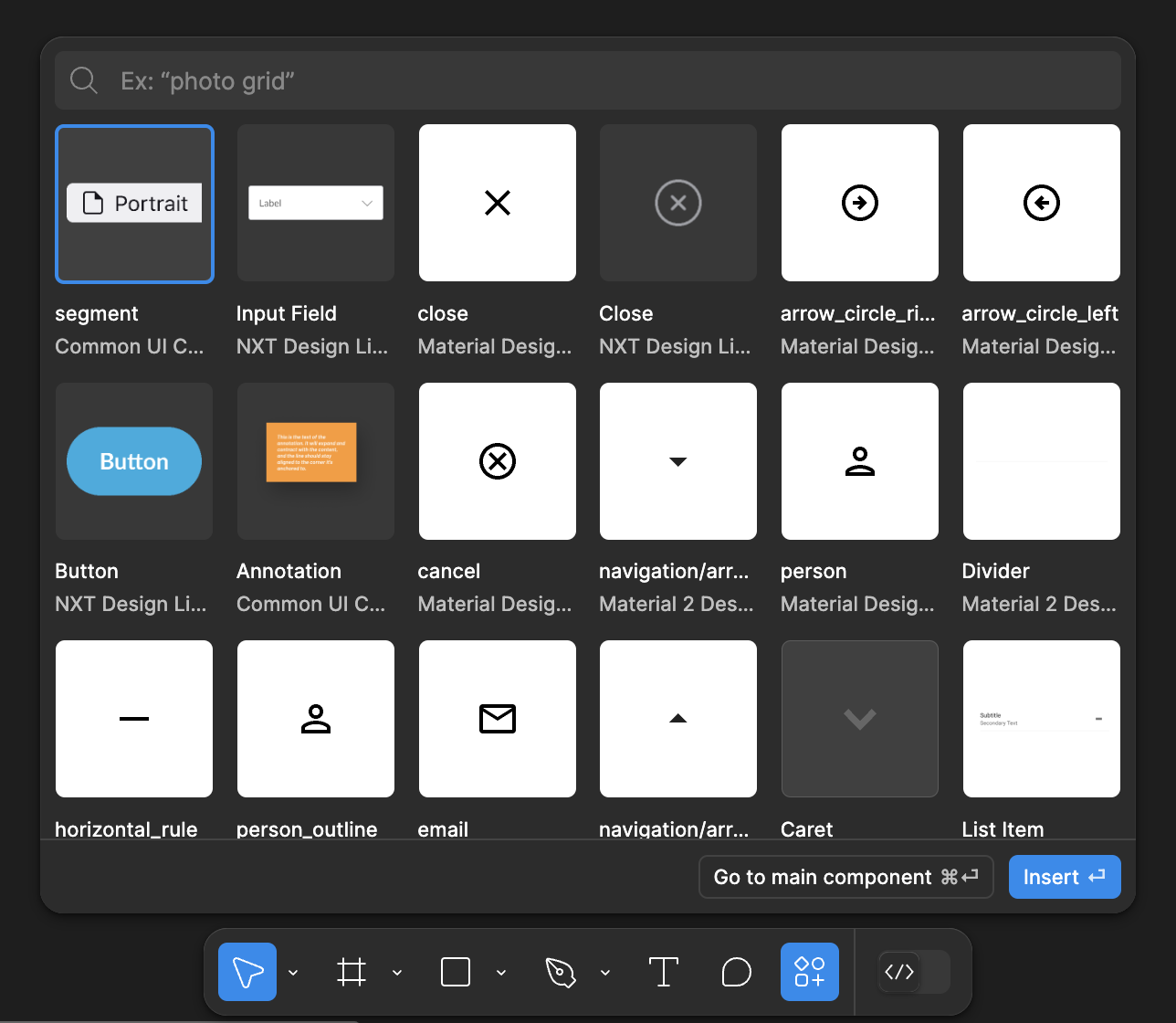
It appears that inserting components from libraries is entirely driven by a “search” in UI3, in UI2 one could also “browse” for components by looking through a library. This was important to me in my workflow as I don’t always know what a component is named. For example, inheriting a UI kit from a previous designer or using an extensive public icon library. To go a bit deeper, I use Material icons for many of our projects and I may not always know what the icon is named. In UI2 I could generally “discover” a suitable icon by browsing the pages of the icon library file, which is organized like categories.
This is how it used to be in UI2:
Even if you didn’t enter a search term, you could still click through files and pages and frames to discover what you need. I find this super useful even when using libraries that I curate, as I may not always recall exactly what something was named. And if another designer adds something to our UI kit, the problem is exacerbated.
And now this is UI3, I don’t see a way to discover components by looking at a specific page in a specific file:
It seems that in an effort to simplify this feature or make it “easier” to use, it has become more difficult for me to find things unless I know (or have a general idea) of what the component is named.
- 1 reply
- July 14, 2024
- Active Member
- 34 replies
- July 16, 2024
This would do my nut in. Definately need a classic view mode so you can choose the new floating UI3 or not.
- New Member
- 6 replies
- July 18, 2024
I mean, this exists…
1 Attachments
- 17 replies
- July 18, 2024
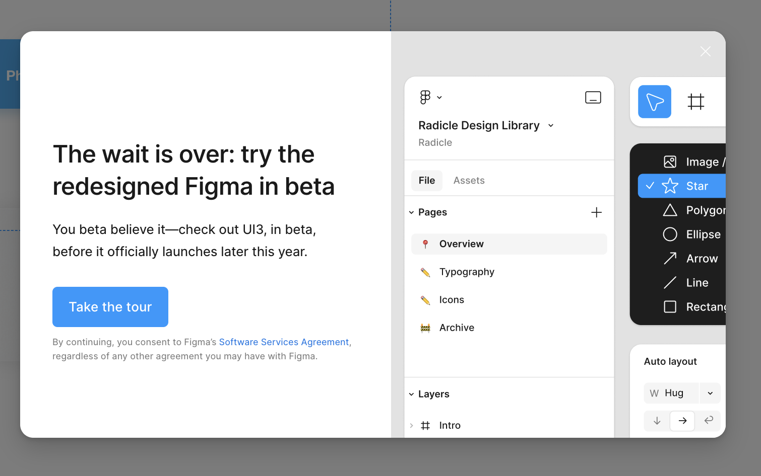
Without even know any of this, or seeing the new UI3, I decided to click the CLOSE button on this pop up. I can’t stand what Figma have been doing lately with terrible, new product releases.
Slides was an abomination. Half of the new Figma features they’ve dropped in the last 12 months are only specific to people who create complex phone apps or software programs for a living — not everyone else that uses Figma.
No idea what’s going on in their office but the decisions they make are clearly not in favour of the people that actually use Figma for a living — outside of Figma employees.
Ain’t no way I’m trying UI3, and when it drops I’ll be sticking with the current UI.
And these floating tiles are truly one of the most horrible things I’ve seen from any design software. Adobe included. And that’s saying something.
Figma going downhill fast in 2024 by trying to hard. Literally.
- 17 replies
- July 18, 2024
Reply
Related topics
Lock resizing on an auto layout componenticon
ArchiveTrying to get hug to work on carousel instance with clipped contenticon
Ask the CommunityReorder objects in an autolayout component instance. Allow for order overrides
ArchiveHow to fix the 1/2 pixel off on "line object" component on Figma?icon
Ask the CommunityChildren of an Auto Layout not responding to the auto vertical gap? / Also, constraints disabled possible bug?icon
Ask the Community
Solved topics
Enter your E-mail address. We'll send you an e-mail with instructions to reset your password.
Scanning file for viruses.
Sorry, we're still checking this file's contents to make sure it's safe to download. Please try again in a few minutes.
OKThis file cannot be downloaded
Sorry, our virus scanner detected that this file isn't safe to download.
OKCookie policy
We use cookies to enhance and personalize your experience. If you accept you agree to our full cookie policy. Learn more about our cookies.
Cookie settings
We use 3 different kinds of cookies. You can choose which cookies you want to accept. We need basic cookies to make this site work, therefore these are the minimum you can select. Learn more about our cookies.


